Women Architects and World Fairs

Author: JJ Bauer (Page 1 of 2)

Mapping Project final thoughts and feedback

Wow! January just flew by in the whirl of new semester business. So of course my first post of 2015 is actually going to be a final report on the digital humanities class project from last semester.

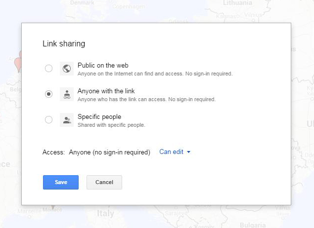
Here is the link to the google map the course made: https://www.google.com/maps/d/edit?mid=zDX3AIg56Xx0.kx2jSWf18o-A

  1. There are many more blue pins than red only because I limited the number of built works by female architects for each group to 15 (and for comparison the textbook had anywhere from 7-24 built works per section pinned by an individual in the first layer). Wanted them to do slightly deeper research on the women architects rather than broader. Although students did say that it was in some cases challenging to find 15 built works where they could also find at least 1 image and any useful data about the built work (including, sometimes a challenge, where it was located if it had since been destroyed).
  2. Their work on the first part of the project ranged all over the place from A+ to C (I almost never get failing students because of UNC’s generous add/drop deadline) and this was still fairly obvious from looking at their work on the map, and much of a piece with their other grades in the course. Their work on the second part of the project ranged from A+ to B+, which was a good sign that they had improved since their first try run at it.
  3. I was surprised at how much I learned from their work on the second part of the project, which brought to light, among other things, that a woman received the first patent for an architectural design (in North Carolina, no less!) and highlighted the neglected work of the first licensed African-American female architect Norma Merrick Sklarek (whose firm wouldn’t ever tell clients that she was the principal designer for fear they would bolt from the project). The students really brought a higher level of engagement to this project than I am used to seeing in previous incarnations of the course.
  4. I also took all of their data from the second part of the project and used it to create a google fusion table (found here), to which I added a field for building type (school, museum, office building, etc.) and showed them various ways they could filter the data. One of the charts I had created was a network of building type by year, which revealed that a lot of early women architects built houses and many more current female architects build office buildings—this raised questions for the class and led to an interesting discussion of late 19th female architects finding more commissions for houses precisely because of sesxist stereotypes about the association of women with the domestic realm (they would just be better at houses, because this is where they spend all of their time and provide the most socially appropriate value as wives and mothers) but also how this distribution might reflect the students’ own assumptions and biases in doing their research and choosing which 15 among potentially many other choices to add to the map for a given date range.
  5. The good: Students were asked after the final presentations to give feedback on the project as a whole. Some found the project fun (r.e. the complaint in number 6 below, one student gave the rejoinder “I don’t care, I really liked it, it was fun”), others found it made the built works much more memorable and helped them better understand how to do formal analysis of architecture, others really liked the interactivity of the exercise (being able to add video and images to the pins as well as links, and to then go explore what their peers had created, and move around the map geographically), and others found it made them feel a sense of ownership over the materials they were pinning to the map. They were unanimously in favor of sharing their work outside the class and a couple of students wanted to know if the project would continue to grow after this. One student used his newly acquired mapping skills in an Islamic art class to map artistic commissions by one particular Andalusian caliph.
  6. The bad but fixable: One student complained about the length of time it took to actually make the pins on the map (6 or 7 hours) and so we talked as a group about how to improve that aspect of the project. Most students would have preferred to just put their data and links into a google drive shared spreadsheet and then let me “make” the map with that. Based on how google maps ingests data from a spreadsheet, from a test with some of the female architect data, this would in turn require adding geolocation fields (the map just couldn’t find an observatory in the far north of Finland from the name of the town it was in, as an example), and also perhaps still adding some images via the individual pin on the map (the map couldn’t convert some urls into images and just added them as links to the bottom of the pin description—seemed to do just fine with embedding video urls).
  7. The kinda bad: I paid for Google Maps pro to allow us to put so many pins on the map and in the last week of the course they announced it will now be free. But it was only $5 a month and I can easily get my department to reimburse me the teaching expense of $20 + tax.

Facilitating DAH projects for Art History Faculty

A rare Tuesday DAH post, since the last Thursday in November is a coma-inducing holiday.

In my Modern Architecture course, the Mapping Project Part 2 is still in progress. More on that at the end of December.

But I was not inactive on the DAH front in November. In fact I was much busier than usual, helping to facilitate the use of DH in several art history undergraduate courses. While many faculty meetings recently have included the questions “What is Digital Art History?” and “Should we be doing Digital Humanities?” and “Everyone else is doing this, so why aren’t we?”, regardless of whether DAH is a good fit with their research and teaching or not, some faculty are already integrating technology-based projects and upgraded pedagogical methods in their courses. It just seems like we are all doing it at once in the same semester. And, wearing my Visual Resources label, I am in the position of supporting and promoting these goals.

As part of the Digital Salon Series, a once-a-month brown bag lunchtime demonstration and workshop co-sponsored by the Art Department and the Sloane Art Library, I presented to my colleagues on how to annotate images and build presentations and class projects using Thinglink. Art Historians have at this point become very comfortable, some would say too comfortable, with Powerpoint as the presentation tool of choice in lieu of slides–not with the low-image quality of the projection technology compared to slides–but even so adept at creating a more varied image presentation style than just single slides compared side-by-side. And there are challenges to suggesting that Art Historians now move on from this technology in the classroom: 1) Converting from their slide lectures to Powerpoint files was initially time-consuming, and the time spent re-building slide lectures every year has been forgotten as a part of the teaching process where revision, improvement and expansion of the material could occur; 2) Powerpoint files are easy to save to a hard drive or a zip drive, and even for those who have used the software more dynamically with embedded music or video files and hyperlinks, still viewed as the most secure option when faced with a conference venue or a classroom that might not have perfectly working internet access, despite the reality that internet access is nearly universal and high-speed and redundantly backed up in most of these locations (we have over 30 wifi routers in the Art building at this point, 5 of which were added to back hallways and stairwells this fall just to boost the overall signal); and 3) Powerpoint files represent uni-directional pedagogy and are therefore fully within the control of the professor and representational of their chosen teaching viewpoint, an authority and mastery level that is difficult to relinquish to students. And Thinglink pretty much requires rethinking all of those ideas–not just would you have to rebuild presentations from scratch, and work directly within the web rather than from the safety of your zip drive, but sharing with students or on a website can lead to interactive responses and new mixes of the lecture content. We are already handing over so many of our technology needs to Google and its development team (and what exactly are they doing with our data and what do we do if they decide to stop developing our favorite tool), that the corporate structure behind Thinglink still makes one pause at the idea of making it a permanent replacement for a stable and successful software tool like Powerpoint. And the responses to the demonstration were uniformly positive (challenges addressed! level up!). Many faculty saw the value in using Thinglink for immediate in-class quiz and response or peer group activities where many different types of research could be demonstrated (attach a video! link to a survey! add to a blog!). The education technology specialist from the Ackland Museum saw a way to create online guides to individual works in the collection that could be easily integrated into the Ackland Museum website, produce exploratory annotating directly on the image instead of alongside it, and also allow for audience commenting and interactivity with the image of the work. And, bonus, my colleagues also found annotating directly onto images to be fun and expansive (or, in my case, down-the-rabbit-hole time sucking and, okay, maybe kickstarting my first idea for a Valentino-related essay for the website).

Also, the VRL became a classroom computer lab for a colleague’s Islamic Architecture undergraduate course. As part of the course, students are investigating architectural fragments in the Ackland Museum collections. For that investigation they were given two digital assignments, one using a Gigapan camera mount to make a large-scale panoramic photograph of the front of a fragment and the other using their phones and ipads and digital cameras and the software 123D Catch to make a rotatable 3D model of a fragment. The VRL became their classroom workspace for stitching together their many photographs into a single panorama and 3D model, which they would then utilize in a future class for a close observation exercise. The goal was to get the students to look at the object from a new perspective as well as to explore new technologies for object-based research. Overall, the lab sessions were successful and also somewhat surprising: students showed up for the lab session and just started using the installed software to stitch their images without even waiting for the professor or myself to give preliminary instructions, which meant we spent most of our “training” time on getting students to back themselves out of corners they had painted themselves into with the tools (especially when it came to choosing which photographs to use in the final image–the stitching software for both had a hard time with out-of-focus images and the students hadn’t looked at their individual photographs in advance to choose the best ones). And we saw a wide-range of success or not with the tools and projects, including students who couldn’t get their images off their zip drives or SD cards, students who couldn’t get their too large image files to load into the 123D Catch online library (5 MB max!), students who hadn’t really taken enough photographs (if you are making a 3D model, you need to remember to take pictures of the top of the object!), and a multitude of editing glitchiness (take out an intervening blurry photograph and you get Frankenstein-stitched stumps of objects). But we also saw a group of students who were enthusiastically engaged for the full class time, trying to find alternatives and solve problems as they went, and proud of the resulting images they created. The professor and I learned pros and cons of each process and software tool as well: Gigapan.com went out of business at the end of October and their stitching software could no longer be licensed but we could demonstrate how to stitch images in Photoshop as a secondary option; 123D Catch’s online editing tools were broken (a hopefully-soon-to-be-repaired plugin issue with browser updates), and images weren’t successfully uploading from Android phones, but the iPhone and iPad apps worked like a dream, instructed the students on where and how many images to shoot, and instantly created the best 3D models of the bunch; and older model cameras (without internal leveling mechanisms) produced the hardest to work with images, so we need to have newer cameras for students to use.

First Phase of the Mapping Project is Complete!

Well, this is a little late, but October is the crazy middle of any semester, with too much to do between grading two writing assignments and evaluating the first phase of student work on the mapping of modernist architects. And technology taketh away even as it giveth: an external hard drive with all of my teaching materials (7 years of syllabi, lectures, powerpoints, images, film files) died, kind of came back to life for a week to allow me to rescue material one file at a time, and then died again for good. In case you are immediately asking, what about the backup? I did have a backup, but it also failed (I got a message telling me “unspecified errors” were preventing me from accessing the backup, which was so. not. helpful.). But the data (literally) is in on the mapping project–what have I and the students learned?

1. Even with very specific written instructions (reiteration of what was also communicated in class during the technology day), students will ignore instructions and do their own thing. I had so much variety in the pins, labels, additional description/text/video materials from students. Some students just placed a pin on the map, without adding architect and date information, or images, article links and videos to supplement their pins as had been requested in the assignment. Some students, on the other hand, gave me an abundance of links, long descriptions, and some students even tried to take up the idiosyncratic challenge of finding a video to relate to each of their pins for a built work on the map. On the plus side, everyone did place pins for most of the built works in their assigned section of the textbook–no abstentions, and no students who missed pinning more than one or two built works (one student jumped over Switzerland in his textbook section and then showed me his used textbook with those pages missing–now, he could have torn them out himself, and he also could have looked at the actual page numbers to realize he was missing something, but it was an anomaly among his otherwise complete pins for the rest of his section). Using technology in pedagogy doesn’t substantially change the instructor’s ability to see clearly who is doing A+ work and who is doing C- work.

2. The students weren’t yet thinking of the project as a whole beyond the pins for their sections of the textbook. During the class discussion where we evaluated the whole map together, students did not seem to have any new insight into modern architecture when seeing it represented geographically in total. This was a disappointment for me because I thought that seeing the huge gaps in geographic representation (almost none of Africa south of the Mediterranean fringe, none of China–or Canada for that matter–with pins) would start discussion about possible textbook bias and/or the problematic first world origins of “modernism,” its definition and its global spread. My students don’t have a very good grasp of global history in general, and I am uncertain about how much of this I have to incorporate into an art history course just to give them the proper context in which to see modernism as a broader concept but also as a specific architectural and cultural agenda of the 20th century.

3. Based on a small sampling of individual student feedback (from students who actually talk to me outside of class), they liked doing the mapping itself. One student is using the new skill to create a map in an Islamic art class, where he will map Andalusian Caliphal architects, which his instructor is also enthusiastic about. This did make me realize that I need to ask for student feedback in general on the project as we go along, rather than wait for it to come out at the end of the semester in course evaluations.

Student teams of 3 have already started adding pins for the second phase of the mapping project, mapping built works by women architects. Using the Virginia Tech International Archive of Women in Architecture as a starting point for research, each team will be mapping at least 15 built works for a given date range and with the proviso to have at least 3 different women architects represented among those fifteen (especially didn’t want to see the last decade plus become the “Zaha Hadid” years, when there should be more female architects than ever to choose from). To increase the in-class assessment of the pinning exercise, each team will be giving a lightning presentation of their research results on this portion to their peers during the final exam period.

The Perils and Pitfalls of Group Online Work in Google Maps Beta

As promised, this Digital Art History Thursdays post is about the progress that has been made in my Modern Architecture course in using Google Map Engine Lite (now out of beta and officially My Maps) to create a group map. Phase one of the project will be finished in mid-October, but the following issues arose as we got started:

1. Google, in various ways, provides incorrect information about how to share maps in such a way that all users could edit the map. Below are the options that Google gives you for sharing maps.

Google Map Sharing

Since our map was for class purposes, and would likely have some bumps along the way, option 1 was discarded immediately. The class will vote at the end of the semester about whether to make the final map public or not. In theory, I could have used option 3 to share with all of the students in the course by entering their individual email addresses into a list and letting them access the map by signing into Google, but this too was discarded as an option because Google rejected their university email addresses out of hand (and one at a time also–I would delete an email from the list and Google would reject another, and so on) and because the task of collecting everyone’s gmail address (and because some students did not have gmail addresses, which I did not want to force them to create) would have made the sharing process too piecemeal and drawn out instead of giving everyone equal access from the first day. So I chose option 2 and emailed the map link to all of the students via the course Sakai page–they could bookmark the link and Google (supposedly) wouldn’t care what email address they had or even who they were when they accessed and edited the map. Easy, right?

But then a student tried to access the map, and this is where things were clearly not as advertised. Notice above that option 2 says “no sign-in required” and that the access level is “Can edit.” My student could view the map, and could even see a red Edit button in the top right corner of the map toolbar on the left side of the map. However, clicking the Edit button resulted in nothing. Searching for a place in the map search bar would drop a green pin on the location, but that green pin could not be grabbed and added to the map. The student could, in actuality, not edit the map. Nowhere in the Google support documentation does it indicate that sharing maps requires signing in to Google before one can edit a map, but that is the truth that several independent help forums had conclusively discovered. Every student, even the ones who had not previously had gmail or Google accounts, had to now sign in to Google to be able to edit the map.

So Google lied. But it was more like they lied out of ignorance about how their own tool was supposed to work than to deliberately obfuscate. In theory, maps work like docs on Google Drive. In practice, Google’s My Maps can be viewed by strangers (to Google) but only edited by friends (of Google). Something to consider when looking for a more open tool for classroom use.

2. We also discovered that, despite the promise of the ability to add data to a map by importing it from an Excel spreadsheet, Google only allows one spreadsheet import per layer of the map. Out of general assignment fairness, I couldn’t allow the first student out of the gate to have this ability and then deny it to everyone else. This required a bit more logistical thinking before coming up with a procedure that could be used by the whole class.

I could have had each student make a layer, and, since I have a Maps Pro account, we would have been able to have that many layers (times 2, because the students would be doing the same thing for the next phase of the project), but this would also have been difficult to read through on the maps toolbar and also open up a lot more room for importing and data entry error (data columns in different orders from layer to layer, less accurate place locations found, etc.).

Or I could have had every student send me their spreadsheet data a few days in advance of the phase one unveiling and then I could have synthesized their data into one sheet and uploaded it to the map. Since part of the goal of the project is to have the students get hands-on with the digital tool, this was an obvious nonstarter.

So, instead of adding data in sets, each student will be adding individual points to the map for their assigned “section” of the project. Already we have seen that the map search bar can find built works at their actual physically specific street address, so the pins will be very accurately placed on the map, without the students having to enter GIS coordinates. The students can still copy and paste prepared data from their spreadsheets (which is the part of the assignment that will be turned in for the actual grade). And they can more directly and easily add images and video directly from the pin editing function using Google search. Since most students will be adding 15-20 pins, taking the route of adding one item at a time is not excessively burdensome as a whole.

For the next blog post, a report on the results of phase one of the mapping project.


Practicing Digital Art History

I spent two weeks this summer participating in Rebuilding the Portfolio, an introductory digital humanities workshop for art historians sponsored by the Getty Foundation and held by the Roy Rosenzweig Center for History and New Media at George Mason University. After two intense weeks that one of my colleagues nicknamed “DH bootcamp,” I returned to work eager to implement some of the things I had learned. So here are some thoughts now that the fall semester has begun and I have time to evaluate where I am in terms of practicing digital art history.

Public Scholarship

Ha! I have been so busy getting my syllabus and sakai site together for my fall course in modern architecture, as well as performing departmental service in the form of updating art.unc.edu to reflect all of our upcoming fall activities, add new faculty members and staff to the website, and post news about everyone else’s busy summers, that I haven’t really found the time to figure out when and how and what public engagement will look like for me. So this is what I have done so far:

  1. I organized my Twitter feed using Tweetdeck, which has been very illuminating and helped me keep the flow of information in some more tidy categories, including #digitalhumanities and #doingdah2014 as well as inspirational tech and GLAM feeds. As a result, I have tweeted and retweeted to keep relevant dah news stories, gained followers, crossposted things that I have discovered from other dh and daher’s to the vrl facebook page (and picked up some more facebook followers too!), and in general feel like I am now a part of the digital humanities conversation on Twitter, where so much important news and information gets shared.
  2. As you can see from the date of the previous blog post compared to this one, I have not been quite so active on my new website. Okay, so for a week my website was suspended by ICANN because they couldn’t verify my email and it took a while to figure out that the extremely antihacking security-conscious spam settings on my university-based email account kept garbage-binning their confirmation requests and giving me no way to see or retrieve them to fix the problem. Asked for help on Twitter (again, yay!) and in an hour knew that changing my email address associated with the website was the answer. But I can’t say I have been proactive in fleshing out the website or making time in my schedule to write regular blog posts. My goal from today is to write something relevant to dah, art history, or my teaching every other Tuesday.
  3. Art History-related aside here: I am really struggling with what the “look and feel” or “brand” of my website should be. So many themes! So many visual styles! Add images, colors, boxes, and more! When I was in graduate school, I worked for an ad agency, managing accounts’ trade show events, which included working with the agency art director on messaging; currently I manage the art department website (also on WordPress), for which purpose I have read many texts on promotion, marketing, and how to engage with the public on the internet; and I spend an awful lot of time in my classes making the argument that the visual matters in our everyday lives. At the moment I feel paralyzed by something that should be so easy (and to all of the bloggers I follow, whether in the GLAM world or in theater or in crafting, congratulations on solving the basic problem of how to communicate your identity clearly on a website because that takes a lot of work!). For now, I will probably try on many identities, themes, etc. as I try to also figure out what being a publicly engaged digital art historian means for me.
  4. I don’t have a scholarly project to develop, discuss, share, or otherwise make public. The project I thought I wanted to do (censorship and film) is perhaps not what I need to do right now. And I have just become involved in a new GLAM-related project about which I cannot yet speak publicly as it hasn’t been officially announced. Right away, logistical constraints appeared which have nothing to do with my desire to engage publicly.

Pedagogy

On this front, I have been more immediately successful and exciting things are happening!

  1. I have changed the syllabus for the modern architecture course to incorporate a digital project this semester. Student evaluations have in the past revealed that, while students enjoy the course and actually seem to like the writing project, they hate exams that are based on rote-memorization and the spitting out of the appropriate vocabulary. And yet, since there is not a more introductory architecture course as a prerequisite to mine, I need for them to learn and retain basic facts about modern architects and their built works. So, to approach that goal digitally, the course will instead of exams be undertaking a two-part project which will a) map the architects and identified built works from the textbook, William J.R. Curtis’ Modern Architecture since 1900 and b) research and map modernist women architects’ built works on top of the first map, which we will then compare and discuss as a group in class. Win-win. The students get to engage with creating digitally rather than just consuming digitally, and in the process the basic facts of architects and built works will be better retained because of how the students had to engage with the source material. I will post updates on this course project as the semester goes along.
  2. I have consulted with a colleague in the department about supporting a digital project in her fall course where students will be trained to use a Gigapan camera mount to make and then stitch together Gigapixel images of a work or works in the Ackland Museum. This will be a collaboration between the Sloane Art Library (who own the Gigapan mount and necessary tripod), the VRL (where the Gigapan Stitch software will be learned and then used to make the final images) and the Ackland Museum (who will be providing the objects and the space in their digitization lab for the photographing of those objects). This will also result in a presentation on the project to the Art Department as well as in the new UNC Libraries Research Hub. Cross-campus connections are being forged.
  3. I have surprised my colleagues and myself by producing and submitting a fully-fleshed out syllabus for a digital art history graduate-level course in the department, to be taught in the fall of 2015 if approved. This became an urgent necessity after the departure of a colleague in the School of Information and Library Science for the University of Maryland and the disappearance of his digital humanities course with him–this course had been much-utilized by our dual degree Art History MA/Library Science MLS program and had even been approved to cross-count for said degree so that the students would have at least 3 options to fill the 2 cross-counting requirements. I was already going to urge the creation of a digital art history course after seeing how effectively digital humanities had been integrated into the undergraduate and graduate curriculum at GMU, and also to convert my former practice of one-on-one digital training with highly-motivated graduate students in the VRL into something more formal and consistent and available to many more of the students. Thanks to the openness of my departmental colleagues who shared their methods syllabi, and to the dh community for sharing so many syllabi online, I was able to create a draft syllabus for “alt-Methods: Digital Art History” in a little over two weeks. And of course I will share in turn once the course has been approved. This is one reason why the censorship and film project has been paused, since I did not make any more progress on the syllabus proposal for the course that would be connected to that project.

Miscellaneous

The VRL will be undergoing a (slow) makeover this year, as slide cabinets and slides move into storage, a big projection screen gets installed on one wall, and space is opened up for our current assortment of computers and equipment to be utilized for more training and digital project support. And, something I have little to do with but am excited about and hope to participate in, a Maker space is coming to the basement of the Hanes Art Center to add to the digital project possibilities for studio art, art history and other interested campus users.

I apologize for the lengthy, wordy, and very non-visual post–catching up after so many weeks of not managing to blog. And there will be visuals next time!

Leaving the workshop behind and blogging into the DAH future

I am sitting on the sidelines of today’s discussion about scholarly communication, publishing, peer review and collaboration. As a non-tenure track instructor, I have a larger service and teaching component to my academic review than for publishing. As a VR person, my push is often for fair use in copyright and not in the trenches of the scholarly publishing crisis like my library colleagues are experiencing. And I already blog regularly as the manager of the Art Department website, so I am used to writing and “publishing” on the fly, but not so much in a scholarly context and very much in the social outreach context. Even during the break, there is a lively argument about open scholarship going on at my workshop table. I know that this aspect of art history has to change and is changing but I don’t know what leverage I have to make the change I want to see.

So I am going to go back to my service and teaching–in training students and faculty, facilitating departmental DAH projects, and bridging the DH gap at my institution, I am hopefully aiming to create a group of academic colleagues who will themselves have and use that leverage. This has been such an exciting workshop that I feel ready to start the moment I get back on Monday. The reality of having to re-build my fall course Sakai website will take precedence for a little while, but I feel the support from the other workshop participants that will come through on twitter and in our blogs and even in some of our plans for future collaboration. Brave new world.

Valentino, when dressed, was frequently in his costuming exoticized as a cultural and racial other, a problematic layering of the feminizing of male otherness onto a consistently objectified (by the camera and by female fans) star’s body. This gender and race warping fluidity in the silent film era would be reduced under the Production Code into  more rigidly separated westernized hetero-masculine (dominant, power-bearing) representation and, on the other side, invisibility and stereotype. For the future of DAH, I hope we can embrace the fluidity, of authorship, participation, process, publication, and pedagogy.

Responses to the Columbian Exposition Data-mined

Since I did not have any txt ready censorship data for today’s workshop exercise, I quickly grabbed four Columbian Exposition of 1893 “visitor response” books from Project Gutenberg to use with Voyant in testing text analysis, and this is the (wordstopped) cloud that emerged:

goingtothefair

Clearly visitors to the fair had a good time. They talked far less about art, artists, artistic work, decor, decorative art and crafts. But it was interesting to learn who did talk about those things a little bit, and it was the picturesque guide–a collection of postcards and text showing the buildings and exhibits of the fair. When I went back to the full text, this made sense, as the picturesque guide was explicitly describing visual works. So I learned something that kinda sorta reconfirmed what I already knew about the texts. But I also learned that the so-called “ordinary” visitor to the fair wasn’t even remotely thinking in terms of conventional art terms for describing their experiences, maybe weren’t even thinking in terms of describing them visually. So I would have to go back to a close-reading of those particular texts to learn more about how art/decorative art was or was not revealed in these texts.

Mapping Film Censorship

While I found the mapping work on Friday interesting, I don’t know how much it could bring to a study of film censorship that isn’t already pretty clearly known. Whole books have been written on the cities and states that brought legal challenges to the showing or banning of films and the pattern is also pretty clear–challenges were most often brought in Chicago, New York City, and the American South (most frequently Kansas City, but also Memphis, Atlanta, and on down to very small towns). The two biggest municipal areas in the US before 1950 with very diverse populations having clashing opinions on rights and values, and the relatively homogenous Bible Belt with a dominant class who held uniform opinions on rights and values that they perceived as being at odds with Hollywood.

"Movies 'Over the Waves' at Lumina Theatre, Wrightsville Beach, Wilmington, N.C., 1931" in Durwood Barbour Collection of North Carolina Postcards (P077), North Carolina Collection Photographic Archives, Wilson Library, UNC-Chapel Hill.

“Movies ‘Over the Waves’ at Lumina Theatre, Wrightsville Beach, Wilmington, N.C., 1931” in Durwood Barbour Collection of North Carolina Postcards (P077), North Carolina Collection Photographic Archives, Wilson Library, UNC-Chapel Hill.

This is not to say that mapping couldn’t be useful to a whole range of aspects of film studies. One of my colleagues at UNC, Robert C. Allen is constructing a digital history of filmgoing in the South (starting with North Carolina and the collections of DocSouth in the UNC libraries) called Going to the Show, beginning with fire insurance records and street block by street block maps. The project is layered and growing and now includes, in addition to mapped theater locations, a set of architectural plans for 23 North Carolina theaters and a case study of the film experience in Wilmington, NC in the first decade of the 20th century.  At my own institution, I see Allen’s project as a model for a multi-modal project with an eye toward sustainability that engages fellow scholars and graduate students in a creative way and that utilizes the unique collections of a particular archive in a way they hadn’t previously considered .

« Older posts

© 2024 Claiming a Place

Theme by Anders NorenUp ↑