Women Architects and World Fairs

Author: Taylor Barrett

Mapping Time

In preparation for class this week, we looked at several timelines, including the MET’s Heilbrunn timeline and the BBC’s British History timeline. I’d like to talk about these two resources as I think they are good examples of how digital timelines can be quite robust in terms of the information they offer their users. As it says on the Heilbrunn’s homepage, the timeline is made up of essays and works of art with chronologies. The Heilbrunn timeline does more than plot works of art in time, it connects users with scholarly information and offers multiple points of entry depending on how one likes to search or browse. Since the timeline is connected to the MET’s online catalog, users can also search the timeline using keywords so that similar images/objects can be found outside (or within) the same time period/region as the image/item they are investigating. The BBC’s British History Timeline is similar in that it links nodes on the timeline to BBC articles, but it lacks the visual element of the MET’s timeline (which, in all fairness, makes sense given that the MET is an arts institution and the BBC is not). An element that I found particularly well-done within the BBC timeline is its ‘take a journey’ feature, which asks users to select a theme (slavey, women’s rights, technology and kings/queens) as a way to narrow down the kinds of information they encounter. I could see this type of organizational approach being particularly useful for large quantities of information in timeline form.

We looked at two different timeline tools in this unit, Timeline JS and Time Mapper. After working with Timeline JS, I actually wish that I had used Time Mapper as I think it would have been more interesting, and many projects I have envisioned (and even talked about in previous blog posts) would likely work with a tool like Time Mapper. The main difference between Timeline JS and Time Mapper is that Time Mapper I had really wanted to link out to the archival exhibition page of a show that White’s work had been in, but hyperlinks in the google sheets page seem not to work. I had a pretty hard time getting some images to link because of the way the source websites had them formatted – this was intensely frustrating. I think a pronounced flaw of Timeline JS is the inability to link images that aren’t already on the web. In class we discussed how one might go about uploading images to the web and thus be able to use them with Timeline JS, but that extra step feels like it could be quite frustrating, especially if a scholar was working with a large amount of material that was not available in digital format elsewhere on the internet.

I think that timelines are great visual tools for most any discipline, but I am still note sure they qualify as digital art history. I view them as wonderful supplements to written text that make information easy to digest and enjoyable to interact with, but I’m not sure they enable us to ask new questions about the works we study. That being said, I would love for someone in the comments to disagree with me and help me see timelines in a new way.

Here’s my timeline of the life of American Photographer Minor White. In retrospect, I wish I had used Time Mapper as I think the geographic element of that tool is what enables a timeline to be more dynamic and interesting. Given that White’s work was photographic (aka depicting real places) I think having his works mapped out across the continental U.S. would have been a more exciting way to think about his work and career.

[I would like to thank and acknowledge the Minor White Archive at Princeton University Art Museum, the source for most of my information for this timeline]:

Data Visualization: How useful is it?

As we have been learning several new tools per week this semester, I think many of us, myself included, have often felt a bit overwhelmed. With that feeling comes a bit of skepticism about a tool’s value in comparison to the labor, time, learning etc. that is required in order to actually get something out of the tool. While reading several articles this week about data visualization, I felt that skepticism creeping up. After playing around with a few tools and talking through my thoughts with my colleagues, I think I have come around to the idea of data visualization (for the most part).

The reading that first sparked this skepticism was “When a Machine Learning Algorithm Studied Fine Art Paintings, It Saw Things Art Historians Had Never Noticed.”  Babak Saleh and a team at Rutgers catalogued and generated data for a set of images and then ‘taught’ the computer to draw comparisons between artworks. My main qualm with this article is that the computer was analyzing written (human generated) text about the images and not the images themselves (which parts of the article kind of alluded to). The pairings that the computer generated were either quite obvious (such as a Picasso and a Braque created the same year) or unrelated in terms of scholarly worth ( Bazille and Rockwell). While this data visualization and analysis weren’t particularly useful, working with digital tools on my own helped me to see how data visualization could, in fact, be worth my time as a scholar.

This week, we worked with several data visualization tools but spent the most time with Tableau. Tableau works with the same kind of data as Excel does, but because of the way Tableau reads data, it requires a little less clean up than working with Excel. This was appealing as data clean up is tedious (but, as a library/archives person, you won’t hear me say that data clean up isn’t worth it). That being said, when working with Tableau, you still have to know how the program is interpreting your data and understand what you might need to do (converting values etc.) to make your data more useful.

I found Tableau to be hard to use (though JJ did point me in a direction of Tableau’s resources page, which has a lot of helpful videos). For my experiments with Tableau, I used collection data about the Tate’s collection. To start, I tried a very easy comparison between the date a work was created and the date it was acquired by the Tate. The results were neither exciting nor surprising which goes to show that data visualization is only as useful as you make it.

I then decided to see if there was any connection between acquisition year and medium. As the Tate grew (and aged), the museum collected a higher variety of mediums. In 1830, only one medium was collected (might I assume it was painting?). In 2001, artworks of 35 different mediums were acquired by the Tate. I struggled to figure out how to label the visual elements of my chart, and decided I would have to be satisfied with obtaining information about each circle by hovering over it to reveal the data. With any new digital tool comes an often steep learning curve; I think I would need to spend a considerable amount of time working with Tableau in order to use it in a way that was meaningful and contributed to my scholarly needs.

Sources Cited:

Physics arXiv Blog, Medium.com, “When a Machine Learning Algorithm Studied Fine Art Paintings, It Saw Things Art Historians Had Never Noticed,” https://medium.com/the-physics-arxiv-blog/when-a-machine-learning-algorithm-studied-fine-art-paintings-it-saw-things-art-historians-had-never-b8e4e7bf7d3e,

Visualizing Artists’ Data

Be they arts-related or not, digitized or not, archival collections can be overwhelming for scholars. Where to start? What do they contain? Where should they look for the information they need most? What unexpected information does the material contain and how can they easily locate it? As both an art historian and an aspiring archivist, I see a lot of potential in data analysis tools that help users find access points within larger collections. Data visualization would help users make more informed decisions about whether a collection would be worth investing time in. Of course, some types of data has to be generated by a person, so not all useful or relevant elements of an archival collection or document would necessarily be accounted for, but I still think data analysis would be beneficial if done correctly. If an art historian already had an archival collection they knew was necessary for their research, data visualization could be all the more helpful in discovering hard to see or unrealized themes within an artist’s life or practice.

I have very little experience with data analyzation so several author’s projects and writings helped me to understand how and when such tools would be useful (and also when data analysis is probably less than necessary). I was especially intrigued  by Dan Cohen’s Searching for the Victorians project, as it translated textual material (books) into observable societal trends. Using Victorian era books available online through the Hathi Trust, Cohen was able to generate data visualizations that showed when certain terms became more popular, and thus shed light on how people of the Victorian era conceptualized issues, concerns and the world at-large. I find data visualizations such as Cohens to be particularly useful when approaching material that is not in my specific field. I was able to digest and understand information that would have taken pages to communicate in the written word. There were, of course, some data visualizations that I found less than useful. Of course the graph that plotted books that featured the word ‘revolution’ spiked around the French Revolution. Yet still, it is crucial (ok, maybe useful) to know that people were thinking and writing about the French Revolution while it was happening, even if it is a bit obvious.

I see a lot of potential in Voyant for creating access points within artists’ archives. As artists’ archives usually contain a wide array of materials, I’m going to use this post to focus on what kind of data cleanup would be necessary to process artists’ correspondences. Initially, I had thought I would pretend I was working with handwritten sketchbooks/diaries as they are, in my opinion, some of the most valuable materials in an artist’s personal collection. I use the term sketchbook/diary as a catch-all term that would be any notebook that contains sketches, design ideas, notes, and musings that offer insight into the artist’s mind and creative process. The prep work, data generation and clean-up processes for this kind of archival material could quickly get complicated, even messy, and in the end I’m not sure Voyant would be ideal for this kind of data analysis. I would have to somehow be able to indicate that the textual elements had accompanying images, and it doesn’t seem as if Voyant is designed for that kind of material (if anyone knows otherwise, please say so)*. Given that OCR technologies often struggle with handwritten materials, my imaginary artists’ correspondence is typed. I’d like to not though that if OCR could be done for handwritten letters, they could certainly be analyzed using Voyant.

In terms of preparing materials for analysis, the letters would first need to be scanned. I would then run all of the scanned materials through an OCR software. This would create text files that could then be uploaded to Voyant. A decision would have to be made regarding how to separate out and identify items; would each letter be an item? Would each correspondence set (with replies) be an item? Would letters from both the artist and those with whom they corresponded be included, or would only letters written by the artist be included? As I am still a new Voyant user, I am not sure what the best answers to these questions are, but I do know that depending on the answer, the data could look different or be used differently. For letters, it would be important to exclude words from Voyants analyzation (such as the, and, I, etc.) Once in Voyant, the correspondence could be analyzed using a word cloud (to see what the artist was thinking/talking about most), a graph (to see the relative frequency of terms), or the reader, which allows users to click on a word and see where it appears in other documents.

While nothing replicates the experience of slowly reading through an artist’s correspondence**, I think Voyant could be a very useful tool for art historians when writing about an artist’s life.

*If I only had handwritten letters or materials, such as sketchbooks/diaries, I would catalog these materials and populate necessary fields like author, date, location created, material, if it included visual materials (drawings etc.), and then also come up with a limited but hopefully useful set of subject tags (maybe dictated by my research needs).  This information could then be translated into a spreadsheet, and analysis could be performed using Excel or Tableau.

**I will say, I worked with an artist’s archive last summer, and I have never seen such creative use of type-writter generated text; artists wrote in spirals, zigzags, inserted poems into the text, and really used typed text to express their emotions, moods and set the tenor of a written exchange. Much of this text would be hard for OCR to analyze.

New Meanings with Maps

Maps provide us with a new way of engaging with and interpreting information. In class this week, we looked at several digital projects that utilized maps, two of which I’d like to discuss here. The first being Pamela Fletcher and Anne Helmreich’s “Local/Global: Mapping Nineteenth-Century London’s Art Market.” Using two data sets, one regarding “locations of major London commercial art galleries between 1850 and 1914” and the other concerning sales made by an international art retail firm, Local/Global provides an interactive map that models the London art market at the time. Through this map, they were able to show the changing density of art galleries and the pathways that both dealers and art works traveled, amongst other things. The project was 10 years in the making, which hints to how labor-intensive and time consuming successful digital projects can be.  The feature I enjoyed most about this DAH was that users of the map could modify both the year and the kinds of data they were looking at by changing what layers were in use (museums, galleries, artists and retail). One thing worth noting about this project that applies broadly to many DAH projects is that while it appears simple, this project took countless hours, endless data input and a lot of hard collaborative work.

The second mapping project we looked at was Digital Harlem. The makers of the project mined data from archival records, legal records and newspapers to recreate what daily life in harlem was like. The map’s versatility is quite impressive; one can track where people moved throughout their lives, see concentrations/frequencies of arrests, and the map has over 70 items in its legend from aborton providers to dance halls. My favorite way to use the map of Harlem was to select the name of an individual from the drop down menu and read about their life while navigating the map to see where they spent their days. At each node on the map, a pop up window could be activated and it would tell you the significance of, or the event that occured at that point on the map. I could see this kind of project translating well into a digital art history project that traces the lives of various artists. One thing that has always made archival research exciting to me is the element of intimacy with history that it provides. Such mapping projects make historical figures and their lives feel more tangible; I think this is one reason why the Digital Harlem project was so successful.

This week we looked at two mapping tools, Google Maps and StoryMapJS. I chose to work with Google Maps, but both could provide digital art historians with a unique set of tools with which they could communicate new information to their audiences. I’ll first start with a review of Google Maps that will include my own map, “Artists’ Homes and Studios.” As the title of my map suggests, I chose to plot 20 homes and/or studios of North American/European artists. Ideally, I would have had more time to conduct archival research and plot where various artists lived throughout their lives. I had initially envisioned a map of New York City that charted where artists lived – such a map could convey information about changes in art movements and see if they were related to artists’ proximity to other artists etc. As the turnaround time digital assignment was quick, I chose to select artists whose homes are either museums or historic houses that one can visit.

In class, we looked at the Modern Architects map that JJ Bauer and her ARTH 383 class created. That map had a layer for architects of color, and  another layer for women architects. I had first wanted to organize my map in a similar manner, but then realized there was no way to classify an artists as more than one thing; what to do with Frieda Kahlo who was both a woman and an artist of color? Thus, I chose to create layers based on the country in which the house/studio was located (North America and Europe) and then color-code the points by the primary medium in which each artist worked (Red – painter; Green – sculptor; Teal – print maker; Yellow – mixed media; Illustrator – purple; Gray – architect; Brow photographer). I’d like to note that while I chose to indicate the medium in which an artist worked, I don’t think that has much to do with geographic location in this particular example. That being said, I am sure there could be instances where drawing connections between location and medium could be fruitful.

Google Maps is a useful tool as your map data can be exported into a spreadsheet, photos and videos can be embedded into each point in addition to a description and information pulled from Google itself. Like many other Google Tools, Maps can be worked on collaboratively, which would be useful for most DAH. Google Maps could be useful for a wide array of projects, but I do think there are some inherent limitations imposed by the tool. Unlike a map embedded into a website, you can only provide so much contextual/additional information within Google Maps. In contrast to a mapping project like Digital Harlem, Google Maps seems to fall short of the possibilities for data visualization offered by other mapping tools.

While you can provide a decent amount of contextual information within each point in Google Maps, you don’t have control over how a user interacts with the map, which brings me to StoryMapJS. I didn’t pursue making a map through StoryMapJS,  but I could see it being particularly useful for my own work as it could allow for detailed annotation of archival material. StoryMap lets you tag various points on an image and add descriptive information, links, and other media to provide more information about said image (or in many cases, an image of an art work). In some ways, StoryMap reminded me a bit of Tropy in that you can embed additional images or files within a singular image and use those secondary files to provide more information about the first.

Works Cited

Pamela Fletcher and Anne Helmreich, with David Israel and Seth Erickson, “Local/Global: Mapping Nineteenth-Century London’s Art Market,” Nineteenth Century Art Worldwide 11:3 (Autumn 2012).

Organizing my Omeka

So you’ve digitized your materials, used programs such as Tropy to organize your digital files and now you’re ready to put your project online. But how? Paige Morgan provided realistic, manageable and straightforward advice about carrying out the beginning stages of a digital art history project, and there are several of her points that I feel are worth echoing and/or addressing. The first tip that I found especially helpful was “Figure out what the smallest version of your project is, and start by doing that.” I think with DAH projects, it is easy to get ahead of oneself and envision a highly complex project that would, realistically, be way out of one’s technical, time-related and possibly financial capabilities. Starting small allows for the possibility of expansion and doesn’t leave you with a dead-end project that is too complicated for you to finish. Given that many scholars have to undertake DAH projects on their own (in their spare time), this seemed to me like a vital piece of advice.  The second of Morgan’s tips that I found to be most useful was, “ Know that the platform or tool which which you build your project may change. Don’t commit to one right away. Experiment.” As most scholars are dependent on third party platforms, software and digital tools, accepting early on that whatever you’re using might change, or even disappear, is unfortunate but necessary. Doing research, talking to colleagues and any other method of information gathering is probably a good idea before committing to a platform/tool.

After the initial learning curve that comes with any new software or digital tools, I found Omeka to be fairly user friendly and could see it meeting most of my needs in the future were I to use it for a digital art history project. I uploaded items easily to my collection; at first, I was frustrated because I couldn’t figure out how to upload multiple images to one item. When working with archival documents, they often have crucial information on both the front and the back. Being able to show the recto/verso of a letter, photograph or any other piece of arts-related ephemera is essential. Through an accidental mouse-click, I realized that adding a second image to an item was very possible and easy to do. While at first I thought the collections and exhibits pages were a bit redundant, as I contemplated future uses of Omeka, I concluded that both features were necessary. Collections allow for related materials to be presented together; items from a singular artist, an exhibition or a theme can be organized into groups. The exhibits feature allows for materials from within or across different collections to be put into conversation with one another and for contextual or explanatory texts to be added. As archival material is often made more significant through contextualization, this is a feature I valued. The VRA metadata plug in is a great feature of Omeka for digital art history projects (Scalar also has VRA core, in addition to other schemas, but more on that below). Lastly, the different appearance themes that Omeka offers, while merely cosmetic, make the tool more appealing to me than Scalar. Art history is a visual field, and I think having different themes that make use of an image-heavy project is a strength of Omeka.  [if you’d like to go see my first stab at using Omeka, just click the Omeka option on my top menu bar]

As I didn’t use Scalar as much as Omeka, I am hesitant to say I like it less, but there do seem to be a few features that Omeka offers that make it more suitable to digital art history projects than Scalar. The various plug ins available to Omeka users make the tool flexible and customizable while also providing more opportunities to make the front end of the Omeka easy to use. I had a very hard time navigating Scalar, and it took me quite a while to figure out where and how to upload an image. When I finally did figure it out, I was confused again when it came to filling in metadata. It seemed to me that for each image I uploaded, I had to hand select which metadata schema I wanted to use and which fields I wanted to include. I would have appreciated a more standardized approach so that the risk of forgetting to add a field to subsequent images was decreased. It just seems like extra work that must be done each time an image or item is uploaded. I think that with more time using Scalar, it would get easier to use, but I found Omeka much more intuitive.

Through my research for my SILS thesis, I actually already know of a few art museum archives that use Omeka to publish their collections digitally. While it might come with the constraints of a non-custom digital tool, I think it can be the right option for smaller institutions, independent scholars and the like. I started building a collection of materials related to artists’ working processes; I found digitized archival materials from various artists archives around the web and could see this being a fruitful project for me to pursue in the future.

Where Can Digital Images Go?

I had not intended to review the MET’s online collection as my online resource, but this week’s readings, particularly Kirton and Terras, made me want to bring the MET into the discussion. In this post, I will weave in a review of the MET’s online collection while also putting this digital resource in conversation with relevant or tangential writings about other digital projects. I want to preface this post with the acknowledgement that some of the ideas I am going to present and engage with could be a bit idealistic, but they are ideas that are still worth considering, but I digress.

As more and more cultural heritage institutions are working to digitize parts or all of their collections, questions naturally have and will continue to arise regarding the use, circulation and fate of these digital images. In “Where Do Images of Art Go Once They Go Online? A Reverse Image Lookup Study to Assess the Dissemination of Digitized Cultural Heritage,” Isabella Kirton and Melissa Terras begin to address the afterlife of an artwork once its digital surrogate is put on the web.  Kirton and Terras conducted a study in which they used reverse image lookup (RIL) technologies to assist in “assessing the impact of digitized content,” specifically paintings, from the National Gallery, London. One aspect of this study that I found peculiar was that the RIL technologies used by Kirton and Terras are normally employed by commercial entities curious about how their visual data is being reused. This gave me pause only because often times the goals/aims of the commercial sector are at odds with those of the cultural heritage field. While I do think there are ways in which both industries can utilize the same technologies and resources, I do think its worth considering the implications of a museum using technologies designed for commercial, for-profit organizations.

As Kirton and Terras write, such a information about the reuse of digital images “could be used by cultural heritage institutions to justify the investment in digital materials and in making resources available to others for reuse.” This is an excellent point, especially given that digital projects can be expensive (though not often hard to pitch as most loves new and flashy technological projects) but the ‘why’ of a museum desiring to track the online reuse of their images was a not a large focus of Kirton and Terras’ article. While knowing where digital images of an institution’s artworks end up on the web could be useful in some instances, in others it seems to me to be a waste of labor, technological resources and time.

Thus, as I read, I wondered why else a museum would want to know where on the web their images were being used. I then wondered why a museum should want to know, or, more specifically, instances where it would be particularly illuminating. This brings me to the second reading for this week, “It’s All About the Stuff: Collections, Interfaces, Power, and People” authored by Tim Sherratt.  Sherratt talks about his project, “the real face of White Australia,” which was, in his words, an experiment that utilizes facial recognition technology to detect various faces in the digital images held and hosted online by the National Archives of Australia. The project was inspired by challenging a dominant narrative and reframing the nations history specifically when it came to the notion of ‘White Australia.’ Contrary to popular belief, Sherratt writes, the country of Australia has been a historically diverse place where people form many nations, including China, Japan and Syria, amongst others, not to mention the country’s indigenous population. Using open source software, Sherratt detected the faces within thousands of photographs and built a database populated by said faces. What resulted was a new way to see and interpret government records – Sherratt was able to use his database to reveal that the myth of a White Australia was just that. This project allowed for some reframing and recontextualizing to occur, and shed light on the fact that archival records and interfaces are rarely neutral. Additionally, it had the potential to gave back a sense of ownership and power to minority groups in Australia who have been continually written out of the story.  I wondered if the National Archives of Australia knew about this project, and I have to assume they must. Had they not, they could have used similar RIL software to see the ways in which others have been able to utilize their collections to tell alternative stories and open up new avenues of research and interpretation. An instance like this is one in which I think it could be extremely beneficial for institutions to know how their digital collections are being used, especially if it could foster relationships between independent scholars and institutions or provide avenues for institutions rethinking how they frame their collections.

Now, least you thought I forgot, to return to my initial mention of the MET’s online collection. I thought of the MET for several reasons, the first being that in 2017 the MET announced a new commitment to open access, a choice unparalleled in the museum world given the scope, size and significance of the MET’s collection. The reason this came to mind as I read the Kirton and Terras article was that I initially wondered if the article would be about museums using RIL software to become copyright police. While that wasn’t the case, it did provide me an opportunity to get on the open access soap box, which I always appreciate. While there are financial and rights related restrictions for providing open access that many institutions face, I think it is of paramount importance that most cultural heritage institutions turn towards open access initiatives where they can. When we think about providing more access, and even possibly decolonizing our histories and the institutions upon which they are built and supported, I think open access plays a huge role. As we saw with Sherratt’s project, having unrestricted access to records and historical images can open up a whole world of possibilities when it comes to innovative and necessary digital humanities projects.

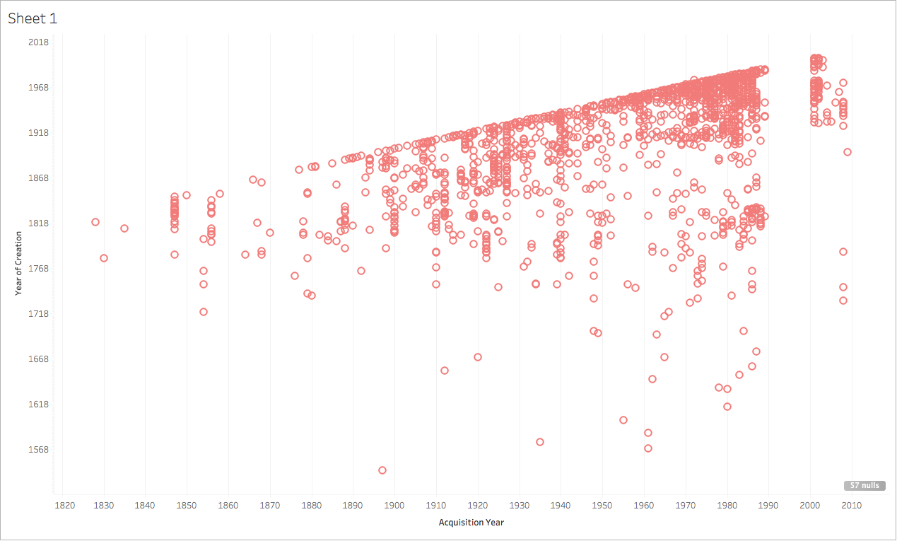
Sherratt also talks about the inherent power and dangers that come along with the ways in which institutions classify and organize their collections. While it is (I think) unarguably great that the MET provides open access to all of their digital images, they do still organize them in more traditional museum classifications. Date/Era, Geographic Location, and museum Department are just a few filters that can be applied within a search, but they all, especially the department, seem to me to connect strongly to a traditional Eurocentric way of organizing information. I would love to see an institution as large as the MET commit to novel ways of enabling searches and enhancing discoverability using alternative systems, vocabularies and the like. (I realize this would require vast amounts of time, research, labor and money.)

In terms of how these ideas can be incorporated in my own work I think about the ways in which artists archives, or archives more broadly, are organized. How can archives enable alternative methods to classify, organize and present their materials online in ways that encourage new types of contextualization, discovery and scholarship? I would love an online archive project where archivists and information professionals could work directly with the artists whose work they are digitizing, preserving, organizing and presenting to come up with personalized vocabularies and ways of classification. Who knows if this would result in the most usable or traditional digital art history project, but I think there is something important in the idea of presenting art and archival material in ways that feel appropriate to their creators.

Making the Digital Dynamic

As a dual degree student (library science/art history) I am most interested and excited by the intersection of archival work and art history. A question that this week’s readings and discussions have made me ask is can archives learn anything from digital art history? Are there ways in which arts archives can present their materials that is more dynamic? Can we move from the digitized to the digital, so to speak?

Digitization fundamentally changed the ways in which archives have functioned, made collections available, and better served researchers. As Cohen and Rosenzweig explain, libraries and archives were early adopters of digitization and online collections.  While such digital initiatives were/are not digital art history projects per say, they did have a significant impact on the way scholars conducted research, providing a newfound immediacy in terms of access to primary source documents.

Now, many artists archives have found their way to the web, facilitating non-linear arrangement and enabling users to search massive collections with ease. I’d like to use this post to highlight a few different online collections that function in more traditional, static ways, provide examples of alternative online archives that start to push organizational boundaries, and wrap up with a few ideas for online artists archives that could take more of a digital art history approach in the ways in which they enable and facilitate new kinds of scholarly possibilities. One classic example of an online archive would be that of the Smithsonian’s Archives of American Art. While expansive in scope, the online incarnation of the Archives is fairly straight forward. Collections of records are presented as they exist in the actual archive, accessible through various search and organizational functions, with Each record presented in isolation with the appropriate metadata. Many other arts-related archives look to SAAA as an example, and thus it makes sense that many online archives function in similar ways. I would classify most online archives, to return to Drucker, as digitized art history (versus digital art history).

When conducting research into the ways in which artist’s foundations/archives make their material available online, I came across the Barry Flanagan archive. While there are likely other online archives that have been set up this way, the Flanagan archive is the most dynamic I have seen. Despite being arranged hierarchically (which is, I must note, standard for archival arrangement) the Flanagan archive offers some unique discovery elements and record linking that makes it different from other online archives. Each digitized record, lets take for example the digital printed image entitled “Eve” from c. 1998, is linked to related material from the archive or from Flanagan’s artistic oeuvre. In this way, scholars can see what sketches, diaries, press materials or other writings are connected to the artist’s work. I appreciate this approach and the design of the archive’s interface as it works against each archival document being viewed in isolation. This feature also takes advantage of the web format in that it enables users to see documents paired or grouped in ways that would not occur in a physical archive. While still organized hierarchically, the Barry Flanagan Archive is a good starting point in terms of how online archives can be made more dynamic and innovative.

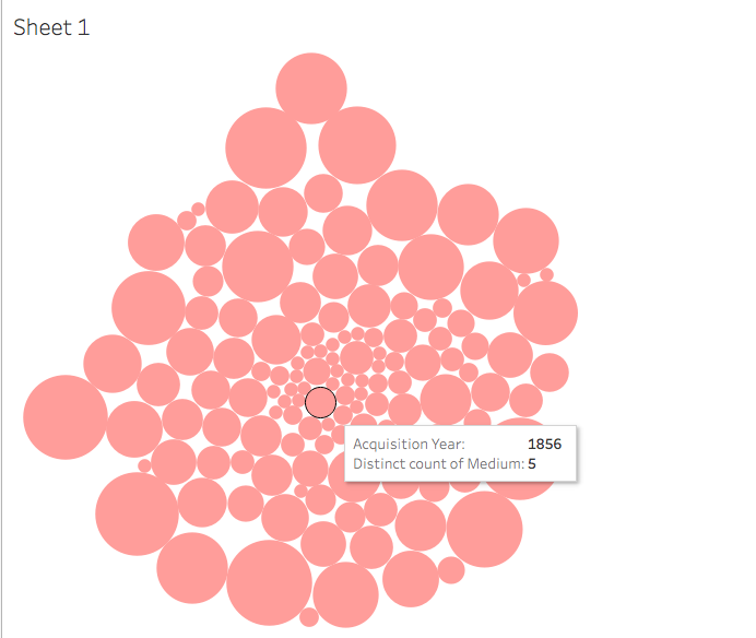
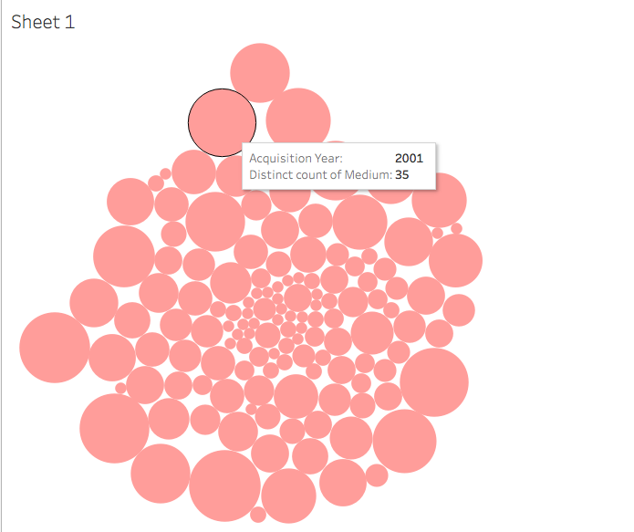
[Example of an image that could contain linked information within an online archive]

The organization of the Barry Flanagan Archive reminded me a bit of the Tropy application. Tropy is an open-source software that enables users to organize and describe both photographs and research materials. This week was my first time using Tropy and while I had a few complaints about how it functioned (mainly that each project has to be opened in a different window), I was pretty excited about the possibilities it could open up, especially for my own research with artists archives.  Once you have added images and PDFs of research materials or photographs to your Tropy project, you can fill in a fair amount of basic yet helpful metadata. You can add substantial notes to each photograph/pdf. Additionally, you can create various tags that can be applied to files or items. The item feature was one I found particularly promising – within an image you can make a selection of a portion of the image and Tropy turns the selection into an item. In essence, the potential for detailed record management combined with linking primary source documents is what I find most compelling about Tropy.

Tropy itself could act as a template for an online digital art history project, especially one using archival materials. Imagine if you encountered a scanned letter written by an artist in their archive. Within this letter was vital information about an understudied work of art, such as the fact that this painting grew out of an earlier body of work and was heavily influenced by a residency the artist had later in their career. All archival materials related to this residency and images of the earlier body of work could be directly linked to the portions of the letter that reference them. I envision another element of such a project where other archives that contain relevant information about an artists could be somehow linked into an interface which would make things easier for researchers, take advantage of already digitized collections and begin to create a network of digital archives. One project that has the potential for such interconnectivity is the Duchamp Research Portal.  This project, lead by the Philadelphia Museum of Art in partnership withMarcel Duchamp and the Musée National d’Art Moderne and Bibliothèque Kandinsky at Paris’s Centre Georges Pompidou, aims to create an aggregate of Duchamp related primary sources. While information about this project is limited as the project is still in the planning stages, collaboration between institutions seems to me to go hand in hand with more dynamic online archival resources. The idea of linked and embedded archival sources for art historical research is one that I find incredibly exciting and I hope that we start to see such digital art history projects enabling scholars to make previously hidden connections more visible.

Drucker’s Digital Art History

As Drucker writes, digital art history is not digitized art history; it must take scholarship to a new level and achieve outcomes not possible without digital tools.  Drucker recounts the methodologies that drastically impacted the way art history was ‘done’; phsychoanalysis, post-structuralism, Marxism, semiotics, feminist theory etc. in order to underline and demonstrate how digital methodologies would need to fundamentally impact the dicipline in order to be worth the time, money and labor required to begin and keep such projects alive.  Digital technologies and interventions would be considered worthwhile and successful if they could radically change the ways in which art historians look at, think about and write on their chosen objects of inquiry.

Drucker continues to address the fact that early digital projects focused around data-mining, metadata, and text-based objects due to the fact that analog text has a one-to-one relationship with that of the digital. The same is not so for the art object, she argues, but various technological processes not based on the visual can still lead to new questions and information regarding our art objects (see page 8 for more details).  It seems that digital tools and technologies might be better suited to tell us less about the art object itself but more about the worlds in which it was made, used, and traveled. We can draw deeper connections between cultures, time periods, geographic regions and the like to create a richer idea of the history of an art object.

Broadly speaking, I think Drucker’s argument is well framed. She takes into account  and discusses the possible impacts of digital art history upon the primary and secondary sources of the field, the conservation of those objects, and general scholarship that could arise out of the use of new technologies and approaches. One small qualm I have with Drucker’s writing is that it diminishes the importance of digitized art history. While digitized art objects may not fundamentally  change scholarship in the field, their existence does facilitate significantly more access to scholars and students alike.  Tangentially, on page 9 of her article, Drucker speaks of the scale of analysis promised through the digital one previously unimaginable in the analog, but does this kind of work not necessarily depend upon mass digitization efforts?

Six years have passed since Drucker wrote “Is there a “Digital” Art History?” and, as we know, six years in technological time is a long time indeed. One example of a digital art history project that came to mind upon reading this article was the pigment timeline.  This project plots the development of various pigments throughout the history of art, while also providing information about the chemical compounds of said pigments. Although I don’t view this project to be as advanced as the imagined van Eyck project in Drucker’s article, I think it is tangential and provides a new way to consider the use of color. That being said, many scholars have dedicated their careers to color usage in art works, and I don’t know enough to say whether this resource is truly taking advantage of all that the current technologies can make possible.

I am primarily interested in working with artists’ archives.  While not as fundamentally or necessarily visual as some other subfields of art history, I think that many of Drucker’s points and questions can be applied to the relationship between digital projects and art history’s primary source archival materials.  Since first encountering the DAH project the Van Gogh Letters, I’ve wondered how a similar model could be used for other archival materials to facilitate a more holistic understanding of an artists’s life, practice and legacy.  After working with the archive of am American photographer last summer, I have been imagining a similar DAH project that could connect written documents (such as letters, manuscripts) to works of art mentioned or created around the same time. It would be interesting to see if some kind of map could also be incorporated into this still-forming DAH project idea, as many artists are/can be nomadic over their careers.  As in Drucker’s van Eyck example, digital art history projects seem to lend themselves easily to visualizing networks in which artists and their works have been enmeshed. I think many arts-related archival collections could benefit from these networks being made more visible and accessible.

© 2024 Claiming a Place

Theme by Anders NorenUp ↑