Lisa Snyder (discusses the growing availability of Virtual Reality technology and its potential or use within the digital humanities. VR can refer to a wide range of technologies but generally allows users to explore 3D models of various spaces or objects. It seems that VR technology could be particularly useful in modeling architecture or 3-Dimensional historical sites.
I found Snyder’s exploration of the reconstruction model of Santiago de Compostela from UCLA particularly illuminating of the potential of VR technology. Santiago de Compostela is a Romanesque style cathedral finished in 1211. It has been a popular pilgrimage destination throughout history and houses many important relics.
The project was originally started to supplement an undergraduate course at UCLA on medieval pilgrimages. Funny enough, John Dagenais did not get the reaction he had anticipated or hoped for from his students when providing them the opportunity to explore this cathedral in a VR space. This unexpected outcome changed the direction and purpose of the project towards a study on process.
Many of the DH projects we have viewed or read about in this course seem to place a lot of emphasis on process. It seems important to many scholars to create a guide for future scholars in the DH.
John Dagenais worked among a team of technologists, scholars, and students. Although his students did not seem excited about the final project of the model, through the project Dagenais saw the importance of incorporating students into the reconstruction process. This project highlights another large theme from this course and DH at large: the need for collaboration. The reconstruction process was possible with help from both historians and architectural students that were able to create the actual models, as well as many other collaborators. The process of creation, which included making 3D models from textual references, images, and 2D drawings, brought up many questions and revealed many insights along the way. For example, “The process of constructing the virtual cathedral from excavation or theoretical reconstruction drawing brought to light a number of questions and issues regarding the accuracy of the archeological drawings” (Snyder 412). This led to multiple iterations of the model where researchers had to reconfigure the model to be more accurate despite inaccuracies in the resources they used as references. There are discussions of placing an installation revised model within the cathedral itself in order to reach audiences beyond the university setting.
The reaction (or lack thereof) from Dagenais’ students is worth contemplation. Are general audiences excited about VR experiences of architecture or other 3D spaces they would otherwise not be able to experience? It seems as if there are many relevant benefits of 3D modeling in scholarship – the process of modeling brings up research questions and the final product allows scholars to deeply analyze 3D spaces they are not geographically near. The benefits and potential for DH VR projects on the general public are more ambiguous and potentially varied.
The use of VR within museum exhibits is becoming increasingly popular. I wonder about public perceptions of VR technology within museums – do people like it? Is it enhancing viewing experiences? I think that digital technology has a lot of potential for enhancing museum experiences but also has a lot of potential to be implemented without intention and benefit. I will be curious to see how VR develops as a museum tool and the public reception of this tool within museum spaces.
Mapping Gothic France | Columbia University
This modeling project shows a map of France (and also England) with markers of locations of gothic cathedrals throughout the regions. The map is interactive, meaning users can click on the icon (+) and see the name and a photo of the cathedral. This project is very successful – it works well, is easy to navigate both visibly and physically, and is backed by a large amount of scholarship and visual resources.
For many of the cathedrals, users are able to do a VR tour of the space suggesting a large amount of time and money that went into extensive 3D modeling for this project. This project is a great example of a successful project in DH both for scholarship and general audience, especially with access to a wealth of resources.
“Networks, Maps, and Time: Visualizing Historical Networks Using Palladio” by Melanie Conroy discusses the use of Palladio, a data tool that allows you to filter, produce diagrams, and display data spatially.
The article highlights how data visualization can be tricky within humanities scholarship because it requires knowledge of both visualization principles and mathematics. This can be achieved through collaboration with scholars who have these specific skill sets but finding affordable and available data science collaborators can be challenging.
Palladio was developed by historians making it an interesting tool to analyze within the realm of digital humanities. I am interested in the future of data management and visualization tools specifically created for humanities scholarship. I posit that digital humanities scholarship will become easier for humanists without a background in data science and visualization as more tools such as Palladio are created. I also believe that it is increasingly important for humanities scholars to learn digital skills, data science principles, and visualization techniques. I wonder what the future will look like – will there be more emphasis on learning digital skills within humanities academic programs? I can foresee three futures emerging within the realm of digital humanities scholarship. 1) The increased need for humanities scholars to train in digital skills.
2) Continued specialization and increased collaboration. 3) The creation of more tools by data science professionals that allow humanities scholars without comprehensive digital skills to work with data and make visualizations.
I believe that increased collaboration between humanities and data science fields would help bridge gaps that keep many disciplines unnecessarily separate from one another. While it seems like humanities scholars should be trained in digital skills, I still think there should be an element of collaboration between disciplines on academic projects.
———–
ORBIS: The Stanford Geospatial Network Model of the Roman World
This tool is extremely well designed and glitch-free. A problem with many DH projects is the breakdown of the digital interface overtime. This project seems as if there are people constantly working on maintenance and upkeep. I appreciate how the tool includes information about its creations and about how one should interact with the tool. It also includes an optional tutorial that helps you navigate the site.
The project is a way to understand transportation within the Roman World. With this tool, users are able to choose a starting and end point within the Roman World. The user is able to control the season, transportation method, and other aspects of the proposed journey. It is immediately clear this project is backed by a large amount of scholarship. The user is able to choose very specific options to alter the specifications of transportation. For example, one can choose which month or season, as well as which network modes (road, river, open sea, and coastal sea) can be included in the generated route. There are options to choose which attribute the generated route prioritizes: fastest, cheapest, or shortest.
The generated Route displays the route on the physical map and includes many specific details that further highlight the extensive scholarship backing this project. The generated journey tells you the length of the trip, cost, distance, and which sections would be completed on a donkey, wagon, or carriage.
This project seems well-suited for non-academic audiences – it is easy to use, even on your first visit to the site. The information is also presented in an extremely consumable and relatively accessible format. I imagine that older children would also be able to navigate this site. While not all DH tools need to be accessible and usable by the general public – this project gives a great example of one that incorporates highly academic scholarship into a highly usable interface. This project gives me a glimpse into the types of digital humanities projects that might be used for younger, or more general audiences.
“Mina Loy: Navigating the Avant-Garde” is a collaborative digital project created by researchers from Davidson College, Duquesne, and the University of Georgia. One of my main takeaways from their article published in “Visualizing Objects, Places, and Spaces: A Digital Project Handbook” is how large an undertaking a project like this can become. This project took 4.5 years and helped many different individuals from all three Universities.
I appreciated their discussion of how graduate students were intentionally incorporated into the project. I think this project could work as an example for other University-led digital humanities projects. The Mina Loy project gave graduate students freedom and responsibility. This approach demonstrates how digital humanities projects and their creation can be used as a teaching tool. The authors of this article acknowledged how faculty researchers can learn from graduate (and undergraduate) students due to their differing skill sets and new perspectives. This model of intentionally incorporating students seems well-suited for open ended projects that would benefit from creative and non-traditional ideas that students might bring. The authors of this article discuss the exploratory nature of the project, calling it “flexible” and “organic.” They mention its “flexible limits” which I believe makes it well-suited for a project that can incorporate student researchers. Incorporating both graduate and undergraduate students into the creation process, as well as respecting their contributions disrupts a traditional hierarchical modality of learning and teaching.
While celebrating new modes of teaching and learning through this project, the Mina Loy project is also extremely practical and honest in their approaches. They discuss the timeline constraints of students – they are often involved in a project for short amounts of time and their work might have to be confined to a single semester. To work around this specific time frame, they have students give editing rights to future student and faculty researchers. This way, the students’ work can be included and folded into the ongoing project at large.
I appreciate their Digital Project Handbook because it highlights how this project was a sort of “experiment in DH scholarship.” The researchers frame their project by discussing much more than the final project; they are equally as focused on the process of creation. They include many specific details and resources to help others take on similar projects. I like their transparency with timelines, hardships, and specific software tools they used throughout. For example, they include a link to a “DH Toolbox” that provides access to their custom “DH Scholarship Theme” on GitHub.
I wanted to provide a short review of “Perspectives on the Haram” a digital humanities project that incorporates a map. This is an example of one way we can visually represent spatial histories. A little more about the project:
“Perspectives on the Haram aims to showcase the Haram Mosque and Mecca throughout time by drawing upon the accounts of different travelers spanning one thousand years. By focusing on these accounts we hope to not only showcase the ways in which the Haram changed over time, but also the parts of Mecca that travelers found most worthy of recording.”
The project includes a large map, central to the user interface. At the bottom of the page there is an interactive timeline that lets you scroll throughout the years. As you scroll the map shifts positions to highlight the relevant areas. You can click on specific travelers and learn more about their accounts by clicking on their name along the timeline or on a menu bar on the right side of the screen.
While there are a few bugs on the website that make some of the text hard to read, overall this project is very successful! The inclusion of both a map and timeline into one project helps give users a comprehensive look at the Haram Mosque and Mecca throughout time. This projects highlights the strengths of DH projects, because the information presented would be a lot less compelling without the map and the timeline.
I wish the map component of the project was more interactive and contextualized for the user. The map seems to jump around haphazardly when clicking on various travelers. Also, since pretty much all of the accounts deal with the Mecca or Mosque site, the map ends up taking you to pretty much the same spot each time you click on a different person. I think this project would benefit from a more detailed and zoomed in map that highlighted different locations on a smaller geographic scale. There are many icons on the map that are not labeled or discussed in the project which is a bit confusing. I would love it if there was a legend for the map explaining these symbols.
The difference between Lev Manovich’s “Data Science and Digital Art History” and Nathan Yau’s “Representing Data,” provides an interesting point for comparison.
Yau’s chapter gives widespread insights into the best practices for visualizing all types of data. Manovich explores concepts of data science that are specifically relevant to digital art history.
Both authors deal with data science, yet only Manovich’s is specifically tailored to art historical work. Manovich emphasizes that concepts used in data science, such as objects, features, data, feature space, and dimension reduction, are independently important and critical for most people, in most fields to understand: “Anybody who wants to understand how our society ‘thinks with data’ needs to understand these concepts” (Manovich 13). Yet, some of these concepts and ideas are more relevant or useful for digital humanities scholarship.
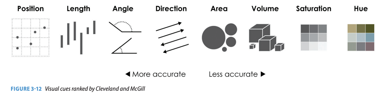
Yau includes an analysis of many types of visual cues: position, length, angle, direction, shapes, area, volume, color saturation, color hue. He references a study done at AT&T Bell Laboratories in 1985 where William Cleavland and Robert McGill how accurately people perceive visual cues from most to least accurate. The ranking order can be seen here:
I find it interesting that hue is the least accurately perceived visual cue. Yau warns against blindly following this ranking system and brings this ranking up to emphasize the need to understand how a specific visual cue or visualizing technique might be perceived by audiences. I think the perception of hue is an interesting concept to examine in the context of digital art history due to the extreme relevance of color, hue, and saturation in analyzing visual artworks.
The use of hue or saturation can be used as a tool for sorting large datasets of visual artworks. For example, the Software Studies Initiative and Gravity Lab jointly developed the “287 megapixel HIPerSpace super visualization system.” In this software one can explore a set of paintings using cultural analytics techniques by turning paintings into sets of data that can be graphed and turn those graphs into collections of paintings. The video (linked below) demonstrating this software uses the works of painter Mark Rothko. At 1:38 in the video, they take the group of Rothko’s paintings, which are organized from left to right by year created and displayed overlapping one another on this loose chronological timeline, and add a transparency layer to the visual display. This creates a blurring effect that just shows a general impression of hues across the screen. Through this software and these types of sorting we are able to see color trends over the course of Rothko’s career. This example demonstrates the importance and practicality of using hue as a visual cue for understanding sets of visual art historical data.
287 megapixel HIPerSpace supervisualization system, 2009-
The software is developed jointly by Gravity Lab and Software Studies Initiative http://lab.softwarestudies.com/p/cultural-analytics.html
I am also interested in exploring Manovich’s discussion of the crucial decisions in making representations.. The first decision involves creating a boundary, such as a time period, for the phenomenon being studied (other boundaries could be countries, artists, or groups of artworks). It is within this first decision that we are already feeding software or technology information defined by human terms. The idea that a certain art historical movement is defined on either end by two specific dates (or even decades) is a boundary created by historians. I would argue that we have come to accept some of these “boundaries” as truths within the art historical world despite their human construction. Movements such as the Renaissance, impressionism, or modernism have become widely accepted movements within history with (relatively) defined time periods in which they exist. Although we largely just accept these boundaries as facts, rather than a specific perspective in which to view history, there is still room for interpretation, critique, and alternating modes of understanding movements, time periods, and human created boundaries.
I argue that these human defined boundaries become additionally obscured and hidden once mediated through technologies. Although it can be difficult, it is possible to recognize how an art historian’s writing is clearly specific to their viewpoint, knowledge, and construction.
Once a human created boundary is inputted into a software, it attaches from human construction and becomes a truth on which the computer relies to put out new data, graphs, or information. I have concerns about the ability of technologies to obfuscate and conceal these human created boundaries within digital art historical scholarship.
Matthew Battles and Michael Maizels reveal that our empirical understanding of art history is a relatively recent phenomenon. They discuss the medium of photography as inseparable from this empirical transformation within the discipline. The invention of photography allowed art historians to compare objects with others and share these comparisons with readers. Since the invention of photography, there have been increasingly more technological advances that allow for increasingly in depth opportunities for comparison. Many of these tools and technologies allow art historians to work with large amounts of data and make previously impossible comparisons across objects. Battles and Maizels acknowledge that tensions arise due to “art history’s disciplinary encounter with ‘big data.’”
The article discusses Lightbox, a digital humanities project associated with Harvard’s metLAB, is an interactive element within the Harvard Art Museum’s galleries. This model is similar to the Cleveland Museum of Art’s “Art lens wall” (as discussed in this post).
The project offers an interface through which museum visitors can use the screen array to navigate and interactively manipulate, on-screen, metadata associated with the collection on display in the galleries. Lightbox seeks to enact a critical turning-around, an interrogation not so much of artworks themselves but the digital means by which we so frequently know them.
Digital interfaces such as this one raise many questions and concerns for art history and the art object. As Walter Benjamin has famously questioned, we must reexamine the purpose of art within the age of mechanical reproduction. Now that we can view a photo of the Mona Lisa from anywhere in the world, why should (or do) so many people still make the pilgrimage to the Louvre over and over? Do physical art objects become obsolete in the digital age?
I am curious about the positive potential for projects such as the Lightbox. I am interested in the ways these technologies could be utilized within public space outside of the gallery. Imagine you are walking through Central Park in Manhattan and you come across a large free standing screen with many images displayed. You notice someone touching the screen, zooming in on a particular image and zooming out again. This screen is a version of the “lightbox” or “art lens wall” for the objects within the Metropolitan Museum of Art’s collection. In this scenario, you are able to explore the collection without ever entering the museum’s doors.
Some might argue that this would discourage visitors from actually going to view the physical objects and supporting the museum. I argue that encouraging public pedestrians, who might not otherwise be interested in art institutions, to interact with these art objects would increase the amount of (and type of) people who visit the museum. Although my curiosity around this idea stems from a want for increased education and access to art, it can also be viewed as an advertisement for museums.
I believe another positive outcome of tools that help art historians deal with big data and compare objects is the potential for more comprehensively and critically examining preexisting museum collections. With tools that can quickly sort through large sets of objects and categorize them by geography, artist, time period etc., museums might be able to more easily view the gaps in their collections. If a museum is able to see a bar graph of objects categorized by continent of origin, they might see that they have an abundance of European and South American art but much less Asian art. They might also be able to see that they have art from every European country except for Greece. These are just examples, but they demonstrate the ways in which technologies can help museums quickly make assessments about their collection as a whole.
Applying the innovations of the digital age has been the primary focus of the digital humanities, which can be divided into four broad categories: text analysis, spatial analysis, network analysis, and image analysis. Our project combines spatial analysis, specifically historical mapping, and network analysis, which examines relationships between entities. In using these tools, we aim not only to harness the capacities of the digital environment for innovative research, but also to expand the framework of our discipline.”
One of the largest strengths of this map (and most maps within digital humanities projects) is how intuitive it is for viewers, even on their first interaction with the tool. As smartphone apps such as Google and Apple maps have become an everyday tool, the majority of digitally literate people seem to be well-versed in navigating digital mapping tools. For this reason, interactive digital maps are a great way to immediately invite a viewer into an art historical or humanities project of which they might not have previous background knowledge. The digital map acts as a visual and knowledge-based mediator between the general public and humanities scholarship.
Their project explores the possibilities of interactive mapping tools and map visualizations within digital humanities projects. Their map allows viewers to see the development of London’s art market through time. Users can manually adjust the timeline (with data available from 1851 to 1915) and see colored dots appear on the map as galleries, museums, artists, or retail locations were opened in London (each type of establishment represented by a different color).
Fig. 2, Timeline with Gallery and Exhibition Societies layers turned on. Pamela Fletcher and David Israel, London Gallery Project, 2007, revised 2012, http://learn.bowdoin.edu/fletcher/london-gallery/
The mapping tool not only eases viewer usability, but enhances academic research and the possibilities of synthesizing large amounts of historical information into meaningful truths.
“By offering a larger view than hitherto possible, our approach allows us to understand the London art market in new ways—as a set of pluralistic and elastic possibilities—rather than rigidly codified by institutional bodies such as the Royal Academy. These possibilities both opened up the market—meaning there were multiple pathways for artistic success as measured in commercial terms—and also exerted pressure on artists seeking to steer a course through this dense and rapidly changing landscape.”
Making maps not only acts as a public-to-scholarship mediator helping the public interact with scholarship in new ways, it offers a new way of looking for art and humanities scholars. As opposed to the most commonly used case-study approach, this project demonstrates the power in using larger datasets, along with digital tools to help comb through and make meaning of these datasets, within digital humanities projects. This project further highlights the need for interdisciplinary research, as data analysts, GIS specialists, and humanities scholars all play a role in creating a successful project such as this one.
Mapping Tools
Interacting with online mapping tools has become an every-day practice. Now, creating these maps has become extremely accessible to the general public as well. With the use of free online tools such as Google Maps, ArcGIS Online Story Maps, and Story Maps JS, most people can make an interactive map to enhance a scholarly project (or for any other personal purpose!).
The digital humanities have potential for democratizing previously exclusive information, as well as presenting previously held knowledge in new ways. As tools for digital data visualization such as commonly used mapping tools like Google Maps become more widespread, the democratization of humanities research becomes even more possible.
In Linda Shopes’ Making Sense of Oral History, she discusses oral history in the digital age – definitions, best practices, and questions we should be asking about oral history.
Shopes’ working definition of Oral History:
“…a self-conscious, disciplined conversation between two people about some aspect of the past considered by them to be of historical significance and intentionally recorded for the record.”
She discusses bias within the field, using examples to illuminate how bias can present itself in varied ways. She gives us two products from different interviews with the same person, side by side for comparison. Both interviewers spoke with Susan Hamilton or Hamlin, a formerly enslaved person in South Carolina. One interview was conducted by a white interviewer and one by an African-American interviewer. In the side-by-side write-ups we can see the evidence, or lack of evidence, of the interviewers’ identity within the narrative they write. The white interview begins their summary by saying “On July 6th, I interviewed Susan Hamlin.” Immediately the white interviewer centers themself within the narrative. Throughout the summary they refer to their role within the interview and the questions they asked. The African-American interviewer’s summary does not include any written evidence of their presence or questions. Their transcription of Susan Hamlin’s answers are clearly written in the dialect in which she spoke, making us aware of the editing of the speech that happened in the white interviewers’ summary.
What I find interesting here is the ambiguity about how much an interviewer should be centered in the final product of an oral history interview. I believe the centering of themself and the editing done in the summary by the white interviewer highly biases and alters the information given by Susan Hamlin. We are getting a filtered view of Susan Hamlin’s speech and life through the lens of the white interviewer. It is important to recognize that the summary by the African-American interviewer also filter’s Susan Hamlin’s answers yet this evidence of bias or perspective is less evident to the reader. I would be more inclined to read the African-American interviewer’s summary as more historically “accurate” due to less editing of Susan Hamlin’s dialect. But, I think it is deceptive how the interviewer is not at all visible in the narrative, giving a false impression of an impartial account of Susan Hamlin’s life. I am unsure about the appropriate amount of visibility for an interviewer within an interview product. Shopes helps us think about this question in her piece.
Shopes helps showcase art historical methods within the digital age besides the static image. She also puts forth the importance to look critically at these altered mediums, such as oral histories, as we would other historical disciplines.
The Software Studies Initiative shares Cultural Analytics – Mark Rothko Paintings – on the 287-Megapixel HIPerSpace Wall at Calit2 (developed jointly by Software Studies Initiative and Gravity Lab).
Cultural Analytics – Mark Rothko Paintings – on the 287-Megapixel HIPerSpace Wall at Calit2
This tool can take data from visual images and sort them by varying characteristics. This example demonstrates the tool by uploading all Mark Rothko images. Viewers are then able to sort through the images using varying metrics. For example, one could look at color chronologically throughout Rothko’s career. This allows someone to sort through a large amount of data from a large set of visual images that would otherwise not be possible. Additionally, this can all be done in a digital format. With this tool, art historians are able to quickly recognize patterns and breaks from the patterns within a set of visual images.
This tool helps me imagine a world in which technology enhances physical museum experiences. Imagine that you walk into a museum of which you know little about. As you walk in, you are greeted with a large touch screen that hosts high quality images of all of the objects housed within the museum, on and off display. On this touch screen, you are able to sort through the objects by time period, color, artist, geographic region – exploring objects both in the galleries or in storage. You are then able to pick out specific objects you would like to see in the galleries and are presented with a map of the museum aiding you in finding these objects during your visit.
The Cleveland Museum of Art houses the Art Lens wall.
“The ArtLens Wall, a 40-foot interactive, multi-touch, MicroTile wall, displays in real time all works of art from the permanent collection currently on view in the galleries—between 4,200 and 4,500 artworks at any given time. In addition, the ArtLens Wall displays thematic groupings that may include highlighted artworks currently on loan as well as select light-sensitive artworks that are in storage.”
The Software Studies Initiative and Art Lens Wall help us imagine a world in which art history exists beyond the static image – it exists within oral histories both written and available for listening online, within the partnership of technology and physical art spaces to enhance art and culture experiences. These examples show how technology can be an asset to art spaces and the power of thinking of art history beyond one static image in a book or on a projector.
In reading through many different sources sharing best practices digital collections, I was struck by the specificity of standards across multiple different sources. The VRA core lists out specific syntax to use when building digital collections. These readings emphasized the importance of high-quality, detailed, and consistent metadata. I had not previously considered the importance of tagging collection items consistently across multiple platforms, as even slight augmentations in the metadata of a digital object can completely transform its accessibility within the digital space.
Paige Morgan, in “How To Get Your Digital Humanities Project Off the Ground” (2014), emphasized the importance of understanding copyright laws and regulations before starting your project. The significance of having knowledge about copyright law, and being able to follow these guidelines in your work, is another aspect of digital humanities work I had not previously considered. I was highly interested in the concept of fair use exemptions, especially what is considered fair use, what is not, and where this line can become ambiguous. Teaching and productive use (changing the work for a new utility) is generally within fair use. I suppose most digital collections would fall under this category as many digital exhibitions are created for educational purposes. I imagine uncertainty arises when objects and images are re-used for teaching and entertainment or profits simultaneously.
Scalar is one platform for digital scholarship and exhibitions. It has a book-like format that allows authors to publish long-form writing and include multi-media elements.
Scalar seems to be highly flexible and adaptable to your specific project. There are options to display content linearly through the book-like, ordered format, or nonlinearly through their tagging system. The advanced flexibility of its grouping and sequence technology seems to distinguish it from other platforms. “Paths can contain other paths, and tags can reference other tags, making both hierarchical and rhizomatic structures possible.”
Scalar also has an open API where you can combine Scalar with other data sources. Using its built-in API you can create your own visualizations or custom interfaces. Additionally, there are many opportunties for aesthetic customization throughout your digital project.
Scalar seems less image-centric than other platforms such as Omeka. If you are wanting to make a digital exhibition centered around images, Scalar is not as useful. Although the tagging aspect of the software does allow for some non-linear explorations of Scalar sites, I think the book-like format can be restrictive. The book-like format does not encourage 3-dimensional interaction with the digitized space. I wish there were multiple ways to engage with the content besides clicking through linearly or through tags.


Digital interfaces such as this one raise many questions and concerns for art history and the art object. As Walter Benjamin has famously questioned, we must reexamine the purpose of art within the age of mechanical reproduction. Now that we can view a photo of the Mona Lisa from anywhere in the world, why should (or do) so many people still make the pilgrimage to the Louvre over and over? Do physical art objects become obsolete in the digital age?
I am curious about the positive potential for projects such as the Lightbox. I am interested in the ways these technologies could be utilized within public space outside of the gallery. Imagine you are walking through Central Park in Manhattan and you come across a large free standing screen with many images displayed. You notice someone touching the screen, zooming in on a particular image and zooming out again. This screen is a version of the “lightbox” or “art lens wall” for the objects within the Metropolitan Museum of Art’s collection. In this scenario, you are able to explore the collection without ever entering the museum’s doors.
Some might argue that this would discourage visitors from actually going to view the physical objects and supporting the museum. I argue that encouraging public pedestrians, who might not otherwise be interested in art institutions, to interact with these art objects would increase the amount of (and type of) people who visit the museum. Although my curiosity around this idea stems from a want for increased education and access to art, it can also be viewed as an advertisement for museums.
I believe another positive outcome of tools that help art historians deal with big data and compare objects is the potential for more comprehensively and critically examining preexisting museum collections. With tools that can quickly sort through large sets of objects and categorize them by geography, artist, time period etc., museums might be able to more easily view the gaps in their collections. If a museum is able to see a bar graph of objects categorized by continent of origin, they might see that they have an abundance of European and South American art but much less Asian art. They might also be able to see that they have art from every European country except for Greece. These are just examples, but they demonstrate the ways in which technologies can help museums quickly make assessments about their collection as a whole.


