Women Architects and World Fairs

Category: Digital Art History

On digital surrogacy of magazines.

People vol. 36, no. 7.

During my lifetime, magazines went from a waiting room stable, an airplane must-have, and a beloved piece of mail in my mailbox to nearly entirely obsolete. Culturally, not much is different. People are still interested in reading the news, tabloids or other specialized publications. What has changed is the habit of how they get this information. The format in which they read has evolved to the digital. Why would someone pay for a magazine when they could read the exact same article on the internet for free? Undeniably, users prefer convenience above all else when engaging with media. This trend exists outside of magazines. Video streaming replaced DVD, music streaming replaced CD, and even online shopping has replaced the need to shop in person. The user is given convenience of time, of access, of space, of cost, and of selection. “You can just do it online” has become a defining statement of our current era of user experience. Yet, are these experiences the same? The product may be the same – for magazines, this means getting the same information – but digital surrogates do not fully emulate the embodied experience of physical engagement. Furthermore, when something is unavailable digitally, suddenly the convenience evaporates. Emma Stanford evaluates the user experience with digital surrogates in her chapter “A Field Guide to Digital Surrogates.” Where digitization is a great way to enable multi-platform conveniences, it also necessitates altering the source material. Digital surrogacy is a fundamentally different user experience, and magazines are a model of these differences.

“The hallmark of a bad digital surrogate is that its badness cannot be gauged, because important contextual details are missing. Put another way, there are no bad digital surrogates—only misleading and poorly described ones.”
A Field Guide to Digital Surrogates p210. Emma Stanford.

Emma Stanford argues that digital surrogates are neither perfect substitutes nor are they threats to originals. To tie back to my own previous blog post, digital surrogates do not replace the experience of engaging with works in person. They are not inherently bad nor inherently good. Digitized works exist in their own category as approximations. Their value is in their ability to reproduce and disseminate works, but in turn, they freeze a work into one specific viewing model. This is where digital archivists have to be the most mindful. They want to be sure that they are using best practices and good equipment when digitizing works. Digital archivists have to use very specialized equipment and the work can be quite time consuming. This step is critical and is the invisible labor behind all digital surrogates. What is chosen for digitization depends heavily on the resources and interest of the archivists. That which is given the most attention is most likely to be digitized (and digitized well). There are all kinds of works that are not digitized, and to illustrate the difference between the physical and the digital, I want to make an example out of a personal collection of mine.

I am deeply interested in keeping up with celebrity news. One of my favorite sources for this information is the magazine People. Physical issues have been available since 1974, and now the magazine can be accessed through their website and on social media platforms. Articles and issues published after about 2008 are fairly easy to access through their in-site navigation. The website even offers some web-exclusive articles such as the People StyleWatch section. The online platform also allows for functionality that would otherwise be unavailable in the print format. To name a few, users can click links to products and go directly to its shopping page, they can leave comments on articles, and they can search through tags to read more on news that interests them. All of these conveniences have made it so the digital format has surpassed the physical in popularity. Yet, on the other side, the physical issue has noticeable differences.

Below are two photo scans from the cover article of People vol. 36, no. 7, Patrick Swayze’s Sexiest Man Alive issue from August 26 1991 (rotated for readability). These are digitizations I made using my personal physical copy of the issue.

Digitized spread from Park, Jeannie. “Body and Soul.” People, August 26, 1991.


And below is a screenshot of the digital surrogate of the same article.

Capture from Wayback Machine archive of “Body and Soul.” https://web.archive.org/web/20241115043810/https://people.com/archive/cover-story-body-and-soul-vol-36-no-7/.

The differences should be immediately apparent. In the printed article, the text is formatted around the photos, there are bold letters and block quotes, and the issue was printed in a rotated vertical format. The emphasis in the web version is on the content of the text, and even still, it does not include all of the text. This web digital surrogate – to use Stanford’s reasoning – is bad. It lacks a great deal of contextual information that the print version had. Yet, this is the only version available online as there are – in my search – no photo scans of the issue online. Complicatedly, I was only able to find the digital article on the Wayback Machine – itself a digital surrogate of the internet and not an exact approximation of viewing the article at the time it was published online. It seems the article has been archived from the site and is inaccessible using the site’s navigation bar. Stanford points out that even when works are made digitally accessible, they may not stay accessible forever thereby making the digitization efforts disappear.

So, with all these problems, what is the point of digitization of older magazines at all?

“…while digital surrogates may not be perfect, they are better than nothing, and the need for them is urgent.”
A Field Guide to Digital Surrogates p208. Emma Stanford.

In my perspective, reading this specific issue in person was the only complete option. Even my digitization is itself a digital surrogate, and I used it in this post to serve as a stand in for the actual object. By rotating the pages, I modified the images in a way that alters your viewing experience. The magazine is also more than just the one article. I found the other articles, the vintage advertisements, and the tactile experiences all shaped how I engaged with this piece of media. I love collecting physical media, but of course this is not always an option for everyone. And while the demand for this issue might not be high, I think it would be a good idea for me to photo scan the rest of the pages and upload them. Now, if only I could figure out if that is legal under copyright… that is a thought for another day.

Paul B. Jaskot’s “Digital Art History as the Social History of Art” and the potential for digital storytelling through games

Paul B. Jaskot’s “Digital Art History as the Social History of Art: Towards the Disciplinary Relevance of Digital Methods” questions not only what research questions are best suited for examination using computational tools but what art history itself is. By placing digital art history in the heritage of social art history, Jaskot presents digital art history as capable of changing the art history field like the interventions of feminist and Marxist critiques that came before it. Digital art history is capable of this change by allowing the examination of understudied and noncanonical areas of the field.

The situating of digital art history within social history is not surprising given Jaskot’s background. Jaskot serves as the Co-Director of the Digital Art History & Visual Culture Research Lab at Duke University. His research centers on architecture and Nazi Germany. His projects primarily use GIS to question assumptions about construction and modernism in the era.

One of the more surprising aspects of Jaskot’s article for me was his expansive definition of social art history. Jaskot acknowledges the historical importance of Marxism and feminism and other -isms in reinvigorating art history towards previously unexamined artworks and ideas, but ultimately presents social art history as any approach that treats art and society as deeply interconnected. That relationship is the backbone and focus of social art history. As someone who does not generally consider themselves a social art historian since I rarely use specific identity or political lens, this definition made me reconsider my assessment of my work. My research and projects are often specifically focused on the relational aspect of art and society, mainly understudied areas of video game culture. Even outside that niche, I have an investigative bend in research (likely from growing up watching so much Law & Order as a kid that I played assistant district attorney the way other kids played house). Investigation is about what lives in the cracks of assumptions and following threads of connection to find new truths.

Jaskot also breaks down four of the most common methods used in digital art history: digital storytelling, text analysis, network analysis, and spatial analysis. Jaskot calls out network and spatial analysis as the most used and most fitted to art historical research (as of 2019 when the article was written). This assessment is because Jaskot focuses on large scale projects as the most fertile ground for any type of digital art history. Jaskot is correct that some illuminating projects have used digital art history tools to see areas that would be very difficult to examine without the distance viewing digital art history methods can provide. Network analysis and geographic mapping certainly can work well to preserve large scale complexity alongside a point of view and thesis.

I would be interested to know how Jaskot feels about more recent digital art history projects that use the same tools to look closer than traditional close looking. These projects present a microscopic version of close looking when compared to the space telescope version of distance viewing Jaskot focuses on in the article. One that came to my mind immediately is the presentation of historical research in video games like Pentiment.

Spoiler note: Pentiment – Examples come from interactions that can happen in the first hour or so of the game. I do not touch on the central plot.

Pentiment by Obsidian Entertainment released in 2022, but it’s status in academic research has only continued to grow in the years between then and now (2026). A point-and-click mystery set in Upper Bavaria in the 16th century, Pentiment is extraordinarily well researched. While series like Assassin’s Creed use extensive research in their creation, they often present this research primarily as world building or in objective sounding codex entries that the player can access in the menu. Pentiment embeds the research across the game at all levels. When picking where the player character, a journeyman manuscript illuminator named Andreas, previously studied, you are given the options of Italy, Basel, or Flanders. Each option provides unique dialogue and skills grounded in the history of those places, but also shows how people of different social classes in a small Alpine village conceptualized those places through specific interactions with Andreas.

The art style of Pentiment is also vital to how the game shares insights into perceptions of status, education, and technological progress. Different characters “speak” (via text bubble) in different lettering styles based on Andreas perception of them. The town printer’s speech appears in upside down blocks before reversing into readable script all at once with a clunk. Monks in the scriptorium speak in a flourished ink style that fills in religiously significant words like “Christ” in red after the rest of the text is written. This was a practice I had no idea existed until I search online to see why the script behaved that way.

Pentiment takes this digital narrative presentation beyond research and into a ludic thesis. There are two notable moments early in the game that showed how a ludic thesis could work that stood out to me.

The first moment is when Andreas discovers that a local shepherd is much more well-read then he thought. The shepherd’s speech rewrites itself from a messy illiterate script used for all the peasants to the clear measured text of the academics and educated. The lettering change subtly communicates how status and education worked in the background of all interactions at the time. The second moment is when retrieving books for the Sister who runs the abbey library. As she discusses the books with Andreas, they enter into the books themselves. Here, she has the freedom to explain the lack of choice for women in their lives. She focuses on how this lack of choice is visible in the treatment of the female characters in the books. Women are presented as inherently wicked or only present to suffer for a male character’s benefit regardless of the books being bawdy popular tales, classical texts, or religious allegory.

As the player experiences these moments as Andreas, there is a clear imperative to move beyond enjoyment of the historical setting to reflection on the perspectives about status, equality, progress, and justice that are raised. Despite not explicitly presenting as digital art history, this expansion of purpose makes Pentiment digital social art history. By using digital storytelling, the creators of Pentiment relinquish some control and clarity of their arguments in favor of allowing the player a much closer look than would be possible normally. The player is able to actually control an artist in the time period and choose how to confront the issues raised in game. Despite how the player decides to play Andreas, the reactions of the other characters and the art choices show the clear point of view and arguments being made. It will be interesting to see how new games approach digital storytelling as more works inspired by Pentiment are released. I also wonder if the game studies practice of presenting research in both traditional modes of scholarship and non-tradition modes like game design will expand to other fields).

Can you become an art history expert without ever setting foot into a physical museum?

Photograph of Les Demoiselles d’Avignon – Pablo Picasso 1907 – in the Blanchette Hooker Rockefeller Gallery at the MoMA. Photo taken by Katarina Baltisberger, 2026.

Does digital art history substitute the need for art tourism?

I recently took a trip to the Museum of Modern Art in New York City, a museum that is six floors of some of the best-known artworks in the canon of Western Modern art. Virtually every gallery had a work of art that I had either studied extensively or a work by an artist I have studied extensively. One of the highlights of the collection is Pablo Picasso’s Les Demoiselles d’Avignon, a large-scale painting that revolutionized depictions of the human form through a distinct and developing Modern subject. The painting has established a reputation as emblematic of several converging art movements that emerged from the early 20th century that solidified Les Demoiselles as one of Picasso’s most analyzed works of art. It is an essential work of art to study in university level art history courses; I personally have studied the work in multiple classes. So, when I finally saw Les Demoiselles in person for the first time, I found that I had very little left to engage with.

In The Digital Transformation of Art History, a chapter from the 2020 book Companion to Digital Humanities and Art History – Harald Klinke explores the notion of “distant viewing” (p.34). Alois Riegl coined the term in 1897/8 – originally Fernsicht – to distinguish how our modes of viewing are altered based on our physical proximity to a work of art. When up close to a painting, we can study and understand that the work is made of brushstrokes and, in turn, when far away from a painting, we can employ methodological study the broader work of art. This framework was developed assuming the viewer would be physically in front of a work of art, so, the question is, how do digital renderings of art change our modes of viewing?

The field of art history began in grand tours and flaneur style connoisseurship. Art pilgrimages remain the peak to any art historical research today (otherwise, why would we set departmental travel funds aside for students wanting to see researched works in person?). Yet, for me with Les Demoiselles, I felt that the MoMA had done sufficient work in producing digital renderings of the painting that I as a viewer and student had enough visual information to study the work of art through digital-born distant viewing. I can admit, I am not a Picasso scholar, but I am a Modernist, and in that moment, I felt surprised that I extracted very little from my close viewing experience with Les Demoiselles. So, does this mean that museums are obsolete? Do we even need to go see works of art in person at all if their digital stand-in counterparts do the job? I’d even ask one question further: hypothetically, could you become an art history expert without ever setting foot into a physical museum?

Klinke counters these questions by posing specific difficulties of relying on digital-only modes of viewing. As he sees it, our current systems of digital viewing do not serve as complete enough of platforms to support research questions (p.36). The data associated with works of art could be irrelevant, insufficient, and invalid. Their visualizations only tell part of the story behind the work and lack distinct interactivity. Why would a researcher have to travel to the MoMA to see Les Demoiselles d’Avignon when they could just go online and look up an image of it themselves? Digital art history aims to do what conventional art history cannot – it allows equal access. Yet, as a consequence of doing so, Klinke observes that art historical research is largely conducted alone. Klinke argues that digital art history should not replace conventional methods of art history and should serve as an extension of traditional approaches that enhances and deepens understanding.

Where spaces like museums, libraries, and classrooms may feel obsolete now that you can just look up the same information online, digital spaces do not allow the same level of collaborative communication. Distant viewing when done alone without contextual information is just looking. Collaboration through learning visual and digital literacy skills is the key to true art historical understanding. My viewing experience of seeing Les Demoiselles at the museum was not deeply stimulating, but this is because I have already done so much collaborative visual learning on the painting in the classroom. While I am still unsure if someone could become an expert in art history without ever setting foot into an art museum, I do feel strongly that someone cannot become an expert in art history by themselves. In creating this blog, here is my own kind of attempt at engaging in digital art history through a more social internet. I put my thoughts into the world with hopes that it creates collaborative and productive art historical discussion.

Mapping Project final thoughts and feedback

Wow! January just flew by in the whirl of new semester business. So of course my first post of 2015 is actually going to be a final report on the digital humanities class project from last semester.

Here is the link to the google map the course made: https://www.google.com/maps/d/edit?mid=zDX3AIg56Xx0.kx2jSWf18o-A

  1. There are many more blue pins than red only because I limited the number of built works by female architects for each group to 15 (and for comparison the textbook had anywhere from 7-24 built works per section pinned by an individual in the first layer). Wanted them to do slightly deeper research on the women architects rather than broader. Although students did say that it was in some cases challenging to find 15 built works where they could also find at least 1 image and any useful data about the built work (including, sometimes a challenge, where it was located if it had since been destroyed).
  2. Their work on the first part of the project ranged all over the place from A+ to C (I almost never get failing students because of UNC’s generous add/drop deadline) and this was still fairly obvious from looking at their work on the map, and much of a piece with their other grades in the course. Their work on the second part of the project ranged from A+ to B+, which was a good sign that they had improved since their first try run at it.
  3. I was surprised at how much I learned from their work on the second part of the project, which brought to light, among other things, that a woman received the first patent for an architectural design (in North Carolina, no less!) and highlighted the neglected work of the first licensed African-American female architect Norma Merrick Sklarek (whose firm wouldn’t ever tell clients that she was the principal designer for fear they would bolt from the project). The students really brought a higher level of engagement to this project than I am used to seeing in previous incarnations of the course.
  4. I also took all of their data from the second part of the project and used it to create a google fusion table (found here), to which I added a field for building type (school, museum, office building, etc.) and showed them various ways they could filter the data. One of the charts I had created was a network of building type by year, which revealed that a lot of early women architects built houses and many more current female architects build office buildings—this raised questions for the class and led to an interesting discussion of late 19th female architects finding more commissions for houses precisely because of sesxist stereotypes about the association of women with the domestic realm (they would just be better at houses, because this is where they spend all of their time and provide the most socially appropriate value as wives and mothers) but also how this distribution might reflect the students’ own assumptions and biases in doing their research and choosing which 15 among potentially many other choices to add to the map for a given date range.
  5. The good: Students were asked after the final presentations to give feedback on the project as a whole. Some found the project fun (r.e. the complaint in number 6 below, one student gave the rejoinder “I don’t care, I really liked it, it was fun”), others found it made the built works much more memorable and helped them better understand how to do formal analysis of architecture, others really liked the interactivity of the exercise (being able to add video and images to the pins as well as links, and to then go explore what their peers had created, and move around the map geographically), and others found it made them feel a sense of ownership over the materials they were pinning to the map. They were unanimously in favor of sharing their work outside the class and a couple of students wanted to know if the project would continue to grow after this. One student used his newly acquired mapping skills in an Islamic art class to map artistic commissions by one particular Andalusian caliph.
  6. The bad but fixable: One student complained about the length of time it took to actually make the pins on the map (6 or 7 hours) and so we talked as a group about how to improve that aspect of the project. Most students would have preferred to just put their data and links into a google drive shared spreadsheet and then let me “make” the map with that. Based on how google maps ingests data from a spreadsheet, from a test with some of the female architect data, this would in turn require adding geolocation fields (the map just couldn’t find an observatory in the far north of Finland from the name of the town it was in, as an example), and also perhaps still adding some images via the individual pin on the map (the map couldn’t convert some urls into images and just added them as links to the bottom of the pin description—seemed to do just fine with embedding video urls).
  7. The kinda bad: I paid for Google Maps pro to allow us to put so many pins on the map and in the last week of the course they announced it will now be free. But it was only $5 a month and I can easily get my department to reimburse me the teaching expense of $20 + tax.

Facilitating DAH projects for Art History Faculty

A rare Tuesday DAH post, since the last Thursday in November is a coma-inducing holiday.

In my Modern Architecture course, the Mapping Project Part 2 is still in progress. More on that at the end of December.

But I was not inactive on the DAH front in November. In fact I was much busier than usual, helping to facilitate the use of DH in several art history undergraduate courses. While many faculty meetings recently have included the questions “What is Digital Art History?” and “Should we be doing Digital Humanities?” and “Everyone else is doing this, so why aren’t we?”, regardless of whether DAH is a good fit with their research and teaching or not, some faculty are already integrating technology-based projects and upgraded pedagogical methods in their courses. It just seems like we are all doing it at once in the same semester. And, wearing my Visual Resources label, I am in the position of supporting and promoting these goals.

As part of the Digital Salon Series, a once-a-month brown bag lunchtime demonstration and workshop co-sponsored by the Art Department and the Sloane Art Library, I presented to my colleagues on how to annotate images and build presentations and class projects using Thinglink. Art Historians have at this point become very comfortable, some would say too comfortable, with Powerpoint as the presentation tool of choice in lieu of slides–not with the low-image quality of the projection technology compared to slides–but even so adept at creating a more varied image presentation style than just single slides compared side-by-side. And there are challenges to suggesting that Art Historians now move on from this technology in the classroom: 1) Converting from their slide lectures to Powerpoint files was initially time-consuming, and the time spent re-building slide lectures every year has been forgotten as a part of the teaching process where revision, improvement and expansion of the material could occur; 2) Powerpoint files are easy to save to a hard drive or a zip drive, and even for those who have used the software more dynamically with embedded music or video files and hyperlinks, still viewed as the most secure option when faced with a conference venue or a classroom that might not have perfectly working internet access, despite the reality that internet access is nearly universal and high-speed and redundantly backed up in most of these locations (we have over 30 wifi routers in the Art building at this point, 5 of which were added to back hallways and stairwells this fall just to boost the overall signal); and 3) Powerpoint files represent uni-directional pedagogy and are therefore fully within the control of the professor and representational of their chosen teaching viewpoint, an authority and mastery level that is difficult to relinquish to students. And Thinglink pretty much requires rethinking all of those ideas–not just would you have to rebuild presentations from scratch, and work directly within the web rather than from the safety of your zip drive, but sharing with students or on a website can lead to interactive responses and new mixes of the lecture content. We are already handing over so many of our technology needs to Google and its development team (and what exactly are they doing with our data and what do we do if they decide to stop developing our favorite tool), that the corporate structure behind Thinglink still makes one pause at the idea of making it a permanent replacement for a stable and successful software tool like Powerpoint. And the responses to the demonstration were uniformly positive (challenges addressed! level up!). Many faculty saw the value in using Thinglink for immediate in-class quiz and response or peer group activities where many different types of research could be demonstrated (attach a video! link to a survey! add to a blog!). The education technology specialist from the Ackland Museum saw a way to create online guides to individual works in the collection that could be easily integrated into the Ackland Museum website, produce exploratory annotating directly on the image instead of alongside it, and also allow for audience commenting and interactivity with the image of the work. And, bonus, my colleagues also found annotating directly onto images to be fun and expansive (or, in my case, down-the-rabbit-hole time sucking and, okay, maybe kickstarting my first idea for a Valentino-related essay for the website).

Also, the VRL became a classroom computer lab for a colleague’s Islamic Architecture undergraduate course. As part of the course, students are investigating architectural fragments in the Ackland Museum collections. For that investigation they were given two digital assignments, one using a Gigapan camera mount to make a large-scale panoramic photograph of the front of a fragment and the other using their phones and ipads and digital cameras and the software 123D Catch to make a rotatable 3D model of a fragment. The VRL became their classroom workspace for stitching together their many photographs into a single panorama and 3D model, which they would then utilize in a future class for a close observation exercise. The goal was to get the students to look at the object from a new perspective as well as to explore new technologies for object-based research. Overall, the lab sessions were successful and also somewhat surprising: students showed up for the lab session and just started using the installed software to stitch their images without even waiting for the professor or myself to give preliminary instructions, which meant we spent most of our “training” time on getting students to back themselves out of corners they had painted themselves into with the tools (especially when it came to choosing which photographs to use in the final image–the stitching software for both had a hard time with out-of-focus images and the students hadn’t looked at their individual photographs in advance to choose the best ones). And we saw a wide-range of success or not with the tools and projects, including students who couldn’t get their images off their zip drives or SD cards, students who couldn’t get their too large image files to load into the 123D Catch online library (5 MB max!), students who hadn’t really taken enough photographs (if you are making a 3D model, you need to remember to take pictures of the top of the object!), and a multitude of editing glitchiness (take out an intervening blurry photograph and you get Frankenstein-stitched stumps of objects). But we also saw a group of students who were enthusiastically engaged for the full class time, trying to find alternatives and solve problems as they went, and proud of the resulting images they created. The professor and I learned pros and cons of each process and software tool as well: Gigapan.com went out of business at the end of October and their stitching software could no longer be licensed but we could demonstrate how to stitch images in Photoshop as a secondary option; 123D Catch’s online editing tools were broken (a hopefully-soon-to-be-repaired plugin issue with browser updates), and images weren’t successfully uploading from Android phones, but the iPhone and iPad apps worked like a dream, instructed the students on where and how many images to shoot, and instantly created the best 3D models of the bunch; and older model cameras (without internal leveling mechanisms) produced the hardest to work with images, so we need to have newer cameras for students to use.

First Phase of the Mapping Project is Complete!

Well, this is a little late, but October is the crazy middle of any semester, with too much to do between grading two writing assignments and evaluating the first phase of student work on the mapping of modernist architects. And technology taketh away even as it giveth: an external hard drive with all of my teaching materials (7 years of syllabi, lectures, powerpoints, images, film files) died, kind of came back to life for a week to allow me to rescue material one file at a time, and then died again for good. In case you are immediately asking, what about the backup? I did have a backup, but it also failed (I got a message telling me “unspecified errors” were preventing me from accessing the backup, which was so. not. helpful.). But the data (literally) is in on the mapping project–what have I and the students learned?

1. Even with very specific written instructions (reiteration of what was also communicated in class during the technology day), students will ignore instructions and do their own thing. I had so much variety in the pins, labels, additional description/text/video materials from students. Some students just placed a pin on the map, without adding architect and date information, or images, article links and videos to supplement their pins as had been requested in the assignment. Some students, on the other hand, gave me an abundance of links, long descriptions, and some students even tried to take up the idiosyncratic challenge of finding a video to relate to each of their pins for a built work on the map. On the plus side, everyone did place pins for most of the built works in their assigned section of the textbook–no abstentions, and no students who missed pinning more than one or two built works (one student jumped over Switzerland in his textbook section and then showed me his used textbook with those pages missing–now, he could have torn them out himself, and he also could have looked at the actual page numbers to realize he was missing something, but it was an anomaly among his otherwise complete pins for the rest of his section). Using technology in pedagogy doesn’t substantially change the instructor’s ability to see clearly who is doing A+ work and who is doing C- work.

2. The students weren’t yet thinking of the project as a whole beyond the pins for their sections of the textbook. During the class discussion where we evaluated the whole map together, students did not seem to have any new insight into modern architecture when seeing it represented geographically in total. This was a disappointment for me because I thought that seeing the huge gaps in geographic representation (almost none of Africa south of the Mediterranean fringe, none of China–or Canada for that matter–with pins) would start discussion about possible textbook bias and/or the problematic first world origins of “modernism,” its definition and its global spread. My students don’t have a very good grasp of global history in general, and I am uncertain about how much of this I have to incorporate into an art history course just to give them the proper context in which to see modernism as a broader concept but also as a specific architectural and cultural agenda of the 20th century.

3. Based on a small sampling of individual student feedback (from students who actually talk to me outside of class), they liked doing the mapping itself. One student is using the new skill to create a map in an Islamic art class, where he will map Andalusian Caliphal architects, which his instructor is also enthusiastic about. This did make me realize that I need to ask for student feedback in general on the project as we go along, rather than wait for it to come out at the end of the semester in course evaluations.

Student teams of 3 have already started adding pins for the second phase of the mapping project, mapping built works by women architects. Using the Virginia Tech International Archive of Women in Architecture as a starting point for research, each team will be mapping at least 15 built works for a given date range and with the proviso to have at least 3 different women architects represented among those fifteen (especially didn’t want to see the last decade plus become the “Zaha Hadid” years, when there should be more female architects than ever to choose from). To increase the in-class assessment of the pinning exercise, each team will be giving a lightning presentation of their research results on this portion to their peers during the final exam period.

The Perils and Pitfalls of Group Online Work in Google Maps Beta

As promised, this Digital Art History Thursdays post is about the progress that has been made in my Modern Architecture course in using Google Map Engine Lite (now out of beta and officially My Maps) to create a group map. Phase one of the project will be finished in mid-October, but the following issues arose as we got started:

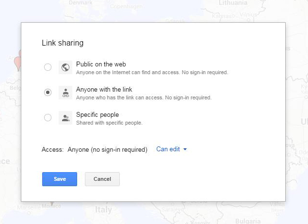
1. Google, in various ways, provides incorrect information about how to share maps in such a way that all users could edit the map. Below are the options that Google gives you for sharing maps.

Google Map Sharing

Since our map was for class purposes, and would likely have some bumps along the way, option 1 was discarded immediately. The class will vote at the end of the semester about whether to make the final map public or not. In theory, I could have used option 3 to share with all of the students in the course by entering their individual email addresses into a list and letting them access the map by signing into Google, but this too was discarded as an option because Google rejected their university email addresses out of hand (and one at a time also–I would delete an email from the list and Google would reject another, and so on) and because the task of collecting everyone’s gmail address (and because some students did not have gmail addresses, which I did not want to force them to create) would have made the sharing process too piecemeal and drawn out instead of giving everyone equal access from the first day. So I chose option 2 and emailed the map link to all of the students via the course Sakai page–they could bookmark the link and Google (supposedly) wouldn’t care what email address they had or even who they were when they accessed and edited the map. Easy, right?

But then a student tried to access the map, and this is where things were clearly not as advertised. Notice above that option 2 says “no sign-in required” and that the access level is “Can edit.” My student could view the map, and could even see a red Edit button in the top right corner of the map toolbar on the left side of the map. However, clicking the Edit button resulted in nothing. Searching for a place in the map search bar would drop a green pin on the location, but that green pin could not be grabbed and added to the map. The student could, in actuality, not edit the map. Nowhere in the Google support documentation does it indicate that sharing maps requires signing in to Google before one can edit a map, but that is the truth that several independent help forums had conclusively discovered. Every student, even the ones who had not previously had gmail or Google accounts, had to now sign in to Google to be able to edit the map.

So Google lied. But it was more like they lied out of ignorance about how their own tool was supposed to work than to deliberately obfuscate. In theory, maps work like docs on Google Drive. In practice, Google’s My Maps can be viewed by strangers (to Google) but only edited by friends (of Google). Something to consider when looking for a more open tool for classroom use.

2. We also discovered that, despite the promise of the ability to add data to a map by importing it from an Excel spreadsheet, Google only allows one spreadsheet import per layer of the map. Out of general assignment fairness, I couldn’t allow the first student out of the gate to have this ability and then deny it to everyone else. This required a bit more logistical thinking before coming up with a procedure that could be used by the whole class.

I could have had each student make a layer, and, since I have a Maps Pro account, we would have been able to have that many layers (times 2, because the students would be doing the same thing for the next phase of the project), but this would also have been difficult to read through on the maps toolbar and also open up a lot more room for importing and data entry error (data columns in different orders from layer to layer, less accurate place locations found, etc.).

Or I could have had every student send me their spreadsheet data a few days in advance of the phase one unveiling and then I could have synthesized their data into one sheet and uploaded it to the map. Since part of the goal of the project is to have the students get hands-on with the digital tool, this was an obvious nonstarter.

So, instead of adding data in sets, each student will be adding individual points to the map for their assigned “section” of the project. Already we have seen that the map search bar can find built works at their actual physically specific street address, so the pins will be very accurately placed on the map, without the students having to enter GIS coordinates. The students can still copy and paste prepared data from their spreadsheets (which is the part of the assignment that will be turned in for the actual grade). And they can more directly and easily add images and video directly from the pin editing function using Google search. Since most students will be adding 15-20 pins, taking the route of adding one item at a time is not excessively burdensome as a whole.

For the next blog post, a report on the results of phase one of the mapping project.


Practicing Digital Art History

I spent two weeks this summer participating in Rebuilding the Portfolio, an introductory digital humanities workshop for art historians sponsored by the Getty Foundation and held by the Roy Rosenzweig Center for History and New Media at George Mason University. After two intense weeks that one of my colleagues nicknamed “DH bootcamp,” I returned to work eager to implement some of the things I had learned. So here are some thoughts now that the fall semester has begun and I have time to evaluate where I am in terms of practicing digital art history.

Public Scholarship

Ha! I have been so busy getting my syllabus and sakai site together for my fall course in modern architecture, as well as performing departmental service in the form of updating art.unc.edu to reflect all of our upcoming fall activities, add new faculty members and staff to the website, and post news about everyone else’s busy summers, that I haven’t really found the time to figure out when and how and what public engagement will look like for me. So this is what I have done so far:

  1. I organized my Twitter feed using Tweetdeck, which has been very illuminating and helped me keep the flow of information in some more tidy categories, including #digitalhumanities and #doingdah2014 as well as inspirational tech and GLAM feeds. As a result, I have tweeted and retweeted to keep relevant dah news stories, gained followers, crossposted things that I have discovered from other dh and daher’s to the vrl facebook page (and picked up some more facebook followers too!), and in general feel like I am now a part of the digital humanities conversation on Twitter, where so much important news and information gets shared.
  2. As you can see from the date of the previous blog post compared to this one, I have not been quite so active on my new website. Okay, so for a week my website was suspended by ICANN because they couldn’t verify my email and it took a while to figure out that the extremely antihacking security-conscious spam settings on my university-based email account kept garbage-binning their confirmation requests and giving me no way to see or retrieve them to fix the problem. Asked for help on Twitter (again, yay!) and in an hour knew that changing my email address associated with the website was the answer. But I can’t say I have been proactive in fleshing out the website or making time in my schedule to write regular blog posts. My goal from today is to write something relevant to dah, art history, or my teaching every other Tuesday.
  3. Art History-related aside here: I am really struggling with what the “look and feel” or “brand” of my website should be. So many themes! So many visual styles! Add images, colors, boxes, and more! When I was in graduate school, I worked for an ad agency, managing accounts’ trade show events, which included working with the agency art director on messaging; currently I manage the art department website (also on WordPress), for which purpose I have read many texts on promotion, marketing, and how to engage with the public on the internet; and I spend an awful lot of time in my classes making the argument that the visual matters in our everyday lives. At the moment I feel paralyzed by something that should be so easy (and to all of the bloggers I follow, whether in the GLAM world or in theater or in crafting, congratulations on solving the basic problem of how to communicate your identity clearly on a website because that takes a lot of work!). For now, I will probably try on many identities, themes, etc. as I try to also figure out what being a publicly engaged digital art historian means for me.
  4. I don’t have a scholarly project to develop, discuss, share, or otherwise make public. The project I thought I wanted to do (censorship and film) is perhaps not what I need to do right now. And I have just become involved in a new GLAM-related project about which I cannot yet speak publicly as it hasn’t been officially announced. Right away, logistical constraints appeared which have nothing to do with my desire to engage publicly.

Pedagogy

On this front, I have been more immediately successful and exciting things are happening!

  1. I have changed the syllabus for the modern architecture course to incorporate a digital project this semester. Student evaluations have in the past revealed that, while students enjoy the course and actually seem to like the writing project, they hate exams that are based on rote-memorization and the spitting out of the appropriate vocabulary. And yet, since there is not a more introductory architecture course as a prerequisite to mine, I need for them to learn and retain basic facts about modern architects and their built works. So, to approach that goal digitally, the course will instead of exams be undertaking a two-part project which will a) map the architects and identified built works from the textbook, William J.R. Curtis’ Modern Architecture since 1900 and b) research and map modernist women architects’ built works on top of the first map, which we will then compare and discuss as a group in class. Win-win. The students get to engage with creating digitally rather than just consuming digitally, and in the process the basic facts of architects and built works will be better retained because of how the students had to engage with the source material. I will post updates on this course project as the semester goes along.
  2. I have consulted with a colleague in the department about supporting a digital project in her fall course where students will be trained to use a Gigapan camera mount to make and then stitch together Gigapixel images of a work or works in the Ackland Museum. This will be a collaboration between the Sloane Art Library (who own the Gigapan mount and necessary tripod), the VRL (where the Gigapan Stitch software will be learned and then used to make the final images) and the Ackland Museum (who will be providing the objects and the space in their digitization lab for the photographing of those objects). This will also result in a presentation on the project to the Art Department as well as in the new UNC Libraries Research Hub. Cross-campus connections are being forged.
  3. I have surprised my colleagues and myself by producing and submitting a fully-fleshed out syllabus for a digital art history graduate-level course in the department, to be taught in the fall of 2015 if approved. This became an urgent necessity after the departure of a colleague in the School of Information and Library Science for the University of Maryland and the disappearance of his digital humanities course with him–this course had been much-utilized by our dual degree Art History MA/Library Science MLS program and had even been approved to cross-count for said degree so that the students would have at least 3 options to fill the 2 cross-counting requirements. I was already going to urge the creation of a digital art history course after seeing how effectively digital humanities had been integrated into the undergraduate and graduate curriculum at GMU, and also to convert my former practice of one-on-one digital training with highly-motivated graduate students in the VRL into something more formal and consistent and available to many more of the students. Thanks to the openness of my departmental colleagues who shared their methods syllabi, and to the dh community for sharing so many syllabi online, I was able to create a draft syllabus for “alt-Methods: Digital Art History” in a little over two weeks. And of course I will share in turn once the course has been approved. This is one reason why the censorship and film project has been paused, since I did not make any more progress on the syllabus proposal for the course that would be connected to that project.

Miscellaneous

The VRL will be undergoing a (slow) makeover this year, as slide cabinets and slides move into storage, a big projection screen gets installed on one wall, and space is opened up for our current assortment of computers and equipment to be utilized for more training and digital project support. And, something I have little to do with but am excited about and hope to participate in, a Maker space is coming to the basement of the Hanes Art Center to add to the digital project possibilities for studio art, art history and other interested campus users.

I apologize for the lengthy, wordy, and very non-visual post–catching up after so many weeks of not managing to blog. And there will be visuals next time!