Unlike most disciplines, especially in the humanities, art historians have one aspect that unites them all: the image. There might be fights over methodologies, historiographies, interpretations, and countless other things, but underneath it all is the privileging of images. No matter the genre of art or the field of scholarship, every art historian utilizes images as an integral form of their work, whether it is their own research, including publishing endeavors, or pedagogical tools. That is why, when it comes to data visualizations, it would seem that art historians would be on the cutting edge of these tools. Yet, once again, it appears that art historians seem to be slightly behind the curve when it comes to this aspect of the digital humanities. These ideas are best illuminated by Diane M. Zorich’s presentation “The ‘Art’ of Digital Art History.”
Zorich “consults on information management and digitization issues in cultural and educational organizations” and is perhaps best known for (at least in the realm of digital art history) her 2012 Kress Foundation report entitled “Transitioning to a Digital World: Art History, Its Research Centers, and Digital Scholarship,” which we have looked at earlier this semester. Her presentation, which occurred a year after the report was published, in some ways acts as a response to her report. One of the biggest takeaways, and one that I have written about in almost all of my blogs this semester, is once again highlighting the differences between digitized and digital art history, a concept that Johanna Drucker defines in article “Is There a Digital Art History?” In the responses that Zorich received to her report, it is clear that people within the field are still grappling with the true meaning of digital art history. One response that Zorich highlights in the presentation basically asserts that if scholars use technology, such as Google searching or library databases, they are conversing in digital art history. Yet, as Zorich highlights and reasserts from Drucker’s article, simply using digital resources doesn’t make you a digital art historian- it has to alter the way in which you approach your research or even inform your research question. Zorich writes
“I think the reason for these sentiments is that art history has been slow at adopting the computational methodologies and analytical techniques that are enabled by new technologies. And until it does so, art historians will never really be practicing digital art history in the more meaningful sense that Drucker implies. They will only be moving their current practices to a digital platform, not using the methodologies unique to this platform to expand art history in a transformational way.”
Diane M. Zorich, “The ‘Art’ of Digital Art History” (presented at The Digital World of Art History, Princeton University, June 26, 2013), https://ima.princeton.edu/pubs/2013Zorich.pdf
Afterwards, Zorich proceeds to highlight and reflect on some new computational methodologies and the ways in which they can be incorporated in digital art historical scholarship. In her presentation, Zorich includes many of the tools that we have looked at in class- Google’s N-Gram Viewer, the Software Studies Initiative from Lev Manovich’s Cultural Analytics Lab, Pamela Fletcher & Anne Helmreich’s “Local/Global” mapping of 19th-century London art markets, and “Mining the Dispatch” from the University of Richmond. While not necessarily all art historical projects, they all highlight examples in which computational methodologies have been used and then could be applied to art historical projects.
One of the interesting areas that Zorich highlighted that caught my attention was the potentiality of text mining in art historical studies. Text mining, or distant reading, was one of the first (perhaps the first?) digital humanities tools that really impacted the disciplines of the humanities, yet it is an area that I have largely associated with the discipline of English, and perhaps maybe History. But, as Zorich astutely highlighted in her presentation, art historians could use topic modeling as a new tool, and presents possible avenues of corpora: the Getty Portal, journals in the discipline, the oeuvre of icons in the field (Panofsky, Gombrich, etc.), oral histories, and perhaps even images, although technologies are not quite there yet. Personally, I would absolutely love to do some text mining of these corpora, especially the different journals in the field. While it is most likely that the data will show what we already know (namely that journals wrote mostly about Western white male artists), it would be interesting to find the outlier of this data, something that you might not be able to find without these new technologies.
But First: Coffee (and data cleanup!)
But, before we can even get to to the data visualization, you have to clean up your data! We talked about it last week as well, but it is crazy how much work goes into creating and maintaining tiny data. Last year when I was working on my SILS Master’s Paper, I had a very small amount of data that I was working with- I was doing a content analysis of three different art history digital publishing platforms which totaled to just under fifty publications. When I went to make my visualizations, I thought it would be extremely simple- I used the same codes across the platforms and tried to use the same standardized languages throughout my note taking process. But, I was promptly shown how wrong I was when I met with the Digital Visualization Services Librarian, Lorin Bruckner (who is absolutely amazing! You can check out her work here). Simply using different capitalization (i.e. male versus Male) would create utterly new categories in any type of chart I was trying to create. Having that opportunity, especially with a dataset that was relatively small and easily fixed, was a great experience early on in my ‘career’ (if we can call it that) as it made me realize how important having a clear idea of tidy data at the beginning of your project is to the success of it, especially when you publish it or try to create visualizations from the data.
Show Me the Images!
As this was a blog post about data visualization, it would be pretty sad if I didn’t offer some images!
This first visualization is from Tag Crowd, which lets you create “word clouds” to show the frequency of certain words in a text. The one above is from Alfred Loos’ presentation turned article “Ornament and Crime” published in 1908. While some words I am not suprised by- ornament, man, modern, produced, culture, decoration- I was surprised by Beethoven, child, and food (perhaps reminding me that I need to read this again for my thesis…)
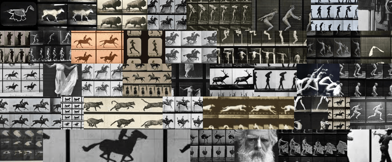
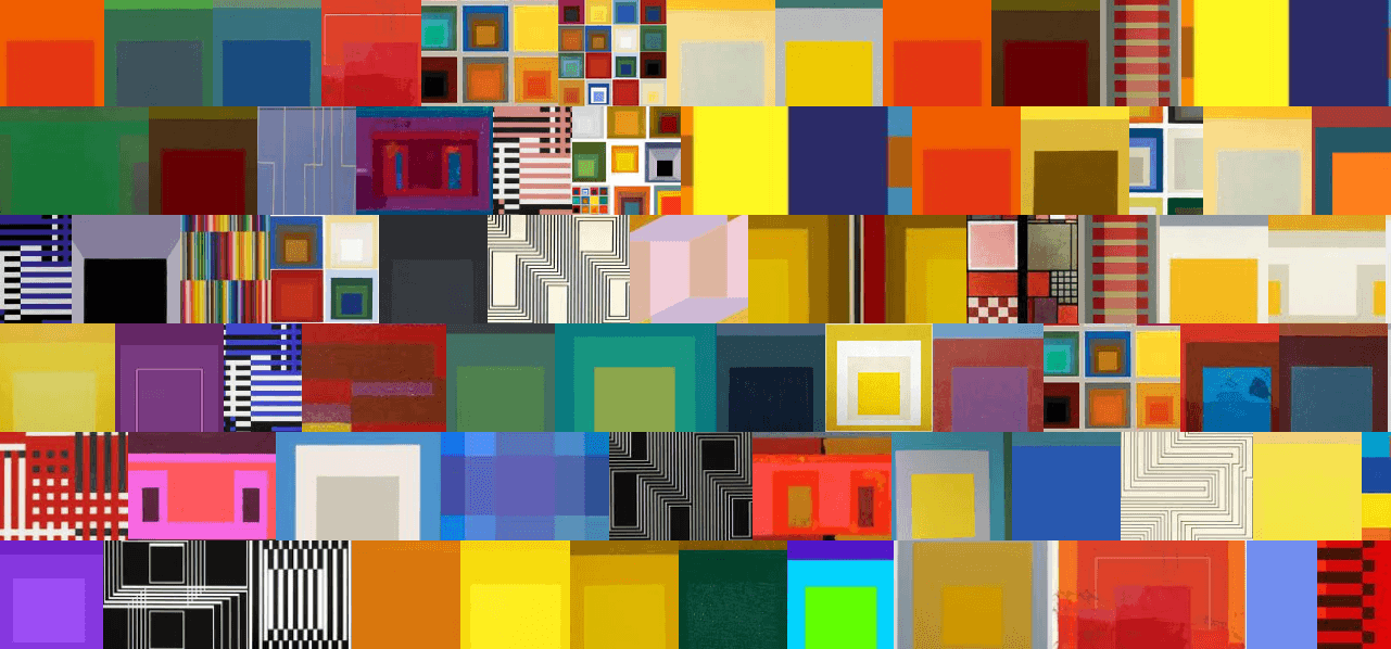
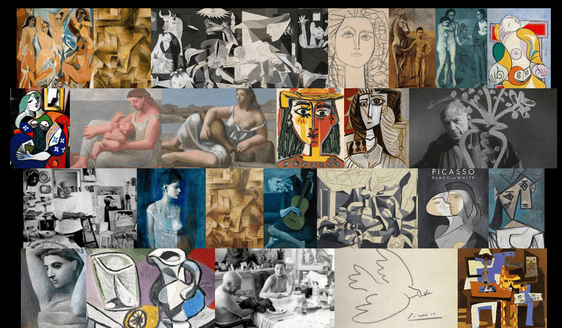
This second visualization is (obviously much more cute) and is made through ImageQuilts, a Google Chrome plug-in that allows you to take a large batch of images from a multitude of sources- WikiMedia, Google Image Search, etc.- to create a manipulable “quilt” of images. While I like looking at lots of images of cute baby beagles, you could also use them as visualization tools for class, such as Pablo Picasso’s work:
or even a ~meta~ quilt of the quilts from Gee’s Bend:
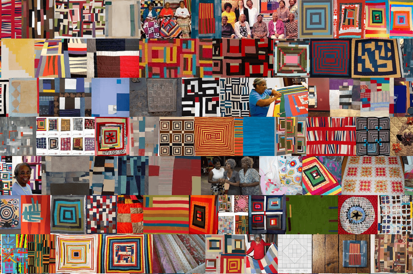
which are both images created by the founders of ImageQuilts, Edward Tufte and Adam Schwartz. They created some amazing images with this software, including these two with which I will conclude my post: