Women Architects and World Fairs

Author: Veronica McGurrin (Page 1 of 2)

Ch-ch-changes: Art History & Digital Publishing

As we have moved towards the end of the semester, it is only fitting that I write my final blog post on the topic that got me interested in digital art history: scholarly communication. I became initially interested in this topic in my art librarianship course in which I researched new modes of digital publishing in the world of art history. From there, my master’s paper was born. The topic scholarly communication, or even of art history digital publishing, is much too large and complicated to discuss in one single blog post, but I thought I would use this opportunity to talk a little bit about art history and digital publishing and introduce some extremely interesting and innovative new publishing endeavors.

For the past few years, scholarly communication within the field of library science has become increasingly popular and, as such, it has filtered into many introductory level library science courses. When we talk about collection development and learn about resource selection, it is impossible to ignore the world of scholarly communication. More and more universities are hiring scholarly communications librarians and are shifting the qualifications needed for this type of job. In past decades, scholarly communications librarians were librarians who (in almost all cases) also had a law degree so that they were able to discuss copyright issues. These responsibilities have increased drastically as the crisis in scholarly publications has expanded; the world of art history has not been spared from this crisis.

As the aim of every (non alt-ac) academic is to achieve a tenure track position, they are extremely likely to follow the exact specifications of the promotion and tenure guidelines. And, as we have talked about throughout the semester, these guidelines have not adapted to the new world of digital humanities nor the idea of digital publications. Even today, the printed monograph is the gold standard for junior academics, which thwarts the possibility of people early in their careers to pursue new digital projects. As such, not as much interest (or funding) has been dedicated to new publishing opportunities within the academy (outside of born digital journals). But, this doesn’t mean that there hasn’t been new publication endeavors…

Beyond the Academy

One of the reasons that scholarly communication for art history is so intriguing (at least, to me) is the fact that there is a whole sector beyond the academy that produces and contributes to the discussion of scholarly publishing. Who are they? Museums and other cultural heritage institutions! Outside of the academy, there has been a shift in focus towards art history digital publishing with funding coming from foundations like the Mellon and the Getty, each of which have their own programs focuses specifically on scholarly communication.

https://mellon.org/programs/scholarly-communications/
http://www.getty.edu/foundation/initiatives/current/dah/index.html

As such, I thought it would be beneficial to explore some examples of art history digital publishing, starting with one funded by the Getty.

OSCI-report

Getty’s OSCI (Online Scholarly Catalogue Initiative) was a program that funded eight separate museums to create and publish an online catalogue related to one of their exhibitions. The only requirement was that the catalogues had to be free and accessible to the public. Additionally, museums that were not funded by the Getty were still able to use the technology as the toolkit (the technology and support needed for the publication) was created open access so that any museum could utilize it.

The Canadian Online Art Book Project is another example of an innovative digital publishing program. While not related to exhibitions or museums, the initiative is meant to shed light on Canadian artists that are often overlooked in the canon of art history. Their mission statement is as such:

Founded in 2013, the Canadian Online Art Book Project is a growing digital library of books–all original works commissioned by the Art Canada Institute–by the country’s leading art experts on artists who have made a critical contribution to the evolution of the nation’s art history. Each year the ACI releases six new titles in this program.

https://aci-iac.ca/art-books

The publications, while meant to be read online, can also be downloaded as a PDF and are available in both English and French. Below is the PDF for artist Pitseolak Ashoona and you can also read the digital publication here.

Art-Canada-Institute_Pitseolak-Ashoona

I wanted to conclude by blog post with a genre that is seemingly made for the digital platform: catalogues raisonné. Unique to the field of art history, a catalogue raisonné is the complete oeuvre of one artist. As you can imagine, this means that most catalogues raisonné are humongous, expensive, and, by the time they are published, are already outdated. As such, the digital medium is ideal for these catalogues. It easy easy to adapt or change any new scholarship and it is not as expensive as printing these publications. There are a variety of different platforms publishing catalogues raisonnés, some of which are highlighted below:

Digital v. Digitized in the Classroom

Throughout the semester, we (and by we, I mean me constantly bringing it up in class) have spent a significant portion of time discussing the differences between digital and digitized (hello, Johanna Drucker!). This important distinction from our very first week of class is something that has stuck with me throughout the semester (hello, my many blog posts referencing Drucker’s article) not just because I think it is a foundational article in the field of Digital Art History, but also because I truly believe that it reveals a great deal about our own conception of what the “digital” is. By using the distinguishing question of is it truly digital or is it simply digitized, we are able to meditate on whether we are using the technology as a new mode of scholarship, or if we are simply using this new technology because it is available to us and it makes our lives easier. Just as using a database or publishing an article on a digital format doesn’t necessarily make the research a digital project, just like utilizing digital tools doesn’t make it a digital pedagogical shift.

But, unlike the very distinct difference between digital and digitized for academic research, I think that there needs to be a bit more nuance, or even flexibility, in the differentiation between digital and digitized. I feel this way, mostly, because the advent or including digital technologies in a classroom can affect a learning objective or one of the outcomes of the course.

Smarthistory, from the Khan Academy, is a great resource for introductory level classes in their discussion of art. In the class I TA for, I showed this example of a formal analysis as an introduction to the topic in our own class.

Using digital technologies can create engaging classroom settings. This past week, my recitation group started a collaborative Google Doc for their final exam so that they can have a place to study, ask questions, and synthesize some of the main ideas or themes from that week. This didn’t affect a learning objective or create a new avenue of research, but it did offer a new opportunity for a mode of study, communication, and collaboration for the students.

In our class discussion this week, we looked at two distinctive pedagogy examples that specifically integrate digital technologies in their classroom. Additionally, I think that they are interesting examples to use as points of comparison because each had a similar aim: to critique the canon of Western Art History.

The first example that we looked at was from Duke University:

Caroline Bruzelius and Hannah L. Jacobs. “The Living Syllabus: Rethinking the Introductory Course to Art History with Interactive Visualization.”Art History Pedagogy & Practice 2, (1). 2017.Download

In this article, Art Historian Caroline Bruzelius and Digital Humanities Specialist Hannah Jacobs discussed their teaching of an introductory level art history survey course with the use of an interactive, mapping syllabus. Not only would the syllabus show the chronological space of the time of their course, but it would also show the chronology of the art that they were studying in the class.

Screenshot of the “Living Syllabus.” To view the full site, click here

This course approach is really interesting to me because the students are still exposed to the traditional canon of art, but already within these introductory discussions, they are exposed to the issues inherently built into this canon. Bruzelius and Jacobs discuss them as such:

Although we used the canonical objects illustrated in the standard introductory textbooks, we approached these places, objects, and the raw materials of which those objects were made as points of departure for a semester-long meditation on the lives (and trajectories) of things. As a result, we practiced visualizing narratives about:
● Why did certain works of art (and not others) “make it” into the canon, an why are these almost always objects from the major museums of America and European capitals: the Louvre, the British Museum, the Cleveland Museum of Art, and the Metropolitan Museum of Art, for example?
● What is the significance of the materials from which works of art were made?
● Why do we find certain types of objects in certain types of places (for example, Egyptian obelisks in Rome, Paris, and London)?
● How were these or other objects transported, and what part did they play in networks of exchange?
● What are the dynamic relationships between objects and spaces?
● What were the systems of exchange—what were valuable materials (ivory, lapis, and gold, for example) traded for, and why?

Bruzelius & Jacobs, “The Living Syllabus,” p. 6

For art history majors, many professors will expect them to be aware of and know the objects that make up the canon of art history, despite how problematic and filled with white European male artists it is. Introducing the topic in this way, where the class is built around the concept that makes you question not only why certain art objects and periods are prioritized, but also gets you to think about how and why the Louvre has the works that it does is a unique foundation to have the study of art history. Moreover, the course includes days in which the students are able to learn, hands on, some of the digital technologies that are being employed in the world of digital art history.

In a contrasting example, Prof. Nancy Ross at Dixie State University decided to completely disregard the typical survey class and instead teach an introductory course on women artists of the twentieth century. During this class, students were also asked to research a women artist, particularly their connections with one another. In doing this, they were able to make a complex network of women artists.

Ros3
The network analysis that Dr. Ross’s students made

Upon first reading the article which was published in 2013, my first thought was, wow, I really wish that they had the tools that we learned this semester to create their visualizations because it would be much more dynamic (and probably easier!).

After reading the article, it was really fulfilling to hear about how Ross felt as if her students were much more engaged in the course material not only because they were interested in it, but also because they felt as if they were making contributions to actual research on the topic. It is extremely easy to rely upon survey texts and secondary resources when teaching, especially when teaching large introductory courses, but the result of this is that many younger students believe that scholarship is finite and complete. Ross remarked that, while creating the data for the visual network, students were able to clearly see the gender biases in many of the traditional art history texts and also the different in the way male and female artists were treated in these texts. Allowing them to actually participate in the creation of the scholarship (similar to what I talked about earlier in a blog post about collaboratively creating Google Maps) usually leads to a greater interest about the project and the end results then what a paper assignment may produce.

Pinterest

Pinterest. Not something you would really expect to see in a post about digital pedagogy, right? Well, just like you might not think of the ability of Google Maps to be used in the classroom (or museum or other cultural heritage institution), Pinterest might surprise you! One way we talked about it in class was the creation of a collaborative “site” where each student could make their own exhibit- this provides a much more collaborative, as well as perhaps easier, alternative than to say, Omeka.

My experience with Pinterest has mostly been in museum education internships. As most art history or history students (or perhaps only female students, but I will not devolve into a gender discussion in this blog post) may relate, the idea of education in some way, shape, or form usually arises as a possible idea as a career path. For me, this resulted in two education internships: one at the Shelburne Museum in Shelburne, VT and one at the Museum of Fine Arts in Boston, MA (the MFA internship was intended to be focused on adult education programing, but children’s activities need a lot more hands to help clean up after). In both of these internships, I relied heavily on Pinterest to use as inspiration and ideas to create activities, crafts, and educational tools. This is a really great opportunity for institutions with lower budgets to find already pre-made lesson plans.

Example of a useful “user” on Pinterest: https://www.pinterest.com/EHeumannGurian/

Digital Art History & Crowdsourcing: A Look At Art&Feminism Wikipedia Edit-a-Thons

Throughout the semester, one of the tends that continuously arises in our discussion is the idea of collaboration. One of the central tenets of scholarly production in the humanities is that of work authored by a single scholar. Unlike the sciences in which it is expected for there to be multiple people- multiple scholars, graduate student assistants, lab assistants, etc.- contributing to the final publication of a research article, the disciplines in the Humanities expect one singular author to produce the entire work. One of the integral aspects of the ‘gold standard’ of the scholarly monograph is the idea that there is only one author who wrote it. That is why, when thinking about the transition to digital art history, many scholars in the humanities were skeptical. How would projects open up in this collaborative manner? This focus on the single authored work often meant that those who contributed to a digital project, including librarians, IT specialists, graduate students, and others, were often not recognized for their labor.

This tight hold on the single-authored monograph has loosened a bit, though certainly not completely. The ‘gold standard’ Digital Art History article that we have talked about throughout this semester is, of course, “Local/Global: Mapping Nineteenth-Century London’s Art Market” by Pamela Fletcher and Anne Helmreich. Not only are there two authors working together to produce this article, but they also acknowledge the work of those who helped create the tools that they used to develop the article. But what happens when collaboration goes beyond the work of multiple scholars or other individuals within the ‘Academy’? What happens when the collaboration brings in the public?

This question was the topic of our discussions this week. Mass collaboration with the public, or crowdsourcing as it is called, is an attribute of the digital world that has been increasing for the past few years. In the article “Digital Humanities and Crowdsourcing: An Exploration,” the authors offer a thoughtful definition for the term:

“Crowdsourcing is a type of participative online activity in which an individual, an institution, a non-profit organization, or company proposes to a group of individuals of varying knowledge, heterogeneity, and number, via a flexible open call, the voluntary undertaking of a task.”

L. Carletti, G. Giannachi, D. Price, D. McAuley, “Digital Humanities and Crowdsourcing: An Exploration,” in MW2013: Museums and the Web 2013, April 17-20, 2013,

Within this definition, crowdsourcing can span a variety of projects, both related to Digital Art History and those beyond its scope. One of the more common types of crowdsourcing is projects that deal with transcription. The New York Public Library, Tate Museum, and the Smithsonian Institution are all examples of cultural heritage institutions that make collections of material available to the public so that members of the public can engage with these materials directly. Additionally, this allows for more transcriptions to occur and the materials to (ideally) reach a wider audience.

At first glance, at looking at these types of projects, the immediate answer that comes to mind (to the question: is crowdsourcing a good/positive thing) is often yes! It is engaging with the community, reaching a wider audience, and more work is ‘getting done.’ Yet the flip side to this line of thinking is- does the value of the professionals work (namely us, as art historians/ librarians/ museum professionals) become undervalued if we broaden these types of projects to the public? Will administrators think that our work can be done by just anyone with a computer if we open up these gates? Most of these questions arose when thinking specifically about our discussion of crowdsourcing exhibition curation, and are all valid questions. Instead of focusing on the negative aspect of crowdsourcing, for this blog post I wanted to focus on one of the positive resources or examples of crowdsourcing: Art & Feminism Wikipedia Edit-a-Thon.

Image result for art and feminism

For those who don’t know, Art + Feminism is an incredible, non-profit organization that is committed to increasing a diverse representation of the arts and art history. Their mission statement is as follows:

“Art+Feminism is a campaign improving coverage of gender, feminism, and the arts on Wikipedia. From coffee shops and community centers to the largest museums and universities in the world, Art+Feminism is a do-it-yourself and do-it-with-others campaign teaching people of all gender identities and expressions to edit Wikipedia.”

http://www.artandfeminism.org/

One of the aspects of their mission statement that I find particularly important is that of the people who are editing Wikipedia. Not only is the organization committed to editing or creating better representation of women artists on Wikipedia, but it is also committed to diversifying the population of those who edit. This mission stems from the fact that less than 10% of editors on Wikipedia are women. Ten percent! And the numbers only go down when you add in race and ethnicity.

Image result for art and feminism wikipedia edit a thon

One of the aspects of their mission statement that I find particularly important is that of the people who are editing Wikipedia. Not only is the organization committed to editing or creating better representation of women artists on Wikipedia, but it is also committed to diversifying the population of those who edit. This mission stems from the fact that less than 10% of editors on Wikipedia are women. Ten percent! And the numbers only go down when you add in race and ethnicity.

At this point, many of you may be asking, okay yes, this all sounds great- but Wikipedia? Haven’t we been taught for most of our life that Wikipedia is not a reliable source?

Well, yes and no. We still urge our students not to cite (or copy!) Wikipedia as a resource for their research papers, but how many times have we looked up a fact on Wikipedia? When was the Seven Years War? What’s the capital of Azerbaijan? Who was the twelfth president of the United States?

In an increasingly digital world, Googling someone’s name is often times our first step in researching their work. Admit it- we all use Wikipedia in our day to day life. I even use it as a starting point of research each page usually has an elaborate list of bibliographic sources.

So what happens if a student can’t find someone on Wikipedia?

What happens if a student is intrigued by a femme or genderqueer artist that they learned about in class and was interested in writing about them for their research paper, but when they Googled their name, nothing came up? Often times, that student will turn elsewhere, to look for a figure that is more well-known. Someone who has a Wikipedia page. Does this happen everyday? Probably not. But when it does happen, it continues the cycle of underrepresentation. For every article added, edited, or improved, more and more underrepresented people get their voices, and work, shown to a wider audience.

Is Art+Feminism’s Wikipedia Edit-a-Thons perfect? No, of course not. Just like in any other avenue of life, there are editors on Wikipedia that try to bring those woh are new to Wikipedia Editing down or remove pages that don’t completely follow the ‘pillars’ of Wikipedia. But overall, I think this is an excellent example of positive crowdsourcing. The results speak for themselves.

Image result for art and feminism wikipedia edit a thon

“Since 2014, over 14,000 people at more than 1,100 events around the world have participated in our edit-a-thons, resulting in the creation and improvement of more than 58,000 articles on Wikipedia. We’ve created and improved pages for artists like Tina Charlie, LaToya Ruby Frazier, Ana Mendieta, Augusta Savage, and Frances Stark.”

https://artandfeminism.org/about/

Playing with 3D Modeling

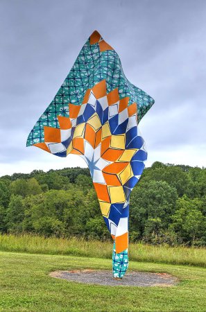
The introduction of 3D modeling technology has hugely influenced the Digital Humanities and almost all university maker spaces have 3D printers, making it a relatively accessible technology (if you want to read my blog post on the topic, you can find it here.) For my digital project related to 3D modeling, I attempted to make a 3D model from a sculpture at the North Carolina Museum of Art. My first attempt was Shonibare’s Wind Sculpture II.

Image result for wind sculpture ii shonibare ncma

Unfortunately, this model did not work out very well (see the Sketchfab model as well as download the PDF), I think due to the ‘folds’ and ‘drapes’ in the sculpture, the 3D modeling technology perceived the sculpture as three different objects instead of complex aspects of one sculpture.

Shonibare OBJ by vmcgurrin on Sketchfab

Shonibare 3D Model PDFDownload

My next attempt was of Henri Moore’s Knife Edge, also at the NCMA.

While still not perfect, the model was much better than my first attempt. and includes one particularly good view, especially in the PDF. I think the reason that this model wasn’t perfect was because the sculpture (seen in the photo above) is in front of extremely reflective glass, which caused confusion. While I tried to blur out anything but the sculpture, it was difficult to get everything that was outside of frame. After completing both projects (and talking to our lovely instructor, JJ), it shows that you learn to be a better photographer to take better photos of the object in order to have a better outcome. Next time, I know to isolate my object with no reflective backgrounds and to ensure that I have all angles shown, including the top of the work.

Moore Project
by vmcgurrin
on Sketchfab

Henri Moore 3D ModelDownload

Network Analysis to 3D Modeling

Warning to readers: this blog post is created in two parts as it covers two weeks of material. As I was unable to finish my blog post from last week on network analysis but still thought it was important information, I wanted to include some of the material that I had written. My second part of the blog post will be spent on this week’s topic: 3D Modeling. With that being said, let’s get this show on the road!

(Net)workin’ 9 to 5

When looking at the theme of this week’s class, the words ‘network analysis’ did inspire a strike of fear in me, to be honest. Coming from my SILS background, anytime I hear “network analysis,” I am brought into the realm of system analysis, database creation, and all other scary things that I try my best to avoid in the “information science” part of my library degree (I will happily lead all those scary items to Emily C., thank you). But, once broken down into simple terms, and also related in applicable ways in the field of art history, network analysis becomes a lot less scary.

For those who, like me, were a bit nervous in approaching this topic, I would highly recommend Scott Weingart’s blog post “Demystifying Networks.”

Link to Weingart’s blog post.

As the title suggests, Weingart succinctly goes through all of the terms associated with networks and provided an excellent overview of the conceptual information associated with networks. For someone who is new to networks (and a bit fearful), this really basic introduction was extremely helpful for my introduction to the topic. But, more than any of the conceptual definitions Weingart offers or even the explanation of what networks are and how they are used, it is the ‘warning’ that he offers at the beginning of the post that I found most compelling. As we have learned more and more tools throughout this semester and looked at various ways in which you can utilize resources in the digital humanities in our own work, specifically within the field of art history, not every tool is actually useful for research. Weingart writes

“Networks can be used on any project. Networks should be used on far fewer.

Scott Weingart. “Demystifying Networks.”

This approach, and reminder, to network analysis, as well as all of the digital technologies that we have talked about this semester, is extremely important. Just because it is a new tool that you know how to use, it doesn’t mean that you actually should use that tool. Weingart points out that almost anything can be placed in a network; we have looked at that various tools that you can just plop your data sets in and the technology does the rest. But before you include this visualization in your research or place it in a presentation, it is important to ask yourself: is this network analysis altering the question I’m asking? Is it helping me support my thesis? If not, then it might not be productive to use it. This mindset is something that I think many digital humanists should incorporate in their

3D Modeling

In contrast to the week on network analysis, 3D modeling is a much different tool and, therefore, it is utilized in a different way than projects with 3D modeling. Unlike some of the other topics that we have covered in class, there are a variety of articles that have directly addressed the methodologies that have been created. This was a really interesting facet to me as I felt like, in the majority of articles or readings that we have encountered this semester, the methodologies were not something that was clearly expressed or even discussed in the majority of the readings. For reference, here are the citations for the readings that we went over this week:

  • Diane Favro. “In the Eyes of the Beholder: Virtual Reality Re-Creations and Academia.” In Imaging Ancient Rome, edited by Haselberger, Lothar Williams Symposium on Classical Architecture and John H Humphrey, 321–34. Supplementary Series 61. Portsmouth, R.I.: Journal of Roman Archaeology, 2006.
  • Alessandro E. Foni, George Papagiannakis, and Nadia Magnenat-Thalmann. “A Taxonomy of Visualization Strategies for Cultural Heritage Applications.”  Comput. Cult. Herit.3, no. 1 (July 2010): 1:1–1:21. doi:10.1145/1805961.1805962.
  • Christopher Johanson. “Visualizing History: Modeling in the Eternal City.” Visual Resources 25, no. 4 (2009): 403–18.
  • Brent Nelson, Melissa M Terras, and Lisa Snyder, eds. “Virtual Reality for Humanities Scholarship.” In Digitizing Medieval and Early Modern Material Culture, 395–428. Toronto, Ontario; Tempe, Arizona: Iter : Gateway to the Middle Ages and Renaissance ; ACMRS (Arizona Center for Medieval and Renaissance Studies), 2012.
  • Pitukcharoen, Decho. 3D Printing Booklet for Beginners (Metropolitan Museum of Art, New York, 2014). http://www.metmuseum.org/~/media/Files/Blogs/Digital%20Media/3DPrintingBookletforBeginners.pdf
  • Jentery Sayers, “Made to Make: Expanding Digital Humanities through Desktop Fabrication,” Made to Make, DH 2013. http://dh2013.unl.edu/abstracts/ab-441.html
  • Melvin J. Wachowiak and Basiliki Vicky Karas, “3D Scanning and Replication for Museum and Cultural Heritage Applications,” JAIC 48 (2009), pp. 141-158. http://www.si.edu/content/MCIImagingStudio/papers/scanning_paper.pdf

Before reading these articles for this week, I was really only familiar with 3D modeling being used for cultural heritage institutions (more on that later) as well as Classics studies. In this instance, it makes sense for, not only 3D modeling but many digital humanities tools to be used in Classics studies. Unlike the majority of fields in Art History, Classics scholars focus on objects and works that are often damaged, or even completely lost. Just like it makes sense that the architectural historians were some of the first to embrace the digital humanities as it most aligned with their own research, it makes sense that Classics would use 3D modeling as it could affect and broaden their own research topics.

One of the things that we discussed in class that I think is integral to emphasize is the fact that in may instances, especially with scholars who study other pre-modern global cultures, the 3D models often involve speculation in order to recreate the object. In light of this, it is easy to criticize the fact that there are a lot of inferences being made by the scholar or the person creating the model. But, this is something that has occurred throughout the field of art history or even history. For example, I am currently a Teaching Assistant for the survey class “Introduction to the Art and Architecture of Pre-Hispanic Mesoamerica.” In this class, we constantly look at objects- whether stone sculptures, ruins of temples, or mural paintings- that are extremely damaged. In these instances, scholars are extremely likely to create recreation drawings of these ruins. In these instances, they are making guesses, based on the other objects that they study, to fill in what is not there anymore. Because of this, I don’t think we need to be extremely wary of digital tools doing the same thing.

Hieroglyphic Stairway, Structure 10L-26 (K’ak’ Yipyaj Chan K’awiil), completed ca. 755 CE (Late Classic Period), Maya, Copán, Honduras.

Hieroglyphic Stairway, Color Reconstruction Drawing (by Tatiana Proskouriakoff), Structure 10L-26 (K’ak’ Yipyaj Chan K’awiil), completed ca. 755 CE (Late Classic Period), Maya, Copán, Honduras.

3D Modeling Projects

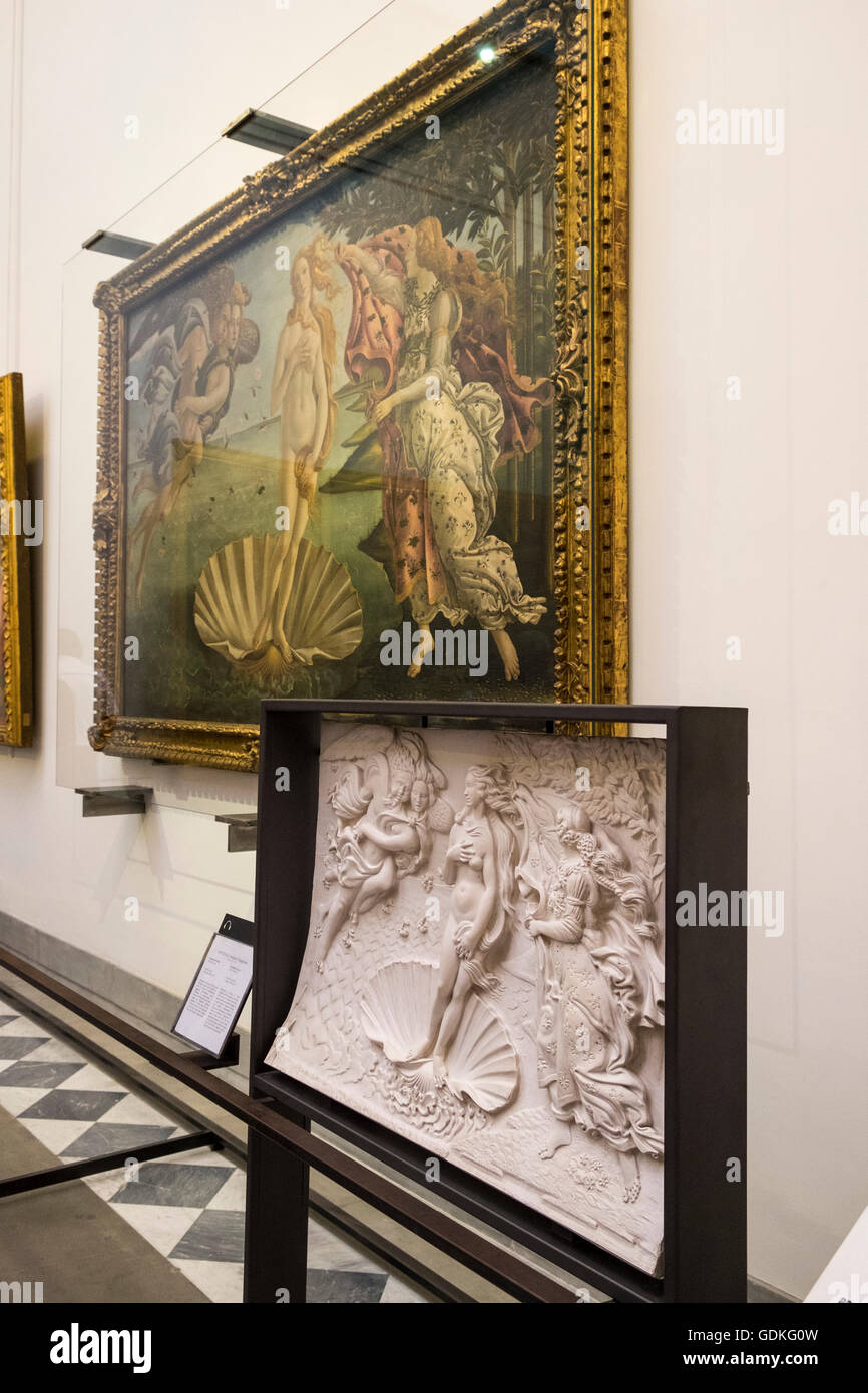
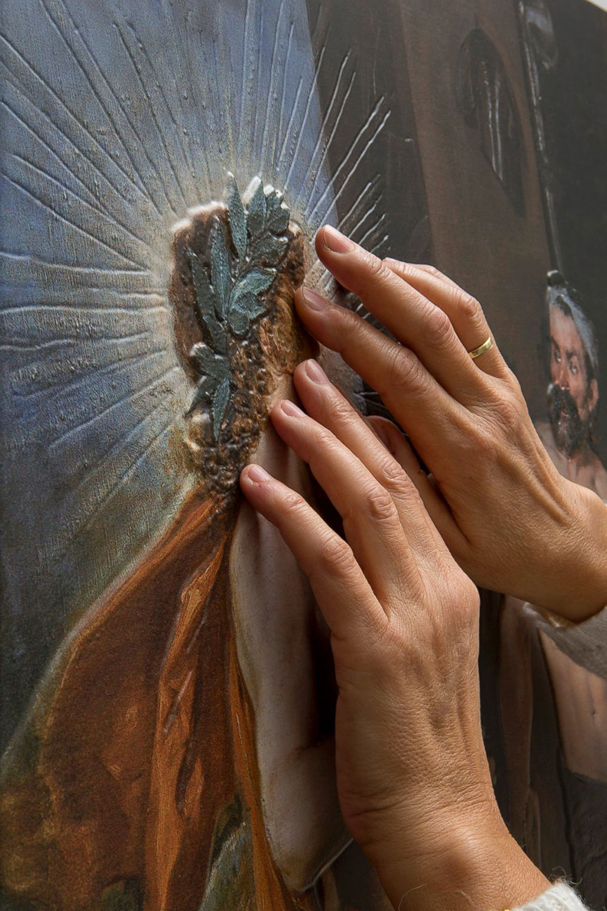
For me, the first thing that comes to mind when I think about 3D modeling projects that are useful and beneficial to the field are 3D models that are used to crease accessibility services. There are many instances when 3D models are created to help people with visual impairments ‘see’ the object. Being able to add another sense can greatly impact an understanding of an object, even beyond those who are visually impaired. These are already being implemented in some museums, but I think about increasing this service is a wonderful way to broaden the communities who museums are able to reach.

Image result for 3d model of spring by botticelli in the uffizi
Sorry for the quality of the image- the only one I could find online! Pictured here is a 3D model of “La Primavera” by Botticelli in the Uffizzi in Florence

classic-paintings-3D-visual-impaired-prado-museum-madrid (9)
Exhibition at the Museum of Prado

The Time Traveler’s Map

In this week’s topic, we revisited the idea of mapping in digital art history, but this time focused on not only mapping space, but also mapping time. Of the digital tools that we have (and will) look at this semester, mapping time seems to be one of (if not the) most recognizable concepts. Creating timelines and chronologies is nothing new in the humanities, nor in history in general; people have created analog or even digital timelines for hundreds of years- is there a timeline for the history of timelines…? But I digress.

With the advent of new and ever changing digital technologies, there have been new and more interactive tools used to create complex timelines. In the realm of art history, the best known, and possibly most used timeline, is that of the Heilbrunn Timeline of the History of Art, hosted by the Metropolitan Museum of Art. Founded in 2000, the timeline is a comprehensive overview of the history of art and is navigable through a variety of ways and is a very useful and widely positively received resource. Moreover, it is an example of a resource that maps both time and geography. As such, I wanted to spend the majority of my blog post this week thinking about this timeline, and the project as a whole, in relation to the ideas of digital art history. My blog post will conclude with my own example of a timeline that I created using KnightLab’s TimelineJS. But first, let’s look at the Heilbrunn Timeline.

The project describes itself as such:

The Metropolitan Museum of Art’s Heilbrunn Timeline of Art History presents a thematic, chronological, and geographical exploration of global art history through The Met collection. Authored by The Met’s experts, the digital publication is a reference, research, and teaching tool conceived for students and scholars of art history. The Timeline currently comprises more than 1,000 essays, 8,000 works of art, 300 chronologies, and 3,700 keywords. It is regularly updated and enriched to provide new scholarship and insights on The Met collection.

“About.” The Heilbrunn Timeline

It is important to note that the way in which the authors conceived of and approach this timeline is through the works in the Met’s collection. While there are some works of art and artists discussed in the Timeline that are not present in the Met’s collection, I think this is an important aspect to note as it could hide potential biases; if they are only writing about works that are in their collection, what is left out from this “global” timeline? Are there art objects underrepresented at the Metropolitan Museum of Art? This immediately called to mind one of the works by the Guerilla Girls which called attention the lack of diversity in the Met’s collection.

Guerrilla Girls Do Women Have To Be Naked To Get Into the Met. Museum? 1989

While there certainly have been vast improvement in the diversity of the collection from the time that this piece was made, it is important to remember to always interrogate the resources that we utilize, especially if they are new(er) resources as oftentimes the “shiny” factor of a new digital technology can outshine some inherent biases in the resource. I do not mean to be overly critical of the Heilbrunn Timeline- I have used it in my work as a jumping point for my research many times; I just wanted to shine light on one of the issues in creating a “global art history timeline” that only uses (primarily or otherwise) the works in one museum. Though, it is clear that the timeline is truly focusing on the items in the “Met Collection,” as it is clearly stated twice in the opening paragraph in the “About” section.

The digital resource is primarily divided into four different sections:

The Timeline is structured with four components. Essays focus on specific themes in art history, including artistic movements and periods, archaeological sites, empires and civilizations, recurrent themes and concepts, media, and artists. Works of Art celebrate human creativity from around the world and from all eras, and are contextualized chronologically, geographically, and thematically. Chronologies provide a linear outline of art history by geographical region. Each chronology includes up to ten representative works of art, a timeline, an overview, and key events. Keywords—categorized by art movement and style, artists and makers, geography (present-day nation states and historical regions), time period, material and technique, object, and subject matter—further connect chronologies, essays, and works of art.

“About.” The Heilbrunn Timeline

When looking at the front page of the Timeline, you can choose three different options, Essays, Works of Art, and Chronologies, each of which will bring you to its own unique home page. One of the interesting facets of this tool, for me, is the way in which each section incorporates chronology or some sense of time in each of the individual menus.

Screenshot of “Essays” Section with dropdown menu of time period highlighted

Of all the sections, the “Chronology” section most embodies the mapping time and space that we have looked at this past week.

“Chronology” section of the Heilbrunn Timeline

Through this tool, you can mouse over a geographic area to specify which timeline you might be interested in browsing, or you can scroll through the 291 timelines (just as you can scroll through the over one thousand essays). After choosing a specific timeline or essay, one of the additional resources that I find particularly useful is the inclusion of a bibliography or further reading section, which is great if you are using the Heilbrunn Timeline as an initial resource from which you can jump to more in depth resources. Additionally, all of the works mentioned in the essays or timelines are linked to the object in the Met’s collection (which is now open access if the object is in the public domain!!). Overall, definitely a great resource and example of a complex art historical timeline that maps not only geography but also time.

Timelines & Me

As always, we were able to play around with some tools in class: TimeMapper and TimelineJS. These two are extremely similar with the main difference being TimeMapper includes a geographic map in addition to the timeline. Both utilize a Google Sheets as the template in which you place the data and overall, is quite easy to use.

For my timeline, I wanted to create a timeline that would be useful for me to use in my own research, so I decided to focus it on my topic of my art history master’s thesis. To give an (extremely brief!) overview, I am looking at Tom Phillips’ canonical artist’s book A Humument: A Treated Victorian Novel in relation to Phillips interest in ornament, an area that has been neglected in scholarship on Phillips. In this timeline, I wanted to interweave the publication of various prominent theories of ornament into a timeline on Phillips’ work. While certainly not comprehensive (of Phillips’ history not the entire historiography of theories of ornament), it is an interesting visual to include in my research and the process of creating the timeline made be look at some connections that I had not thought of yet, such as the fact that Robert Venturi was publishing his work while Phillips was at Oxford and he could have encountered the ideas then. Below is the link to my timeline: let me know what you think!

In case the embed isn’t working, here is a link to my timeline.

Data Sutra: The Many Forms of Data Visualization

Unlike most disciplines, especially in the humanities, art historians have one aspect that unites them all: the image. There might be fights over methodologies, historiographies, interpretations, and countless other things, but underneath it all is the privileging of images. No matter the genre of art or the field of scholarship, every art historian utilizes images as an integral form of their work, whether it is their own research, including publishing endeavors, or pedagogical tools. That is why, when it comes to data visualizations, it would seem that art historians would be on the cutting edge of these tools. Yet, once again, it appears that art historians seem to be slightly behind the curve when it comes to this aspect of the digital humanities. These ideas are best illuminated by Diane M. Zorich’s presentation “The ‘Art’ of Digital Art History.”

Zorich “consults on information management and digitization issues in cultural and educational organizations” and is perhaps best known for (at least in the realm of digital art history) her 2012 Kress Foundation report entitled “Transitioning to a Digital World: Art History, Its Research Centers, and Digital Scholarship,” which we have looked at earlier this semester. Her presentation, which occurred a year after the report was published, in some ways acts as a response to her report. One of the biggest takeaways, and one that I have written about in almost all of my blogs this semester, is once again highlighting the differences between digitized and digital art history, a concept that Johanna Drucker defines in article “Is There a Digital Art History?” In the responses that Zorich received to her report, it is clear that people within the field are still grappling with the true meaning of digital art history. One response that Zorich highlights in the presentation basically asserts that if scholars use technology, such as Google searching or library databases, they are conversing in digital art history. Yet, as Zorich highlights and reasserts from Drucker’s article, simply using digital resources doesn’t make you a digital art historian- it has to alter the way in which you approach your research or even inform your research question. Zorich writes

“I think the reason for these sentiments is that art history has been slow at adopting the computational methodologies and analytical techniques that are enabled by new technologies. And until it does so, art historians will never really be practicing digital art history in the more meaningful sense that Drucker implies. They will only be moving their current practices to a digital platform, not using the methodologies unique to this platform to expand art history in a transformational way.”

Diane M. Zorich, “The ‘Art’ of Digital Art History” (presented at The Digital World of Art History, Princeton University, June 26, 2013), https://ima.princeton.edu/pubs/2013Zorich.pdf

Afterwards, Zorich proceeds to highlight and reflect on some new computational methodologies and the ways in which they can be incorporated in digital art historical scholarship. In her presentation, Zorich includes many of the tools that we have looked at in class- Google’s N-Gram Viewer, the Software Studies Initiative from Lev Manovich’s Cultural Analytics Lab, Pamela Fletcher & Anne Helmreich’s “Local/Global” mapping of 19th-century London art markets, and “Mining the Dispatch” from the University of Richmond. While not necessarily all art historical projects, they all highlight examples in which computational methodologies have been used and then could be applied to art historical projects.

One of the interesting areas that Zorich highlighted that caught my attention was the potentiality of text mining in art historical studies. Text mining, or distant reading, was one of the first (perhaps the first?) digital humanities tools that really impacted the disciplines of the humanities, yet it is an area that I have largely associated with the discipline of English, and perhaps maybe History. But, as Zorich astutely highlighted in her presentation, art historians could use topic modeling as a new tool, and presents possible avenues of corpora: the Getty Portal, journals in the discipline, the oeuvre of icons in the field (Panofsky, Gombrich, etc.), oral histories, and perhaps even images, although technologies are not quite there yet. Personally, I would absolutely love to do some text mining of these corpora, especially the different journals in the field. While it is most likely that the data will show what we already know (namely that journals wrote mostly about Western white male artists), it would be interesting to find the outlier of this data, something that you might not be able to find without these new technologies.

But First: Coffee (and data cleanup!)

But, before we can even get to to the data visualization, you have to clean up your data! We talked about it last week as well, but it is crazy how much work goes into creating and maintaining tiny data. Last year when I was working on my SILS Master’s Paper, I had a very small amount of data that I was working with- I was doing a content analysis of three different art history digital publishing platforms which totaled to just under fifty publications. When I went to make my visualizations, I thought it would be extremely simple- I used the same codes across the platforms and tried to use the same standardized languages throughout my note taking process. But, I was promptly shown how wrong I was when I met with the Digital Visualization Services Librarian, Lorin Bruckner (who is absolutely amazing! You can check out her work here). Simply using different capitalization (i.e. male versus Male) would create utterly new categories in any type of chart I was trying to create. Having that opportunity, especially with a dataset that was relatively small and easily fixed, was a great experience early on in my ‘career’ (if we can call it that) as it made me realize how important having a clear idea of tidy data at the beginning of your project is to the success of it, especially when you publish it or try to create visualizations from the data.

Show Me the Images!

As this was a blog post about data visualization, it would be pretty sad if I didn’t offer some images!

appear aristocrats art austrian beautiful beethoven century child clothes cobbler countries criminal culture decoration degenerate development erotic everything food graffiti happy hear humanity increases longer man modern natural objects ornament papuan past pay people pieces pleasures price produced recognize sometimes state tattoos today unaesthetic understand urge value velvet walls work
created at TagCrowd.com

This first visualization is from Tag Crowd, which lets you create “word clouds” to show the frequency of certain words in a text. The one above is from Alfred Loos’ presentation turned article “Ornament and Crime” published in 1908. While some words I am not suprised by- ornament, man, modern, produced, culture, decoration- I was surprised by Beethoven, child, and food (perhaps reminding me that I need to read this again for my thesis…)

Beagle Puppies from Google Image Search, Created through ImageQuilts

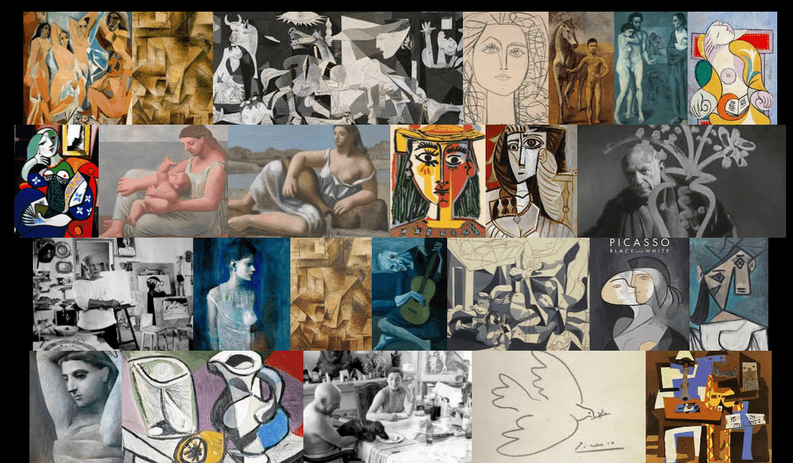
This second visualization is (obviously much more cute) and is made through ImageQuilts, a Google Chrome plug-in that allows you to take a large batch of images from a multitude of sources- WikiMedia, Google Image Search, etc.- to create a manipulable “quilt” of images. While I like looking at lots of images of cute baby beagles, you could also use them as visualization tools for class, such as Pablo Picasso’s work:

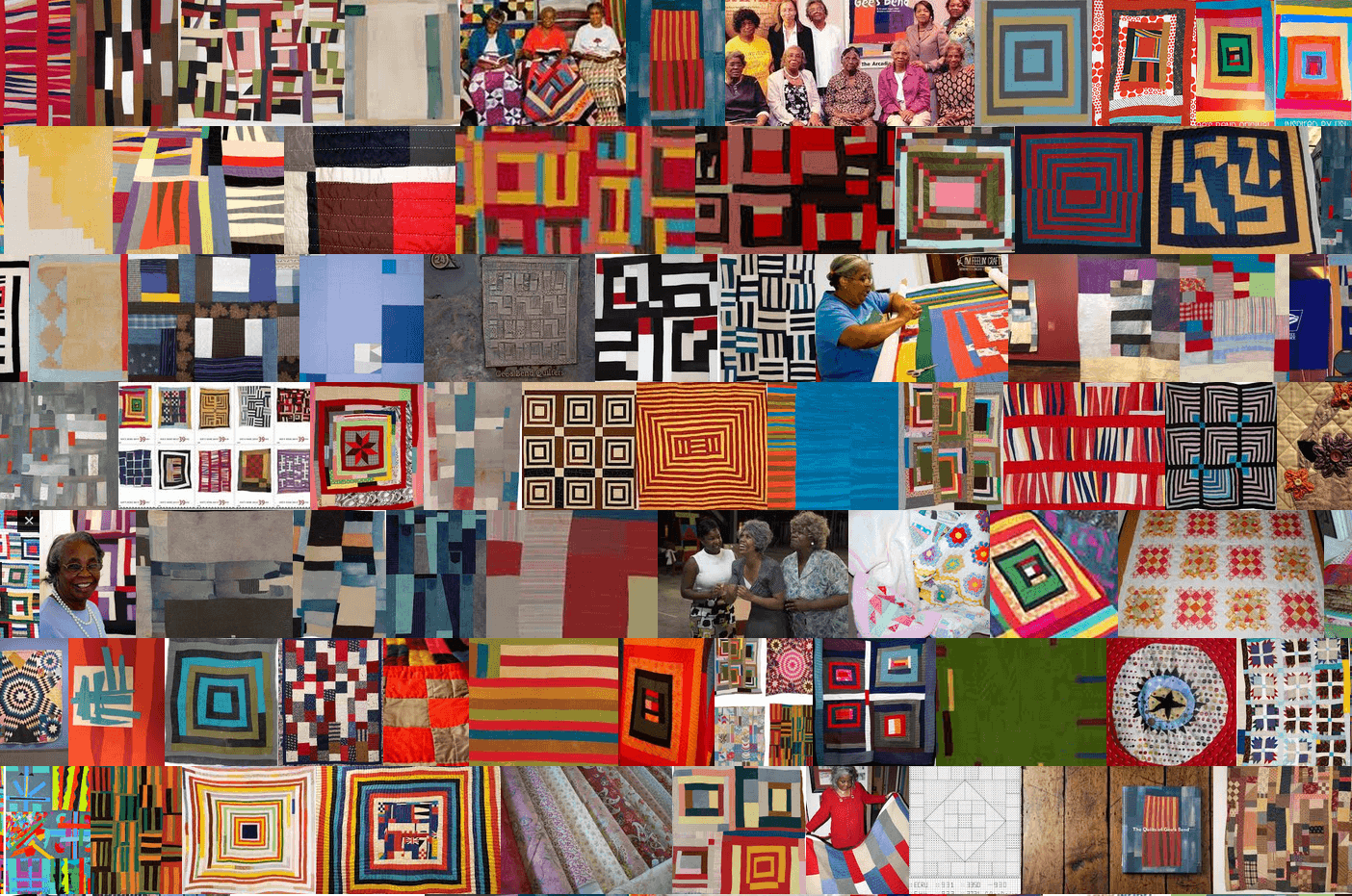
or even a ~meta~ quilt of the quilts from Gee’s Bend:

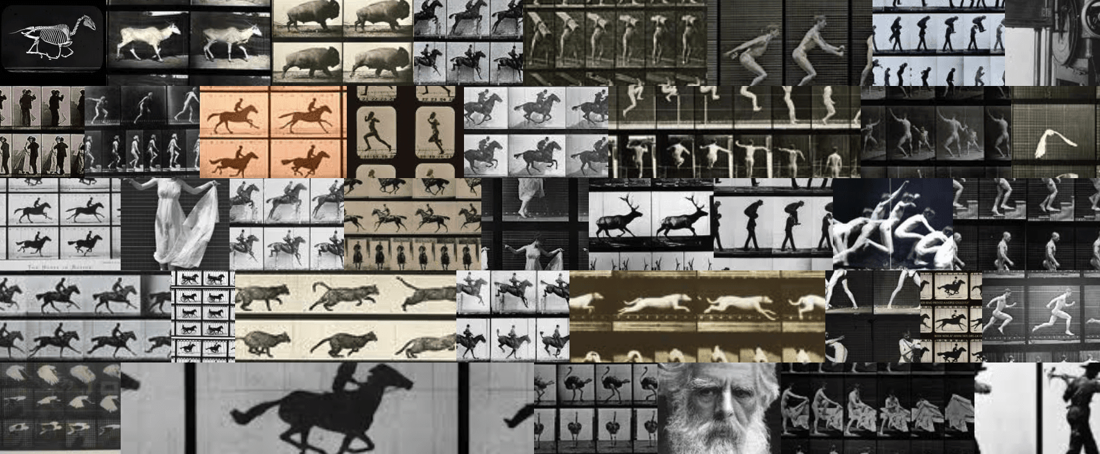
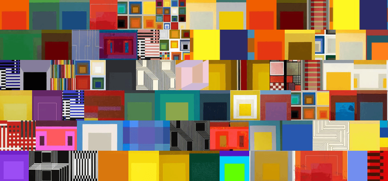
which are both images created by the founders of ImageQuilts, Edward Tufte and Adam Schwartz. They created some amazing images with this software, including these two with which I will conclude my post:

Eadweard Muybridge
Josef Albers

Mapping Bauhaus’ Influence

Mapping is one of the great areas of research in the Digital Humanities and Digital Art History. There are a variety of tools that one can use, including StoryMap JS and Google Maps. While Google Maps is a technology that countless people use in their daily lives, it is also a tool that can be used in art historical scholarship. One way that you can do this is by creating a collaborative map for those to share; you can map art museums, artists’ houses, an architect’s designs, and countless other features.

In order to play around and learn about the tool, I decided to create a map regarding the Legacy of the Bauhaus. It was created to show a variety of places related to the legacy of the Bauhaus. After the school closed in Germany in 1933, students and teachers of the school relocated to locations all over the world, illustrating the profound impact of this modern school. While I mostly focused on sites in the United States, I also included some other international examples as points of contrast. This is a work in progress, and just shows a few examples- in no way does it encapsulate the totality of architectural works related to the Bauhaus internationally.

The map includes images, descriptions, links, and videos related to the sites located on the map.

Google Map of the Legacy of the Bauhaus

Mapping Digital Art History

If you have read any of my blog posts from this semester, it will come as absolutely no surprise that I consider Johanna Drucker’s article “Is There A Digital Art History?” to be one, if not the, most foundational texts in the field of digital art history. Drucker articulately summarizes all of the issues that …

Playing with Thinglink

This is an example of how to use Thinglink, an image interaction tool that allows you to annotate image and video. Here is an example of how to use the tool; I have annotated Tom Phillips’ A Grammar of Ornament from his series A Walk to the Studio.

« Older posts

© 2024 Claiming a Place

Theme by Anders NorenUp ↑