As we have been learning several new tools per week this semester, I think many of us, myself included, have often felt a bit overwhelmed. With that feeling comes a bit of skepticism about a tool’s value in comparison to the labor, time, learning etc. that is required in order to actually get something out of the tool. While reading several articles this week about data visualization, I felt that skepticism creeping up. After playing around with a few tools and talking through my thoughts with my colleagues, I think I have come around to the idea of data visualization (for the most part).
The reading that first sparked this skepticism was “When a Machine Learning Algorithm Studied Fine Art Paintings, It Saw Things Art Historians Had Never Noticed.” Babak Saleh and a team at Rutgers catalogued and generated data for a set of images and then ‘taught’ the computer to draw comparisons between artworks. My main qualm with this article is that the computer was analyzing written (human generated) text about the images and not the images themselves (which parts of the article kind of alluded to). The pairings that the computer generated were either quite obvious (such as a Picasso and a Braque created the same year) or unrelated in terms of scholarly worth ( Bazille and Rockwell). While this data visualization and analysis weren’t particularly useful, working with digital tools on my own helped me to see how data visualization could, in fact, be worth my time as a scholar.
This week, we worked with several data visualization tools but spent the most time with Tableau. Tableau works with the same kind of data as Excel does, but because of the way Tableau reads data, it requires a little less clean up than working with Excel. This was appealing as data clean up is tedious (but, as a library/archives person, you won’t hear me say that data clean up isn’t worth it). That being said, when working with Tableau, you still have to know how the program is interpreting your data and understand what you might need to do (converting values etc.) to make your data more useful.
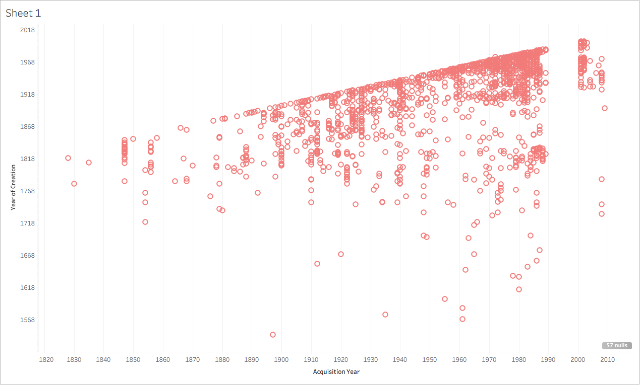
I found Tableau to be hard to use (though JJ did point me in a direction of Tableau’s resources page, which has a lot of helpful videos). For my experiments with Tableau, I used collection data about the Tate’s collection. To start, I tried a very easy comparison between the date a work was created and the date it was acquired by the Tate. The results were neither exciting nor surprising which goes to show that data visualization is only as useful as you make it.
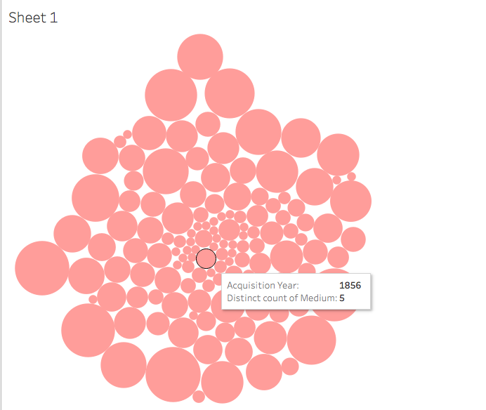
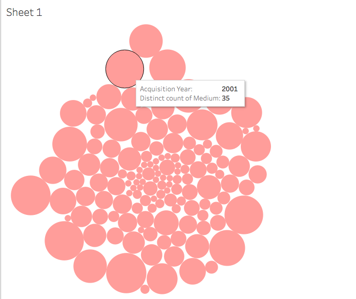
I then decided to see if there was any connection between acquisition year and medium. As the Tate grew (and aged), the museum collected a higher variety of mediums. In 1830, only one medium was collected (might I assume it was painting?). In 2001, artworks of 35 different mediums were acquired by the Tate. I struggled to figure out how to label the visual elements of my chart, and decided I would have to be satisfied with obtaining information about each circle by hovering over it to reveal the data. With any new digital tool comes an often steep learning curve; I think I would need to spend a considerable amount of time working with Tableau in order to use it in a way that was meaningful and contributed to my scholarly needs.
Sources Cited:
Physics arXiv Blog, Medium.com, “When a Machine Learning Algorithm Studied Fine Art Paintings, It Saw Things Art Historians Had Never Noticed,” https://medium.com/the-physics-arxiv-blog/when-a-machine-learning-algorithm-studied-fine-art-paintings-it-saw-things-art-historians-had-never-b8e4e7bf7d3e,