Women Architects and World Fairs

Category: ARTH 851 Fall 2019 (Page 3 of 9)

3D Modeling: Google SketchUp and Replicas in Museums

This week has been all about 3D modeling. We looked at a lot of examples from scholars recreating ancient or medieval architecture and objects. There are so many benefits to 3D modeling in those realms, but I want to focus in my post on how I have used the tools and how I can envision using them in my own work as I continue to get better at them.

I want to begin this post with the only experience I’ve had prior to this class with 3D-modeling, which is working with Google SketchUp. I’ve worked with it during a variety of internships at multiple museums as part of exhibition planning. In those internship contexts I didn’t appreciate how much goes into using the program. It is easy to “hang” works in the galleries on SketchUp and to populate the architecture with works of art (you can adjust proportions and manipulate placement very easily). Because the museums already had exact models of their gallery spaces, what I didn’t realize was how much background works goes into building the physical space that I was then putting art into. That part is the real work. Since I don’t have access to most of the SketchUp files I created in those contexts, I’ll show another example that I’ve made using SketchUp for a class.

For a project in a seminar in undergrad, I was tasked to reimagine a way in which to engage with Confederate monuments. I looked at New Orleans as a case study because of how many news stories were coming out of the city regarding the topic at the time. I looked at previous examples of museum exhibitions that looked at colonial and military histories that I felt were relevant in looking at strategies to incorporate in this example.

Screenshot of my “exhibition” of New Orlean’s Confederate monuments

After trying in vain to build a museum space myself, I ended up borrowing the architectural rendering from one of the museums I had worked at. In the gallery space shown you can see the empty pedestals of the Beauregard Equestrian Statue and the statue to Confederate President Jefferson Davis are on view.  Behind both are photographs of either the vandalized original statues, or edited photographs of what the monument could be.  For example, behind the Jefferson Davis pedestal is an artist reimagining of the statue as a monument to Angela Davis.  The literal absence of the physical statues emphasizes the possibility of reimagining them, as well as decentralizes the figures from the narratives and instead underscores the response from the community.

Back to the point of this example though, you can see that my use of SketchUp is pretty limited. It is easy to incorporate flat images (see the images on the walls), but I had difficultly demonstrating that objects were three-dimensional. I wanted to show that I was including the actual pedestals (not the sculptures, just the pedestals with graffiti), but since I couldn’t include an actual 3D model I simply added a box with the same image on all four sides. I consider this a low-tech solution. Remember, that when you’re in the actual program, you can drag yourself through the space so when you’re “walking” around the center pedestal for example, you do get some sense of what you’re seeing even with just the pictures.

Let’s turn to objects…

I’d like to pivot now to a discussion of 3D scanning and the modeling of objects rather than spaces. In their article, “3D Scanning and Replication for Museum and Cultural Heritage Applications,” Melvin J. Wachowiak and Basiliki Vicky Karas write that “3D scanning neither replaces nor is fully comparable to photography, structural imaging such as radiography, computed tomography (CT scan), colorimetry, and other measurement techniques.” There are already so many tools at museum’s disposals that are used to catalog and record information regarding their collections. It is a simple next step to begin to incorporate 3D modeling into this data collection.

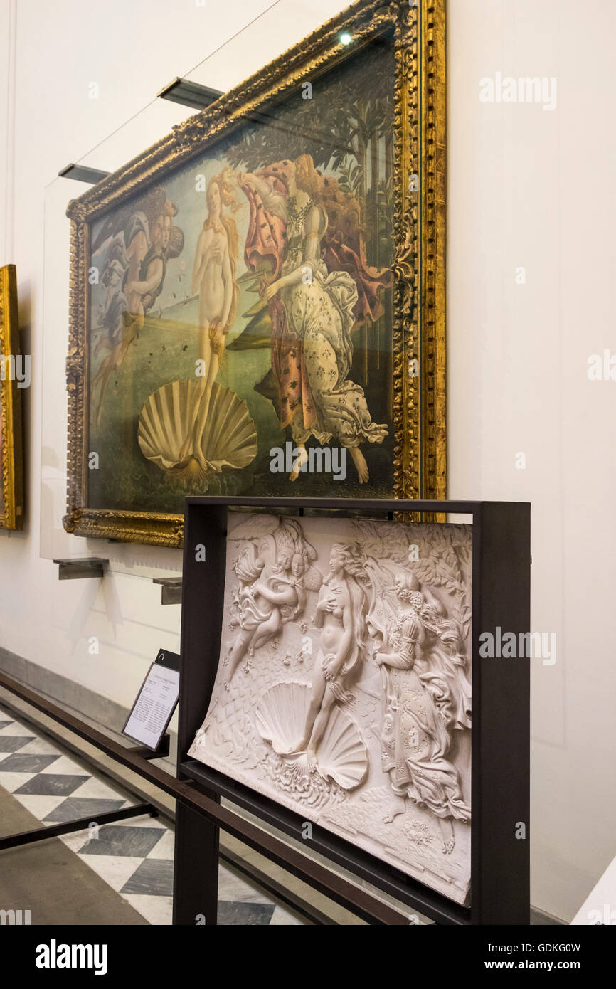
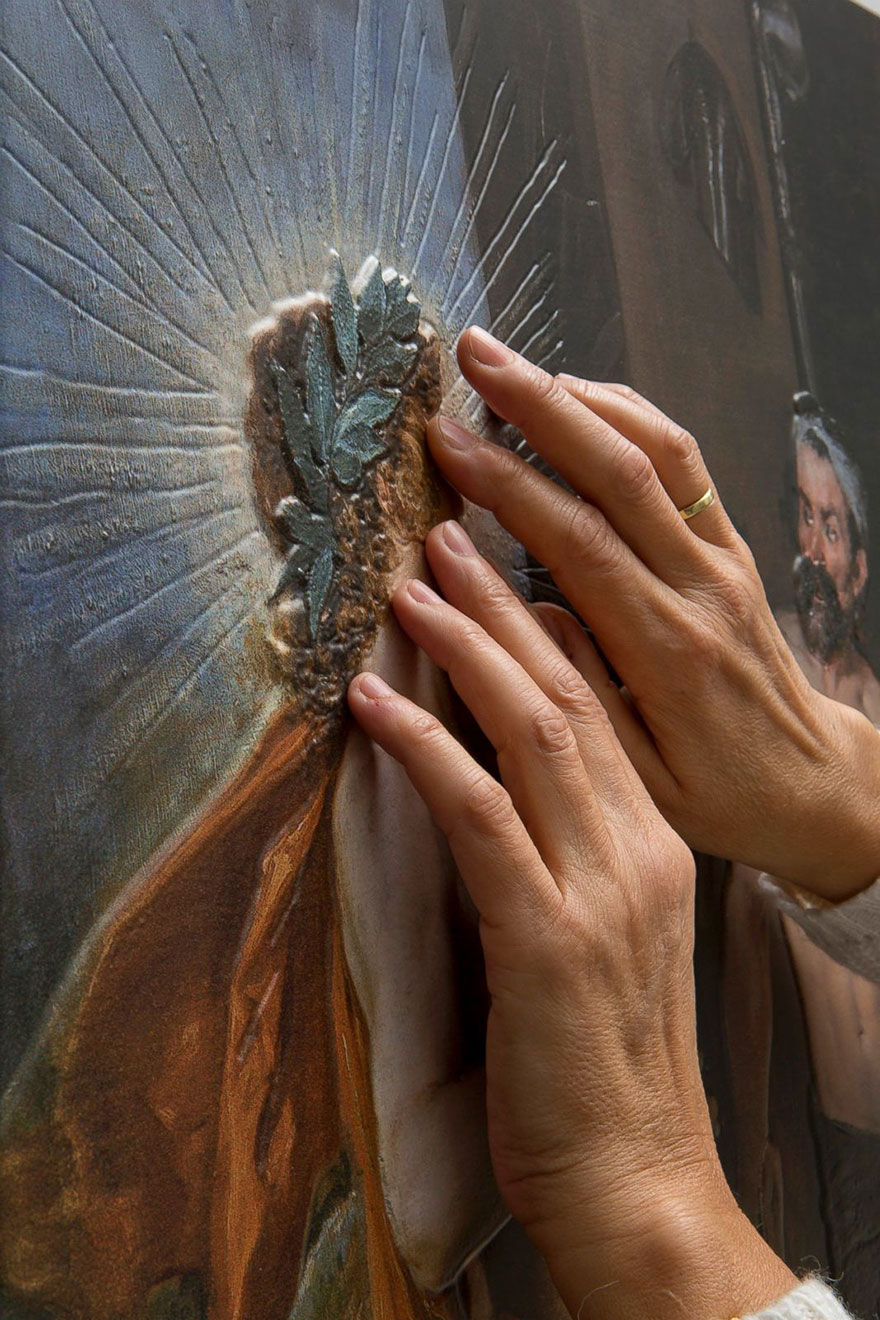
Beyond keeping thorough records, I think there are a number of ways in which models and replicas that are scanned and 3D-printed can be used and incorporated into museum collections. Just one example of how replicas have been used in museums to improve visitor experience is their use in allowing visually-impaired visitors to interact with the art by actually touching the recreation. The Smithsonian Magazine has a great article on this. In that article, David Hewitt writes, “The solution, the curators concluded, was not simply offering audio or braille guides, but to create elaborate 3-D replicas of key works, which visitors could touch.” 3D modeling allows curators to go beyond what can be conceived of as traditional solutions to allow for greater accessibility to collections by visitors who would otherwise be left out of traditional art museum contexts.

In addition, 3D modeling and scanning can be used in object repatriation cases and the study of indigenous art and artifacts. Again, the Smithsonian Magazine has a great article on how the tool can be used in this way. The article discusses a collaboration between the museum and the Tlingit tribe of southeastern Alaska. As a fun shout out to my university, University of North Carolina-Chapel Hill student and photogrammetry specialist Abigail Gancz was a part of this project. During a conference on the topic of 3D modeling, multiple clan artifacts were digitally scanned and replicated as “insurance” for the clan against future loss. They cited instances where important objects were lost or damaged and had to be recreated by memory. Now, with the help of this new technology, there will be thorough records that can be used to recreate these important objects.

I’d be interested to look more into how many museums have used 3D modeling as a solution for repatriation issues. By making replicas from the original object, museums that have acquired items in less than admirable ways could keep the information in their collections while still sending the originals back to their country/peoples of origin. I’d be interested to see how 3D scanning and modeling would work on classical African artifacts. Many masks or sculptures are made of multiple materials and have had multiple substances applied to them over the years so I wonder if scans could adequately capture those specificities.

Virtual Reality & Academics

Architectural historian Diane Favro, discusses the use of Virtual Reality models in the chapter, “In the Eyes of the Beholder: Virtual Reality Re-Creations and Academia,” in Imaging Ancient Rome. Favro focuses on how historic sites were viewed, experienced, imagined, and held in memory. She identified two goals in the Cultural VR Laboratory at UCLA. The first, was to ensure that models would be created scientifically, and be architecturally accurate. The second, was to
contextualize individual structures in broader urban and geographical settings.

Favro notes that the virtual reality models enable viewers to move through digital environments in real time. This is an intriguing idea. I’m curious to learn more about it. Does it mean we could “walk” through the streets of Ancient Rome or Greece? How does it work? Favro goes on to explain, that the vast possibilities offered by connecting Virtual Reality re-creations with sensorial simulations and complex metadata archives are forcing scholars to assess not only the symbiotic research relationship between different disciplines, but also the theorization of re-creations. So, in short, these virtual reality urban simulations cause scholars to work together collaboratively, as some of the research across disciplines overlaps, as well as to analyze the meaning of these re-creations.

She goes on to state that in the United States, academic advocacy for immersive historic urban re-creation is centered in fields such as preservation, museum studies, and cultural management programs, rather than in the academic fields of archaeology and architecture. Favro notes that these other fields embrace these visualizations as part of their education program. Why aren’t scholars in archeology and architecture embracing the re-creations of cityscapes? They believe they are too simplified and too hypothetical.

“Not infrequently, all historical urban re-creations are tainted by association with populist representations made for the entertainment industry. Immersive simulations of ancient cities, regardless of accuracy, have enduring sensationalistic appeal. The politicization and exploitation of popular images depicting ancient cities for formulating national identity have, in the eyes of many scholars, further debased the status of reconstructions.”

Diane Favro

Favro then describes the “cloud of suspicion which hovers over all historical re-creations in academia.” This particularly related to those cityscapes whose scale of necessity requires a high percentage of conjectural representation. In addition, this “suspicion” also arises due to a scholarly discomfort with the visual representation of ideas. Favro asserts that once a visualization becomes part of the cultural memory, it gains a life and iconic power of its own, and is freed from academic constraints. These images forcefully shape our thinking. She asserts that images are potent bearers of meaning, as well as constituents of knowledge, and archaeologists, rather than confronting this fact, have ignored this role of images. From an art historical standpoint, the image, or object, is everything.

Favro addresses the scholarly challenges that historical cityscape re-creations face. She notes that while it is possible to reconstruct a single building with a fair degree of accuracy based on the physical remains and analogs, the same is not true for expansive urban cities. Any urban re-creation that aims to represent environments holistically must, of necessity, involve extensive reasoned approximation. By far the most common criticism of the virtual reality models is that they are too conjectural. It must be explicitly explained that the virtual reality models are based on extensive research, yet in order to show the buildings holistically, significant sections are based on reasoned conjecture. Scholars believe that the educated, or reasoned, guesses the recreations make devalue the overall authenticity of the project. I think it would be difficult to get a group of experts to agree on all points of a cityscape recreation, but that doesn’t mean that we should give up, or state that they don’t have any value. Speaking as a visual learner, these recreations have a tremendous educational value, regardless of whether they are one hundred percent accurate.

Favro adds that in these recreations, the ageing of materials is not depicted, and this can cause some confusion in the viewer. The viewer is asked to accept the omission of unverified aspects, such as color and sculpture, while simultaneously being asked to accept the inclusion
of hypothetical components, such as floors and urban infill. She notes that the distinction between the two categories can become blurred in the mind of the viewer.

Scholars and the general public are polar opposites in their reception of these historical recreations. Lay observers tend to criticize the lack of painterly qualities in the digital recreations, while scholars the presentations are too aestheticized. Scholars maintain that the aesthetics of a color palette, rendered shadows, and textures, conveys unverifiable, and even biased interpretations of facts. I think there must be a way to meet somewhere in the middle. Perhaps scholars could agree on a certain amount of accuracy that would be acceptable for K-12 educational projects.

There are a host of benefits to this type of digital humanities project. The construction of virtual reality models has stimulated interdisciplinary exchange between scholars in the arts, humanities, social sciences, and physical sciences. These projects are collaboration intensive, and require teams of experts working together to achieve accuracy and success. Virtual reality models create new avenues of research, interdisciplinary collaboration, and add to the educational resources of teachers. I would love to see one for myself, and am excited to work on our 3-D project. One of the aspects of the cityscape recreations that Favro mentioned really stuck out for me, and that was using these recreations to get the mood of an ancient city. That idea has captured my imagination. To explore an ancient city, in real time, and get a feel for its mood? To experience that, I would be happy to accept the “reasoned conjectures” of the team programming the cityscape.

Bishop by annieposlusny on Sketchfab

Above is the 3-D model I built today in class using Agisoft and Sketchfab. This was a fun process, and not as complicated as I thought it might be. I’m looking forward to photographing objects at the Ackland museum next week, and building another model.

References:

Diane Favro. “In the Eyes of the Beholder: Virtual Reality Re-Creations and Academia.” In Imaging Ancient Rome, edited by Haselberger, Lothar Williams Symposium on Classical Architecture and John H Humphrey, 321–34. Supplementary Series 61. Portsmouth, R.I.: Journal of Roman Archaeology, 2006.

Working with Networks

Scott Weingart’s “Demystifying Networks” serves as a great, easy-to-read introduction to Network Theory and Network graphing. Network theory, as Weingart notes, is a growing interest for many scholars– especially art historians! He defines Network Theory/Studies as such:

Generally, network studies are made under the assumption that neither the stuff nor the relationships are the whole story on their own. If you’re studying something with networks, odds are you’re doing so because you think the objects of your study are interdependent rather than independent. Representing information as a network implicitly suggests not only that connections matter, but that they are required to understand whatever’s going on.

Scott Weingart

I find his last point to be key– that relations between people, objects, places, concepts, etc are necessary to understand a complete context (story). For art history, I think this makes sense– in fact you could argue that network theory is woven into the foundation of the discipline (art, after all, doesn’t exist in a vacuum, but rather in many networks– private and public, local and global, etc. My point is not to argue that Art History is a form of network studies, but rather use this idea to say that Network Theory is definitely a viable and at times lucrative tool to art historical scholarship.

So how does this translate into Digital Art History? The rest of Weingart’s article describes and explains the ways one can graph networks– that is, turn the idea of a network into a visual. He outlines the many parts of a network and how they can split into different forms (ig. nodes can have two parts, bimodal). He gives some (very basic) examples of what a graphed network might look like, which I think help to reinforce his description. But when looking at these graphs, I think back to his explanation of Network Theory– “Representing information as a network implicitly suggests not only that connections matter, but that they are required to understand whatever’s going on.” Nodes can be connected with lines, symbolizing an interaction. But do these lines necessarily communicate the necessity of that interaction? Take his example:

This network graphs the relationships between Authors and Books, with the lines indicating that the Book (teal) was written by the Author (red). Again, this is a basic graph to serve as an educational model, but the question still applies– is it necessary? Do we need Network Theory to understand the relationship between an author and his books? Not really. Furthermore, is this a network in which we must understand the connections (the lines) to understand the author and or the book? Of course, books wouldn’t exist without authors, but I think the point here is that the network is not producing anything new about the book, the author, or the relationship between the two. We don’t need a visualization like this to know that a book was written by an author.

In fact, Weingart warns us of blindly applying network theory and visualizations to our research, what he calls methodology appropriation. He cautions us to be mindful about when it is best to apply network methodology to our work and critical in evaluating its usefulness. A fancy graph might look cool in your publication, but could be superfluous.

This leaves me with some questions: How can art historians train their critical eye to know when and when not to graph a network? With a strong push for data visualization, it might seem oh-so-appealing to supplement your text with a network graph, but how can we learn when this is actually the wrong move? Furthermore, how can we begin to reimagine network visualizations to communicate the dependency of networks– not just that relationships exist, but that they are necessary to understand the two (or more) parts/nodes. Lines just don’t seem to work, in my opinion. But what will? All in all, I am for network theory and graphing as a method to art historical scholarship, but believe that there is still room for improvement.

Bibliography:
Scott Weingart, “Demystifying Networks”, http://scottbot.net/lets-talk-about-networks/

Network Analysis

Scott Weingart discusses the basics of networks in his article, “Demystifying Networks.” He cautions that, “Networks can be used on any project. Networks should be used on far fewer.” Weingart warns not to apply networks to everything. He notes that network studies are made under the assumption that neither the information, nor the way the information relates to itself is the whole story. I began to have difficulty following the rest of the article at this point. As someone inexperienced with these terms, networks, 2-mode, bimodal, and multimodal sound like another language to me. And it is, a digital language. Weingart went on to stress,

“Besides dealing with the single mode / multimodal issue, humanists also must struggle with fitting square pegs in round holes. Humanistic data are almost by definition uncertain, open to interpretation, flexible, and not easily definable.”

Scott Weingart

He states that many in the digital humanities use or “borrow” networks from others, when these very same networks were creating to answer a specific question in a specific way. Weingart urges us that we “must be willing to get out hands dirty editing the algorithms to suit our needs.” This is sound advice, but I would have no idea where to start editing an algorithm. In the increasing use of digital tools and technology, many, in an attempt to “keep up” resort to borrowing a network, while also lacking the skills to alter it to suit their needs, or the parameters of their project. At times, digital humanities projects offer the illusion of speed and facility, but as we have learned this semester, that is not necessarily the case. From the very beginning of a digital project, there are a great many decisions to make, and these choices impact the success of the project. The careful organization of data, for instance, is one key factor.

Weingart gives a hypothetical example of a digital humanities novice falling into a particular trap. Newcomers will take a dataset, load it into their favorite software and visualizes it to create a network. At this point Weingart blames the ease of use of the software as well as the non-technical description of the buttons for what happens next. According to the author, the novice will press these enticing buttons to see what will come out. The trap is that the novice changes the visual characteristics of the network based on the buttons they have pressed. First of all, as a novice, I resent the implication that I am like a child with a toy, willy-nilly pressing random buttons. Second, even though I am a beginner, I would never assume that my curiosity about what would happen to my network if I changed some of the settings would lead to a scholarly conclusion. I am well aware of what I do, and do not know. It is not the fault of the software if the user is foolhardy in the conclusions she draws from it. Weingart seems to imply that the software should be more difficult to use, and the buttons more technological to impede a beginner’s use, so as to spare us from our ill-advised assumptions. Are we, or are we not trying to encourage more people (especially those in the humanities) to move into the digital arena? If the technology is too difficult to learn or use, then progress towards an acceptance of digital humanities projects will be very slow indeed. Would Weingart prefer to keep digital technology to only those with specific training in the field? If so, then why bother “demystifying” networks, which is an article clearly aimed at the beginner?

One project that we looked at this week was Orbis, the Stanford Geospatial Network of the Roman World, which is an interactive scholarly work (ISW).  The viewer can plot a route anywhere through the Roman Empire as it existed in roughly 200 CE. You can see not only how long this journey would have taken, but also the route, and the expense, based on modes of transportation. You can even account for the season you will be traveling in. ORBIS is a website with both static and interactive components. I was amazed to discover that it only took nine months to build. The designers drew data primarily from the Pleiades project, along with route information from the Barrington Atlas. ORBIS would be a great educational tool for K-12. One of the advantages of DAH projects is how accessible they are to a variety of students. Everyone learns differently, and anything that makes information more accessible and/or more exciting is valuable.

Gephi

This week we worked with Gephi in class. Above is a screenshot of my network. I had difficulty in maneuvering the network image around (perhaps using a mouse would work better than a laptop?) but at least this gives you some idea of what it looks like.

Here are a few of the positives of Gephi:

  • Gephi has a simple interface, and the tool symbols are logical and easy to find.
  • The data import process is easy in CSV format.
  • The software produces a graph automatically once the correct data is loaded and mapped together (edges and nodes).
  • Customization. You have the option to change the size and color of nodes and edges to represent different characteristics of the graph.

The biggest negative for me:

  • In Gephi, there’s not much of an export feature for the map you’ve created. Screenshots can be taken, but you can’t currently export to an image or HTML document. So, what do you do with it once it’s been created?

While only having a cursory experience with Gephi, I’m not sure I would want more. The difficulty in exporting the file is significant, in my mind. If you create a network, you would want others to be able to see it, not as a static image, but as a dynamic one. I admit to being biased against text-based analyses. I have always been a visual learner, and for me personally I prefer Storymap or TimelineJS.

Network Analysis to 3D Modeling

Warning to readers: this blog post is created in two parts as it covers two weeks of material. As I was unable to finish my blog post from last week on network analysis but still thought it was important information, I wanted to include some of the material that I had written. My second part of the blog post will be spent on this week’s topic: 3D Modeling. With that being said, let’s get this show on the road!

(Net)workin’ 9 to 5

When looking at the theme of this week’s class, the words ‘network analysis’ did inspire a strike of fear in me, to be honest. Coming from my SILS background, anytime I hear “network analysis,” I am brought into the realm of system analysis, database creation, and all other scary things that I try my best to avoid in the “information science” part of my library degree (I will happily lead all those scary items to Emily C., thank you). But, once broken down into simple terms, and also related in applicable ways in the field of art history, network analysis becomes a lot less scary.

For those who, like me, were a bit nervous in approaching this topic, I would highly recommend Scott Weingart’s blog post “Demystifying Networks.”

Link to Weingart’s blog post.

As the title suggests, Weingart succinctly goes through all of the terms associated with networks and provided an excellent overview of the conceptual information associated with networks. For someone who is new to networks (and a bit fearful), this really basic introduction was extremely helpful for my introduction to the topic. But, more than any of the conceptual definitions Weingart offers or even the explanation of what networks are and how they are used, it is the ‘warning’ that he offers at the beginning of the post that I found most compelling. As we have learned more and more tools throughout this semester and looked at various ways in which you can utilize resources in the digital humanities in our own work, specifically within the field of art history, not every tool is actually useful for research. Weingart writes

“Networks can be used on any project. Networks should be used on far fewer.

Scott Weingart. “Demystifying Networks.”

This approach, and reminder, to network analysis, as well as all of the digital technologies that we have talked about this semester, is extremely important. Just because it is a new tool that you know how to use, it doesn’t mean that you actually should use that tool. Weingart points out that almost anything can be placed in a network; we have looked at that various tools that you can just plop your data sets in and the technology does the rest. But before you include this visualization in your research or place it in a presentation, it is important to ask yourself: is this network analysis altering the question I’m asking? Is it helping me support my thesis? If not, then it might not be productive to use it. This mindset is something that I think many digital humanists should incorporate in their

3D Modeling

In contrast to the week on network analysis, 3D modeling is a much different tool and, therefore, it is utilized in a different way than projects with 3D modeling. Unlike some of the other topics that we have covered in class, there are a variety of articles that have directly addressed the methodologies that have been created. This was a really interesting facet to me as I felt like, in the majority of articles or readings that we have encountered this semester, the methodologies were not something that was clearly expressed or even discussed in the majority of the readings. For reference, here are the citations for the readings that we went over this week:

  • Diane Favro. “In the Eyes of the Beholder: Virtual Reality Re-Creations and Academia.” In Imaging Ancient Rome, edited by Haselberger, Lothar Williams Symposium on Classical Architecture and John H Humphrey, 321–34. Supplementary Series 61. Portsmouth, R.I.: Journal of Roman Archaeology, 2006.
  • Alessandro E. Foni, George Papagiannakis, and Nadia Magnenat-Thalmann. “A Taxonomy of Visualization Strategies for Cultural Heritage Applications.”  Comput. Cult. Herit.3, no. 1 (July 2010): 1:1–1:21. doi:10.1145/1805961.1805962.
  • Christopher Johanson. “Visualizing History: Modeling in the Eternal City.” Visual Resources 25, no. 4 (2009): 403–18.
  • Brent Nelson, Melissa M Terras, and Lisa Snyder, eds. “Virtual Reality for Humanities Scholarship.” In Digitizing Medieval and Early Modern Material Culture, 395–428. Toronto, Ontario; Tempe, Arizona: Iter : Gateway to the Middle Ages and Renaissance ; ACMRS (Arizona Center for Medieval and Renaissance Studies), 2012.
  • Pitukcharoen, Decho. 3D Printing Booklet for Beginners (Metropolitan Museum of Art, New York, 2014). http://www.metmuseum.org/~/media/Files/Blogs/Digital%20Media/3DPrintingBookletforBeginners.pdf
  • Jentery Sayers, “Made to Make: Expanding Digital Humanities through Desktop Fabrication,” Made to Make, DH 2013. http://dh2013.unl.edu/abstracts/ab-441.html
  • Melvin J. Wachowiak and Basiliki Vicky Karas, “3D Scanning and Replication for Museum and Cultural Heritage Applications,” JAIC 48 (2009), pp. 141-158. http://www.si.edu/content/MCIImagingStudio/papers/scanning_paper.pdf

Before reading these articles for this week, I was really only familiar with 3D modeling being used for cultural heritage institutions (more on that later) as well as Classics studies. In this instance, it makes sense for, not only 3D modeling but many digital humanities tools to be used in Classics studies. Unlike the majority of fields in Art History, Classics scholars focus on objects and works that are often damaged, or even completely lost. Just like it makes sense that the architectural historians were some of the first to embrace the digital humanities as it most aligned with their own research, it makes sense that Classics would use 3D modeling as it could affect and broaden their own research topics.

One of the things that we discussed in class that I think is integral to emphasize is the fact that in may instances, especially with scholars who study other pre-modern global cultures, the 3D models often involve speculation in order to recreate the object. In light of this, it is easy to criticize the fact that there are a lot of inferences being made by the scholar or the person creating the model. But, this is something that has occurred throughout the field of art history or even history. For example, I am currently a Teaching Assistant for the survey class “Introduction to the Art and Architecture of Pre-Hispanic Mesoamerica.” In this class, we constantly look at objects- whether stone sculptures, ruins of temples, or mural paintings- that are extremely damaged. In these instances, scholars are extremely likely to create recreation drawings of these ruins. In these instances, they are making guesses, based on the other objects that they study, to fill in what is not there anymore. Because of this, I don’t think we need to be extremely wary of digital tools doing the same thing.

Hieroglyphic Stairway, Structure 10L-26 (K’ak’ Yipyaj Chan K’awiil), completed ca. 755 CE (Late Classic Period), Maya, Copán, Honduras.

Hieroglyphic Stairway, Color Reconstruction Drawing (by Tatiana Proskouriakoff), Structure 10L-26 (K’ak’ Yipyaj Chan K’awiil), completed ca. 755 CE (Late Classic Period), Maya, Copán, Honduras.

3D Modeling Projects

For me, the first thing that comes to mind when I think about 3D modeling projects that are useful and beneficial to the field are 3D models that are used to crease accessibility services. There are many instances when 3D models are created to help people with visual impairments ‘see’ the object. Being able to add another sense can greatly impact an understanding of an object, even beyond those who are visually impaired. These are already being implemented in some museums, but I think about increasing this service is a wonderful way to broaden the communities who museums are able to reach.

Image result for 3d model of spring by botticelli in the uffizi
Sorry for the quality of the image- the only one I could find online! Pictured here is a 3D model of “La Primavera” by Botticelli in the Uffizzi in Florence

classic-paintings-3D-visual-impaired-prado-museum-madrid (9)
Exhibition at the Museum of Prado

Networks and how they can connect to art history

I want to start with a basic example of a network that may be a helpful jumping off point. I presume most of you have seen a subway map. If you have, you’ve seen and worked with a network before! A network seems like it should be confusing, but really it is just a way to show relationships between different “nodes” or pieces of information. One professor I had in undergrad used this analogy to introduce network theory and, interestingly enough, my professor at UNC used the subway analogy as well to demonstrate her point. Obviously, it works!

Let’s take a look at this image of the NYC subway map. Each station represents a node on the network, and each line in between the stations is an edge. Depending on your discipline, the terms node and edge may vary, but for clarity’s sake I’ll stick with these. An important concept that is related to nodes is their centrality. Centrality very simply measures the importance of a node. One way of thinking about this is how many connections are being made to a certain node, those with more connections are more “central.” Let’s look back at the subway map as an example of this concept. In Figure 2 I’ve adjusted some nodes; I’ve made two station’s nodes larger to represent that more lines converge there. Times Square in Manhattan and Atlantic Terminal in Brooklyn both are meeting points of multiple lines so I’ve enlarged their nodes to note their centrality. This makes the network graphic more useful. Without the adjustment, it seems as though the east 23rd street station on the 6 line and the Times Square station are the same size, which if you’ve ever been on the NYC subway you know is definitely not the case. Another way that changing nodes would be helpful in this case would be to show at which stops the local and express trains overlap. Let’s look at the two green lines, the 4/5 express trains and the local. They are depicted side by side and in places where all three stop there are simply 2 nodes. It could be easier, or at least a more simple graphic, if you had one green line representing all three train lines and smaller nodes would represent local stops by larger nodes would represent where both the local and express trains stop (since there are no stops that are only express and not local this would work). But enough about subways…

If you’re still not comfortable with the basics of networks, see Scott Weingart’s post on “Demystifying Networks.” Weingart does a great job of explaining the basic terminology, different types of networks (bimodal or multimodal for example), and how to read them. Something that Weingart mentions that I want to highlight is that a lot of context is stripped away in order to achieve readable network. I highlight this because the subway example doesn’t necessarily demonstrate the risks of reducing information well.

Let’s take a look at more examples

I want to preface this section with my usual cynicism. While I definitely think networks are useful, I think they are best used as presentational tools rather than research tools because of how much information is stripped from them. While they are helpful to include in presentations or to inspire research questions, applying research questions to them risks oversimplifying the issue. With this caveat in mind, let’s look at some of the examples that were brought up in class.

Let’s look briefly at how Scott Weingart introduced networks and an example he provided. In the example he provides a bimodal network. If we remember from earlier, this means there are 2 types of nodes, they can be either books (in blue) or authors (in red). In this example, he also has two types of edges. The black lines represent the relationship between author and book, i.e. who wrote what. The pink edge shows authors who collaborated with one and other. This is a relatively clear example of a network. There is not much overlap between concepts and relationships are obvious. It is almost clear to the point that you may ask: why bother with a network graphic? That’s exactly what I asked when I first read his post at least. The configuration of the different lines as swooping around and the apparently hierarchy of the nodes in the image makes it appear as if I should be getting more out of the image than I really need to. It seems just as easy that Weingart could have written “Edith Hamilton –> Mythology” on a horizontal plane rather than swooping the line dramatically to connect two floating bubbles. Again for me this represents an instance where it is definitely possible to make basic facts visual, but why. Obviously he merely intended this as a simplified example, but I think my point can be applied more broadly.

ORBIS: The Stanford Geospatial Network Model of the Roman World

Let’s talk about a finished example for a second. Take ORBIS: The Stanford Geospatial Network Model of the Roman World. This project is a massive undertaking. Poke around on it for a few minutes and you’ll realize not only how much labor went into making it, but how much data and research went into making it accurate. When I first interacted with the site I skipped the introduction and tutorial, and let me tell you that was a mistake. This is a fabulous tool, but there are so many moving parts it is difficult to use intuitively. At first glance it definitely doesn’t look like a network in the sense of the subway map or author/book examples I’ve discussed up until now. However, we can see that it is demonstrating a system of relationships in a visual way. Different places act as nodes and travel routes as edges that show the complex interaction of trade goods and distribution in the Roman World.

Screen shot of using ORBIS

I looked at the fastest route you could take with a porter (on roads) from Constantinopolis (in modern Turkey) to Corduba (in modern Spain). The fact that the menu on the left has so many ways to specify the travel is already amazing– you can specify you want to take an ox cart or a donkey rather than walking! We talked a lot in class about how all of us felt like we were using GoogleMaps when we were choosing the routes on the website. It was truly fun to play around with. But back to the point, this is still a network analysis! You can see the nodes on the map as the little circles that represent locations and the edges as the travel route. Thinking through networks in this way as not only a conceptually simple map, but also as something that is so malleable and manipulatable is really important. You can have the same base map (here of the Roman World) and demonstrate multiple networks on it using different nodes and edges in it. A cheaper route to Corduba from Constantinopolis may take me a completely different way via different roads (or edges) and stopping at different cities to restock (so at different nodes).

My own example

Network showing where some artists in the Tate collection were born, created using Palladio

Using that public Tate collection data I’ve used before, I created a network showing where artists were born. I used Palladio, which is an online tool. I found it quite easy to use. Honestly, once you upload or copy and paste your data into it it does pretty much all the work for you; really all you need to do is organize an Excel sheet with your data. Although the screenshot is small, you can see that there are nodes that denote artist names, and nodes that are locations of where they were born. I’ve sized the location nodes so that nodes with more centrality, which if we remember means more edges connect to it, will appear bigger. In this screenshot we see that London is a much larger node than Beijing because many more artists were born in London. I have a similar critique to Weingart’s example where the random placement of the nodes seems to imply something even though it really doesn’t. It doesn’t bother me as much in this example, but I still can’t figure out a rhyme or reason to the placement of the nodes on the graphic. It would be interesting to overlay this example onto a map perhaps, since it seems silly to have London, Venezuela, and Beijing right next to each other here when the network doesn’t seek to show any relationship between the places.

This network is simplistic and I’m not sure exactly how I’d use it in my art historical research, but I can see a multiplicity of uses for museum administration and acquisition meetings (sensing a theme anyone?). It is very easy to visually see which locations are represented more strongly in the collection. For a general public this could also be helpful as an introduction to the museum collections. I can envision this type of network being implemented into a larger interactive digital collection initiative like the Artlens Wall at the Cleveland Museum of Art which we’ve discussed in class.

I want to quickly mention we also played around with Gephi, but I wasn’t crazy about it. It did give you a few more options, but I didn’t think it was as intuitive to use as Palladio so at my level I’d likely stick to Palladio.

Elsa Schiaparelli – life and legacy

Above is timeline about Elsa Schiaparelli; her life, career and legacy, made in TimelineJS. Schiaparelli has always fascinated me (and I’m all but alone in my fascination), as she throughout her career walked the line between fashion and art, merging the two in amazing ways. For this timeline I have added tidbits about her life and career, mainly focus on collaborations and works that we can see being present in our times as well. I had difficulty adding several pictures in one slide, coming to realization that is was probably not possible (please correct me if I’m wrong!), as here it would have been really great if I could have added pictures side by side of Schiaparelli’s works and contemporary work where you can see her influence (even within her own revived fashion house).

TimelineJS was easy to use as it works together with a google spreadsheet; making your posts within the timeline easy to organize. However, they advise against using more than 20 slides, as to make it easier for the viewer to grasp and go through the timeline. I would also argue that it is a good tip for the maker as well, as it got a bit confusing for me when I in the end of my timeline realized I mixed up a few of the slide chronologically, making a hassle to go back and work through to make sure it was correct. They also advise you to create a timeline which in some form goes chronologically, as it otherwise will be confusing for the reader. This made me instantly think of narrating a person’s life and career with the timeline, as it obviously brings an inherent chronological order. The one thing I was apprehensive about is the lack of freedom when it comes to the aesthetic adjustments. TimelineJS enables you to change the colour of the background, as well as some fonts that you can choose between. I would have liked to have changed layout, add pictures more freely as well as deciding font color. However, whilst writing this, I do understand that part of the relatively easy interface would have lost part of the accessibility would have been lost if more changes were enabled.

TimelineJS

Digital Project 3

Here is my completed timeline of Kandinsky that I began working on last week. I had started this project as a way to organize my thoughts on the artist prior to writing my research paper for the Bauhaus seminar. It was definitely useful in this regard. I have never really enjoyed writing outlines, and for me this timeline serves the same purpose, but is significantly better because I can see visuals and text simultaneously. I had way too much fun finding the videos for this timeline — especially video which animates Kandinsky’s art to music. I also enjoyed seeing a clip from a film showing Kandinsky painting. Typically I work in text documents, and this project forced me to look at videos and I’m glad I did, as it opened a new perspective on Kandinsky for me.

Cultural Erasure

Above is a brief example of a timeline I created in class using TimelineJS. I decided to focus on the life of Kandinsky, as I am researching his career as part of the Bauhaus seminar. I thought it would help to organize my thoughts, and to put into visual form the significant moments of his life. I have not had time to finish the timeline, but the above example will at least give you an idea. I find that one of the best uses of a timeline is organization, as well as it affords you the ability to see how different events may overlap each other. Timelines are useful tools for the art historian, and the historian. I had used TimelineJS once before, as we had to create a timeline of German history as a group project in our Bauhaus seminar. The only factor I had difficulty with using TimelineJS was when I tried to add images. There is a specific way you need to copy your image (which I didn’t know the first time I used TimelineJS, but Professor Bauer covered it in class) and if you don’t do it properly, your image won’t appear. This is definitely not what you want to happen during a presentation!

I went to the Digital Conference today at North Carolina Central University, and was able to see Dr. Lyneise Williams’s presentation. She is working on a project examining the images of African-Americans in print, and has run into an issue with archival material. The problem is that when newspapers are transferred to microfilm, the image is distorted and flattened by the process, and many of the gradations from the original image are lost. As a result, the images of African-Americans are obscured by becoming darker than they actually are. If microfilm is then digitized, it is now two steps removed from the original, and the distortions become greater. Dr. Williams explained that the people tasked with digitizing magazines and newspapers are primarily concerned with the text being clear and legible, and that image quality is not considered. She states that the most frequent response she hears when she points out the issue at the various archives she visits is, “We never thought about it.”

This problem has several components. First, Dr. Williams notes that the individuals tasked with digitizing the material are not archivists. They do not consider the image quality when digitizing magazines or newspaper articles. Second, archives are moving completely to digital collections in order to save space, so it will no longer be possible to find the original, primary documents. In this case, Dr. Williams traveled to Paris to find old copies of magazines in shops. Third, the distortion of African-Americans images in history is a form of cultural erasure. Their features can be darkened to the extent that they become a mere shadow, in which they can no longer be recognized. There is something deeply disconcerting about this. Not only is this something that hasn’t been considered, in many cases it is too late to do anything about it as the original photos no longer exist. The idea that people of color are having their features inadvertently darkened to the point that there is a marked difference, and that the move to digitize all archival documents is going to compound the issue is awful.

I also learned that Kodak photographic paper was created and color-keyed for a white person’s skin tone. While this is not surprising, I was unaware that this was the case. This meant that all people of color appeared much darker in the photographs than they actually were. It’s a form of racial bias in the development of photography which I suspect many are unaware of.

The question remains, what do we do? Archives are running out of room, and soon most if not all of them will only work with digitized materials. But the very nature of the digitization process is inherently problematic for representations of people of color. The materials we use, the techniques we use to digitize newspapers can obscure the features of a person. How do we preserve the original images? And what do we do when the original images no longer exist?

As art historians we are taught to examine primary sources. We examine the objects we research. What if these objects no longer existed? What if a new technology came along which seemingly made these objects more accessible, but obscured and altered the image to a significant degree? What if this is all we had left? This is the issue that Dr. Williams is facing in her research. For art historians, the visual image is the very center of our work. But it is possible, and even likely, depending on the area of our research, that the very images we see are not accurate representations, and may even be misleading.

Perhaps the answer is for the field of digital art history to expand. If there were people trained to consider both the text and the image, then perhaps we could stop any further degradation of the image from occurring. But what about the history of people of color in the United States? Most of the original photographs and/or negatives have been lost or destroyed. We are left with the distortions created by microfilm, or the double distortions of microfilm which has been digitized. I was saddened, but not surprised to discover that we have ignorantly been culturally erasing people of color from history. As art historians exploring digital technology, it is crucial for us to remember that even seemingly small choices matter. The very materials we use to make information more accessible can have flaws which render the images inaccurate.

Let’s talk about timelines

I’m a big timeline fan. I’ve always thought they were fun to make for school projects, and as a visual learner they have always helped me make sense of complicated histories. As an obsessive organizer, I am particularly fond of color coordinated or otherwise embellished timelines. I think it not only adds a little pizazz, but also helps the reader navigate the information.

I’ve worked with Timeline JS before and think it is a really easy tool to incorporate into your own practice. My first experience with it was a collaborative timeline of German history for a Bauhaus seminar this year. As a class we each added events from a 20 year period to a communal timeline that spanned German history from something like 1700-1940. We covered a lot of information. The platform was easy to use collaboratively because it operates based on a Google sheet, so it constantly is updating to reflect what your peers are adding. We only had one issue of items not coming up on the final product because apparently you can’t have any blank rows in the sheet between events– overall a minor and easily fixable issue once we all understood what was wrong. Based on that experience, I knew I’d have an easy time making my own timeline using the platform, but wanted to see if I could tweak it at all to suit my specific needs. Interestingly, TimelineJS encourages you not to have more than 20 events for your reader to click through. I know our Bauhaus timeline had at least 75 events, probably more, and it was a little long but the length didn’t change anything about the tool itself, just the class’s attention span. Which reminds me, as a user or reader Timeline JS is also very user friendly. It has easy arrow buttons on either side to toggle through events, or you can swipe across the overall timeline at the bottom to move more quickly across a longer span of time to find a specific year. This is much more user friendly in my opinion than one of the other examples we looked at in class by BBC that was a History of England. Moving through that one is much more cumbersome and the individual events are less visually engaging to the reader. However, the BBC timeline is definitely not limited to just 20 events as Timeline JS apparently suggests, so they do a good job of presenting a truly massive amount of data.

For this week’s digital assignment I made a very basic and incomplete timeline of South African history. Sure enough, when I went to create my own timeline I thought it was easy to create events and to add text and images to them. I’ve been having trouble embedding links into my posts, so click here for a link to my timeline.

Screenshot of my timeline on South African history. Click here to view the whole thing.

Something I realized this time around that I didn’t last time was that I wish I could overlay multiple timelines into one. What I mean is that I wish I could have had a “colonial” timeline and a “local” timeline that existed on the same spreadsheet/timeline, but were somehow distinct (maybe different colors? maybe one at the top of the screen one at the bottom?). As a side note, I know that “colonial” and “local” timelines are problematic in that those terms are very loaded, but the point is that I think it’s perhaps not the best way to have the European presence and local histories (whether Xhosa, Zulu, etc) charted on the same timeline. Unfortunately, I couldn’t find a way to manipulate the data in a way that differentiated the two groups. Maybe that isn’t necessary as all the history has becomes so intertwined, but I still think it would be interesting to see just the events related to the Zulu kingdom, or just the Dutch colonial involvement for example. In an ideal world, I could color code the various events in a way that would correspond to overarching groups or themes (Zulu history could be blue, Dutch orange, British red for example) and then I would have a menu on the side that when one of those colors was selected, a timeline of just those events would pop up on top of the page so you could toggle through just those events more easily. A set up like this would show that there were a lot of events happening around the country at the same time. While the British and Dutch were landing on and arguing over the Cape Coast, the Zulu Empire was very much at its height and expanding as just one example. This could also help to remedy any length issues, as you could “shorten” the timeline by just viewing one group at a time.

Interestingly, one of the examples that Timeline JS provides is a timeline of Nelson Mandela’s life. Although much more specific in scope than my own attempt, it is interesting to compare the two. The formatting of the two are quite similar. In fact, there are a lot of similarities, including the image and structure of the event for Mandela being freed from jail (I promise not copied, it’s just the standard image of the event!). The similarities hint at the fact that there is very little customizing you can do using the tool, which really is my biggest critique. One thing I wasn’t crazy about that the example timeline did was that it includes the “time” of the event, however almost all of them apparently occurred at 12 am. I assume this was made in an attempt to fill in all the data fields of the spreadsheet, but it seems like superfluous information to then translate to the finished product unless the exact time of the event was truly relevant (I know not all of them occurred at midnight).

Screenshot of an example of TimeMapper which incorporates maps into a basic timeline format.

The other program we looked at this week was TimeMapper. I hadn’t used the program before, but it seems equally as intuitive to use. It also uses Google spreadsheets to organize and add data, which makes it really easy to use. One aspect that is cool is that it incorporates a map. Although, in the example they provided on the website (see the screenshot I added), the map wasn’t terribly helpful except for as a way to toggle through events. Still, the concept is interesting. Using the screenshot as an example, I’m not sure I really needed the pin in Italy to understand that Thomas Aquinas was Italian when the text clearly states that he was an “Italian Dominican priest.” I can conjure up a basic map of Europe in my head enough that this visualization didn’t elucidate anything new. Nevertheless, I can still definitely imagine using this map feature in a timeline on South African history as I think this would provide important visual context for where different events were taking place since there were colonial and tribal divisions that did constantly shift. This type of map-based timeline reminds me of the New York Times project “Riding the New Silk Road” that we looked at for class. While I think the map adds something to the NYT project, like in TimeMapper I’m not sure how much it really adds aside from a way to toggle through events. In both cases, I wish that the map provided more interaction to the user rather than just a way to get to the next static timeline event.

Screenshot from the NYT “Riding the New Silk Road” project

It isn’t totally clear from just a screenshot of the NYT project, but you can kind of see that the “map” is really just an interesting way to put events on a squiggly timeline. As you click through the timeline, you “travel” along the route from one static event or location to another, really just scrolling down the webpage. Each point on the map/timeline corresponds to one image and text. Sure, you get a geographic idea of where the events are happening in relation to each other, but I’m not sure I would really say you are experiencing riding on the new silk road through this format. Based on the NYT example, I’m less inclined to use TimeMapper over Timeline JS, because I’m not convinced that the inclusion of maps into a timeline adds enough to warrant the extra work. Maybe that’s pessimistic –I definitely tend to be critical to a lot of these tools– but I also know I have limited time and resources and want to be efficient in what I choose to incorporate into my own research.

In the spirit of collaboration and crowdsourcing that is so important for digital humanities, if anyone knows why I can’t embed anything into my posts, please help a scholar out! For the time being, here is the link to my timeline project. I’ve included it in hyperlinks throughout, but I know my theme makes it hard to see those sometimes and I want to make sure my readers can learn a little something about a few events in South African history and see how Timeline JS works!

So here’s the link: https://cdn.knightlab.com/libs/timeline3/latest/embed/index.html?source=1D5sFTliTBMk2c8dxBek4ggXEVfEr7zVK_vv8zkjW8F8&font=Default&lang=en&initial_zoom=2&height=650

« Older posts Newer posts »

© 2024 Claiming a Place

Theme by Anders NorenUp ↑