Women Architects and World Fairs

Category: ARTH 851 Fall 2019 (Page 4 of 9)

The Time Traveler’s Map

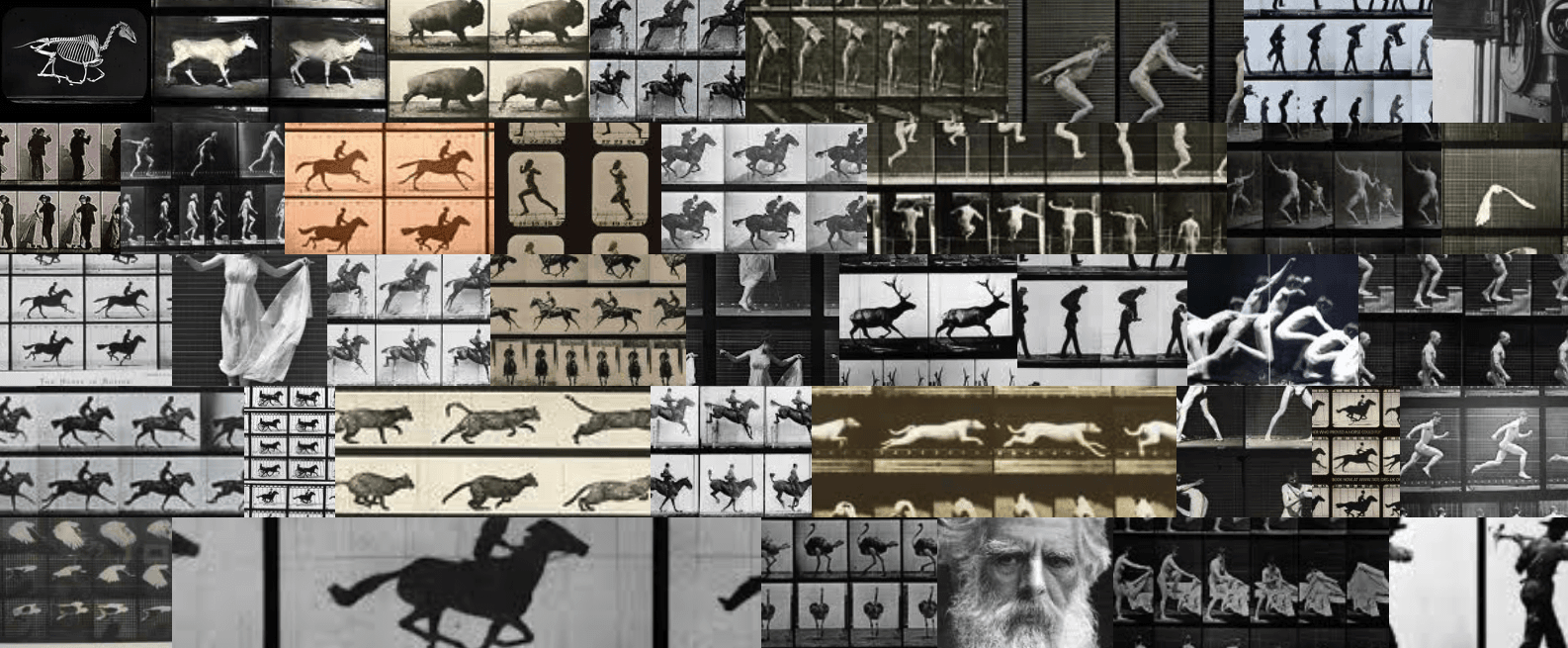
In this week’s topic, we revisited the idea of mapping in digital art history, but this time focused on not only mapping space, but also mapping time. Of the digital tools that we have (and will) look at this semester, mapping time seems to be one of (if not the) most recognizable concepts. Creating timelines and chronologies is nothing new in the humanities, nor in history in general; people have created analog or even digital timelines for hundreds of years- is there a timeline for the history of timelines…? But I digress.

With the advent of new and ever changing digital technologies, there have been new and more interactive tools used to create complex timelines. In the realm of art history, the best known, and possibly most used timeline, is that of the Heilbrunn Timeline of the History of Art, hosted by the Metropolitan Museum of Art. Founded in 2000, the timeline is a comprehensive overview of the history of art and is navigable through a variety of ways and is a very useful and widely positively received resource. Moreover, it is an example of a resource that maps both time and geography. As such, I wanted to spend the majority of my blog post this week thinking about this timeline, and the project as a whole, in relation to the ideas of digital art history. My blog post will conclude with my own example of a timeline that I created using KnightLab’s TimelineJS. But first, let’s look at the Heilbrunn Timeline.

The project describes itself as such:

The Metropolitan Museum of Art’s Heilbrunn Timeline of Art History presents a thematic, chronological, and geographical exploration of global art history through The Met collection. Authored by The Met’s experts, the digital publication is a reference, research, and teaching tool conceived for students and scholars of art history. The Timeline currently comprises more than 1,000 essays, 8,000 works of art, 300 chronologies, and 3,700 keywords. It is regularly updated and enriched to provide new scholarship and insights on The Met collection.

“About.” The Heilbrunn Timeline

It is important to note that the way in which the authors conceived of and approach this timeline is through the works in the Met’s collection. While there are some works of art and artists discussed in the Timeline that are not present in the Met’s collection, I think this is an important aspect to note as it could hide potential biases; if they are only writing about works that are in their collection, what is left out from this “global” timeline? Are there art objects underrepresented at the Metropolitan Museum of Art? This immediately called to mind one of the works by the Guerilla Girls which called attention the lack of diversity in the Met’s collection.

Guerrilla Girls Do Women Have To Be Naked To Get Into the Met. Museum? 1989

While there certainly have been vast improvement in the diversity of the collection from the time that this piece was made, it is important to remember to always interrogate the resources that we utilize, especially if they are new(er) resources as oftentimes the “shiny” factor of a new digital technology can outshine some inherent biases in the resource. I do not mean to be overly critical of the Heilbrunn Timeline- I have used it in my work as a jumping point for my research many times; I just wanted to shine light on one of the issues in creating a “global art history timeline” that only uses (primarily or otherwise) the works in one museum. Though, it is clear that the timeline is truly focusing on the items in the “Met Collection,” as it is clearly stated twice in the opening paragraph in the “About” section.

The digital resource is primarily divided into four different sections:

The Timeline is structured with four components. Essays focus on specific themes in art history, including artistic movements and periods, archaeological sites, empires and civilizations, recurrent themes and concepts, media, and artists. Works of Art celebrate human creativity from around the world and from all eras, and are contextualized chronologically, geographically, and thematically. Chronologies provide a linear outline of art history by geographical region. Each chronology includes up to ten representative works of art, a timeline, an overview, and key events. Keywords—categorized by art movement and style, artists and makers, geography (present-day nation states and historical regions), time period, material and technique, object, and subject matter—further connect chronologies, essays, and works of art.

“About.” The Heilbrunn Timeline

When looking at the front page of the Timeline, you can choose three different options, Essays, Works of Art, and Chronologies, each of which will bring you to its own unique home page. One of the interesting facets of this tool, for me, is the way in which each section incorporates chronology or some sense of time in each of the individual menus.

Screenshot of “Essays” Section with dropdown menu of time period highlighted

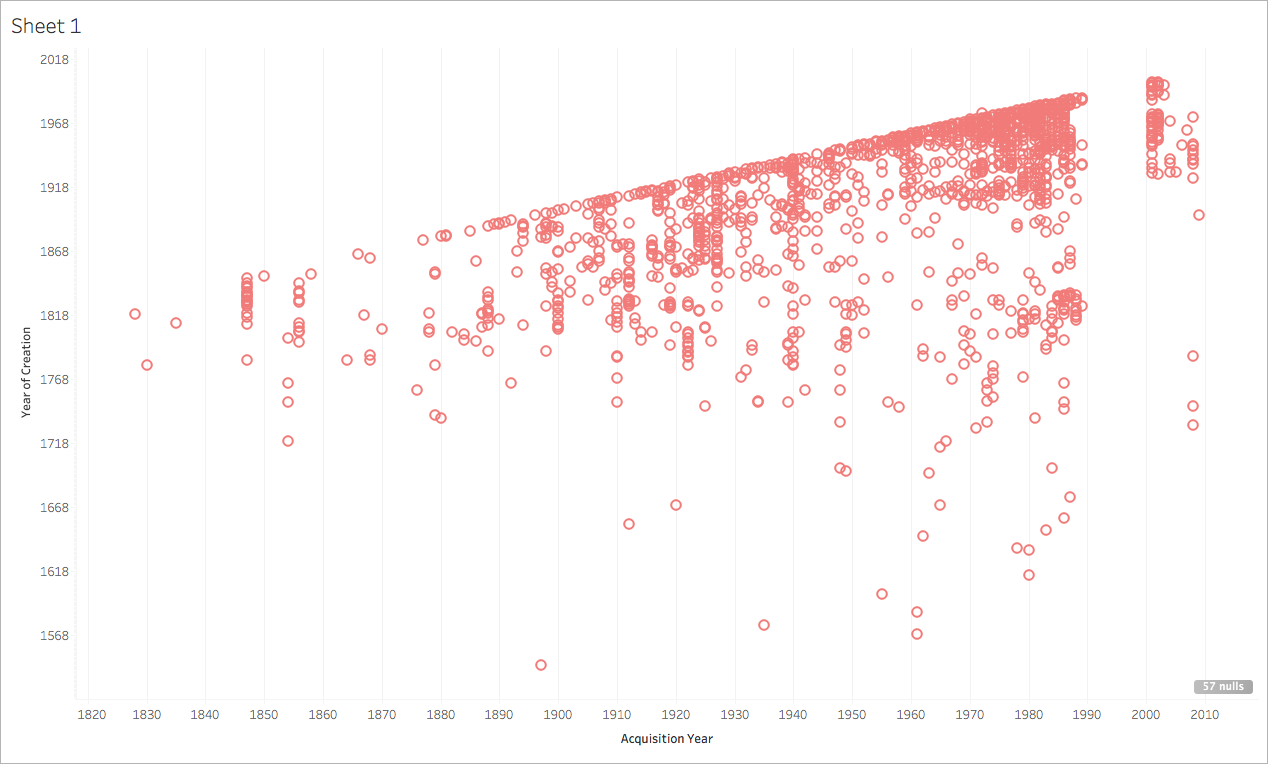
Of all the sections, the “Chronology” section most embodies the mapping time and space that we have looked at this past week.

“Chronology” section of the Heilbrunn Timeline

Through this tool, you can mouse over a geographic area to specify which timeline you might be interested in browsing, or you can scroll through the 291 timelines (just as you can scroll through the over one thousand essays). After choosing a specific timeline or essay, one of the additional resources that I find particularly useful is the inclusion of a bibliography or further reading section, which is great if you are using the Heilbrunn Timeline as an initial resource from which you can jump to more in depth resources. Additionally, all of the works mentioned in the essays or timelines are linked to the object in the Met’s collection (which is now open access if the object is in the public domain!!). Overall, definitely a great resource and example of a complex art historical timeline that maps not only geography but also time.

Timelines & Me

As always, we were able to play around with some tools in class: TimeMapper and TimelineJS. These two are extremely similar with the main difference being TimeMapper includes a geographic map in addition to the timeline. Both utilize a Google Sheets as the template in which you place the data and overall, is quite easy to use.

For my timeline, I wanted to create a timeline that would be useful for me to use in my own research, so I decided to focus it on my topic of my art history master’s thesis. To give an (extremely brief!) overview, I am looking at Tom Phillips’ canonical artist’s book A Humument: A Treated Victorian Novel in relation to Phillips interest in ornament, an area that has been neglected in scholarship on Phillips. In this timeline, I wanted to interweave the publication of various prominent theories of ornament into a timeline on Phillips’ work. While certainly not comprehensive (of Phillips’ history not the entire historiography of theories of ornament), it is an interesting visual to include in my research and the process of creating the timeline made be look at some connections that I had not thought of yet, such as the fact that Robert Venturi was publishing his work while Phillips was at Oxford and he could have encountered the ideas then. Below is the link to my timeline: let me know what you think!

In case the embed isn’t working, here is a link to my timeline.

Tableau, end of “Digital Art History,” Act I sc. ii

One of the thing sI like most is when a data visualization tool encourages play, the more intuitively, the better!If all the world’s a stage, with our parts, entrances, and exits, should “digital humanities” not, by the very nature of its name, promote digital methods to which we see the complicated storylines, character arcs, and acting methods? I believe the best ones do. There are, however, static aspects of a theatrical play, such as the tableau, a still frome easily photographed, pleasing visually and telling of the story in some cases. The Tableau software we worked with this week accomplished just that, but for data sets. And, while I believe Tableau does well enough at accomplishing its purpose (a still visualization of a complex, real life system), we should not get bogged down too much in analyzing it. If we do, we run the risk of losing sight of the intricacies of the human system – or stage, in our metaphor – the nervousness, the adrenaline, the facade, the spectacle, the introspection, the emotion… the part that makes it as much a living, human thing as anything else. The part “the humanities” clings to, quite desperately.

Now, I don’t mean for this to be a heavy critique of Tableau by griping about what it doesn’t do. I would rather engage with it on its own terms. It is moreso the attitude around digital humanities critique that I would like to, well, critique. To start our show, though, let’s just walk through Tableau.

Tableau

Map of Ballads Collected by John and Ruby Lomax on their 1939 Field Recording Trip

My experience with Tableau was not remarkable compared to other data analysis methods I have used in the past. I am impressed with the ease of operations in tableau and the ability to switch between different modes of visualizations, such as polygon map, point map, and basic chart. I also was impressed with the options for topographic map layers supplied by Tableau – I used one above, called “Percentage of Population, Black/African American.” This was an interesting map layer to put under my layer of pin drops showing the frequency of “negro ballads” recorded by John and Ruby Terrill Lomax on their 1939 Southern Field Recording Trip. Notably, it is particularly helpful that in the search for “negro ballads,” the Lomaxes left out a state with a considerably-sized black population. The only issue for these topographic layers supplied by Tableau, though, is that they don’t provide the source or the specific numbers – so it is difficult to say exactly what the statistic is or from what year it was taken. Since Georgia had a sizeable black population in 1939, I still find it a helpful visualization for my purposes, but also would need to be more heavily researched.

The Tableau maps and charts, while fairly quick to make and easy to modify, are not interactive. While the goal of Tableau is not to make interactive maps and visualizations, I will not fault them for this. That would be unfair. I will, however, note that there are other mapping platforms that perform similar functions and let the user (not just the creator) play with map layers, pin-drop pop ups, and topographical layers, such as ArcGIS, CartoDB, and Omeka. While they are less intuitive than Tableau in the map-making process, Tableau is great for creating maps and intentionally thinking about the data in charts, as opposed to batch uploads which magically produce drops on a map.

I hope that in my comparison of these mapping tools I have emphasized a form of writing most scholars are unnused to – compare and contrast, with no objective “best” form of software that does everything. There is no software that does everything – so based on your needs, different software will be best for you. That doesn’t mean that something else isn’t extremely useful to someone else. That being said, there are some forms of digital tool critique that I find quite helpful and illuminating. The first is accessibility and readability.

Especially when concerned with data visualization, we have to keep our reader’s visual literacy in mind. Nessa’s “Visual Literacy in an age of data” offers a nice critique of the ways in which increasingly complicated ways of depicting data actually create more distance between the researcher and the audience and makes you lose readers by making your work visually inaccessible. Practical solutions included opting for bar graphs instead of pie charts; clean, simple text that explains even complex arguments with as much layman’s terminology as possible; and omitting arbitrary visualizations.

We also have to be careful about the way we frame the possibilities and practicalities of digital tools. Physics arXiv Blog’s article “When a Machine Learning Algorithm Studied Fine Art Paintings, It Saw Things Art Historians Had Never Noticed,” makes it sound like the AI potential in their software is capable of things that human art historians were unable to do – this is untrue. They were able to make one connection in particular between two unrelated artworks that hadn’t been made before (presumably whoever noticed this has read all of the literature possible on these artworks and therefore can confidently say that connection had not been previously made). The title of the post is misleading, as even in the article they say that the AI in no way could replace a real, human art historian. The flashy headline to catch readers’ attention to a DH project ended up negatively affecting the overall tone of the article and came across as very off-putting to every art historian I’ve talked about it with.

Data Visualization: How useful is it?

As we have been learning several new tools per week this semester, I think many of us, myself included, have often felt a bit overwhelmed. With that feeling comes a bit of skepticism about a tool’s value in comparison to the labor, time, learning etc. that is required in order to actually get something out of the tool. While reading several articles this week about data visualization, I felt that skepticism creeping up. After playing around with a few tools and talking through my thoughts with my colleagues, I think I have come around to the idea of data visualization (for the most part).

The reading that first sparked this skepticism was “When a Machine Learning Algorithm Studied Fine Art Paintings, It Saw Things Art Historians Had Never Noticed.”  Babak Saleh and a team at Rutgers catalogued and generated data for a set of images and then ‘taught’ the computer to draw comparisons between artworks. My main qualm with this article is that the computer was analyzing written (human generated) text about the images and not the images themselves (which parts of the article kind of alluded to). The pairings that the computer generated were either quite obvious (such as a Picasso and a Braque created the same year) or unrelated in terms of scholarly worth ( Bazille and Rockwell). While this data visualization and analysis weren’t particularly useful, working with digital tools on my own helped me to see how data visualization could, in fact, be worth my time as a scholar.

This week, we worked with several data visualization tools but spent the most time with Tableau. Tableau works with the same kind of data as Excel does, but because of the way Tableau reads data, it requires a little less clean up than working with Excel. This was appealing as data clean up is tedious (but, as a library/archives person, you won’t hear me say that data clean up isn’t worth it). That being said, when working with Tableau, you still have to know how the program is interpreting your data and understand what you might need to do (converting values etc.) to make your data more useful.

I found Tableau to be hard to use (though JJ did point me in a direction of Tableau’s resources page, which has a lot of helpful videos). For my experiments with Tableau, I used collection data about the Tate’s collection. To start, I tried a very easy comparison between the date a work was created and the date it was acquired by the Tate. The results were neither exciting nor surprising which goes to show that data visualization is only as useful as you make it.

I then decided to see if there was any connection between acquisition year and medium. As the Tate grew (and aged), the museum collected a higher variety of mediums. In 1830, only one medium was collected (might I assume it was painting?). In 2001, artworks of 35 different mediums were acquired by the Tate. I struggled to figure out how to label the visual elements of my chart, and decided I would have to be satisfied with obtaining information about each circle by hovering over it to reveal the data. With any new digital tool comes an often steep learning curve; I think I would need to spend a considerable amount of time working with Tableau in order to use it in a way that was meaningful and contributed to my scholarly needs.

Sources Cited:

Physics arXiv Blog, Medium.com, “When a Machine Learning Algorithm Studied Fine Art Paintings, It Saw Things Art Historians Had Never Noticed,” https://medium.com/the-physics-arxiv-blog/when-a-machine-learning-algorithm-studied-fine-art-paintings-it-saw-things-art-historians-had-never-b8e4e7bf7d3e,

Digital Project 3

Kandinsky & Klee

I wanted to create several visualizations using the Chrome plugin, Tableau. I was excited to use it, because it enables the viewer to see a vast array of work in different modes, for example you can zoom in, or view in grayscale. This would enable you to examine brushstrokes, colors, shapes, figures, and patterns. However, I had so much difficulty getting this to work! When I clicked on the download quilt button, nothing happened. Professor Bauer gave me some suggestions, which I tried, but to no avail. So I came up with a temporary solution, which was to take a screenshot of the image, crop it, and upload it here. When I am able to download the image, I will edit the post and add the larger image.

The visualization above is the work of painters Kandinsky and Klee, two Bauhaus artists, who became good friends. As you can see, their styles were similar. I also included Friedrich’s Monk by the Sea painting as well, as we learned it is one of the earliest abstract paintings in Germany, and possibly inspired Kandinsky (I am in the process of researching that potential link).

The quilt below is of my favorite portrait painter, John Singer Sargent. I only included his portraits of women and children, because I wanted to see if his portrait of Madame X is the only portrait painting of a woman he did in profile. From these examples, it certainly looks that way, but I would need to sample images of all his portraits.

Madame X is my second favorite painting of Sargent’s, my first is this one.

John Singer Sargent, Pailleron Children, ca. 1880
The Metropolitan Museum of Art, New York

This was Sargent’s first double portrait, and it depicts the children of playwright Edouard Pailleron and his wife, Marie. His son, Edouard, and daughter Marie-Louise are pictured. Marie-Louise later became a literary figure in her own right, and recounted, (we hope with exaggerration) eighty-three sittings for the portrait, as well as battles about costume and the arrangement of her hair. Sargent has captured Marie-Louise’s unsettling intensity, in an image that departs from conventional Victorian representations of children. Just look at her face — what fierceness!

Visualization software has a lot to offer art historians, especially when working with large amounts of images or text. I hope to become more proficient in using them, so I can better understand all the possibilities.

Where is the “Art” in Digital Art History?

With so many resources, software, and applications at our disposal, the possibilities for digital projects seems infinite. Moreover, the integration of technology in almost every factor of our lives can easily turn any novice to a computer wiz (at least self-proclaimed). Yet, as Diane Zorich states, a Digital Humanist or Digital Art historian is not one who can effectively use Google or who knows their way around the Met’s online collection. A Digital scholar is one who “adopt(s) the computational methodologies and analytical techniques that are enabled by new technologies” to their own research. I’ve mentioned in previous blog posts the utilitarianism of digital art history/humanities– that it is one method within the scholars tool belt. But Zorich poses a question–and its a big one– where is the Art in Digital Art History?

It’s a good question, right? Something to really keep in mind. As I’ve been researching different projects and initiatives, I’ve asked myself it a few times– where is the art? I want to spend this post unpacking this question because ultimately art historical research does not always have to focus on an artwork(s), yet art should be at its center, if only indirectly. Let me elaborate….

I was taught that art history should always focus on the object– that the art guides your scholarly discussion. Any questions or insights should come from within the object as it is the portal to new ways of understanding realities. With this, any method employed should serve the art. It should provide a frame in which the art takes on new understanding. If digital art history is an alternative method, then it should work the same way and for the same purpose (that is to provide a new understanding of works of art).

I should note that my skepticism is in response to digital projects that deal with large data sets– data visualization, cultural and network analytics, and text mining . At the foundation of the many types of data visualization projects is the transformation of data (which can include numerical data to even text documents) into visual forms that may provide new ways of engaging with the information. It seems that these projects help us comprehend trends over time and place and popularity of terms, styles, artists, schools, etc. Of course, there are so many other insights that these projects could present, but i am basing my understanding from the examples I’ve explored.

Zorich presents a few examples of Art Historical projects that deal with large data sets. Lev Manovich at the City University of New York employed a statistical technique called Principal Component Analysis (PCA) to analyze 60 visual features (or ‘image features’ such as color, texture, lines, shapes, etc.) In one project, Manovich applied this model to 128 paintings by Mondrian, creating a scatter plot organized by visual similarity among the works. From this cultural analysis, he explains how this visualization allows you to see, “the parts of the space of visual possibilities (that the artist) explored, the relative distributions of their works– the dense areas, the sparser areas, the presence or absence of clusters, etc.” (Zorich)

As we can see, the presentation of data provides new insights that allow for further inquiry. It prompts a scholarly discussion that centers on works of art. Even with this comparative image of Mondrian and Rothko, we can begin to recognize similarities and ask questions— all of which originate from the paintings themselves. In my opinion, this is a strong Digital Art History project because it applies a new way to engage with works of art that allow for new avenues of research. I doubt that one could notice the comparisons between Mondrian and Rothko through analog methods. We can page and page through catalogues, but even this might not spark such big insights! Manovich’s Cultural Analytics seems to be an effective way to center works of art within a digital project.

Zorich also includes a topic or textual mining project in which large corpuses of texts are mined and visualized for popularity of words and themes. She includes Dr. Robert Nelson’s project “Mining the Dispatch,” as an example. “Mining the Dispatch” examines the print run of the Richmond Daily Paper from 1860-1865. A number of topics were mined from over 112,000 papers, including Negro, years, reward, boy, man, jail, delivery, black, ran, and color. Like Manovich’s “Cultural Analytics”, the results from this project allowing for new questions– specifically in thinking why these terms might be so popular. Text mining projects like this are extremely interesting, no doubt, but its place of origin– its site of creation– has shifted from image to word. Zorich suggests ways in which Art Historians could use text mining for their work (such as scanning over Academic Journals or even the oeuvres of some of the leading theorists in the field) and I agree these would be extremely insightful and useful contextualizations to any research project. Still, though, I am not totally convinced this would result in an art historical scholarship. Sure, it would be illuminating to topic-mine African Art journals and major publications from the past 70 years to see which countries or ethnic groups are most popular (though I think most Africanists would already have some good guesses), but this seems like a historiography inquiry of the field. Historiography is important and often can be a much-needed addition to an art historical study, but should it be the foundation for said study? Should an art historical project come out of a mining of textual data from the field? Should it be the site of creation?

I suppose I will end with this thought– an Art Historian should practice visual primacy. Our discipline utilizes images and objects to understand our world and its histories. And so, I have some trouble approaching art history without a focus on the visual. Am I discrediting textual evidence, historical documents, and theoretical writings? Obviously not! But to ground a discussion on these is not art historical. With this, data visualization projects should follow this hierarchy. If a project, like Cultural Analytics, examines image sets, then we could use this as a foundation for inquiry. If a project does not, such as text mining, then it should be used as supplement. Text mining could definitely unearth new avenues of discussion, but I think should be used selectively and to assist the image. It is one digital method that I can see being employed during the process and not at its beginning. Most of these projects should be situated in a sequence of research (and some might be able to exist at multiple points). But regardless of method, digital or not, the beginning of any sequence must be an image or object. It must be the art.

Bibliography:
Nelson, Robert K. “Mining the Dispatch.” Digital Research Lab, the University of Richmond. http://dsl.richmond.edu/dispatch/
Software Studies Initiative. “Mondrian vs Rothko: footprints and evolution in style space.” 2011. http://lab.softwarestudies.com/2011/06/mondrian-vs-rothko-footprints-and.html
Zorich, Diane M. “The ‘Art’ of Digital Art History” (presented at The Digital World of Art History, Princeton University, June 26, 2013), https://ima.princeton.edu/pubs/2013Zorich.pdf

Visualizing Artists’ Data

Be they arts-related or not, digitized or not, archival collections can be overwhelming for scholars. Where to start? What do they contain? Where should they look for the information they need most? What unexpected information does the material contain and how can they easily locate it? As both an art historian and an aspiring archivist, I see a lot of potential in data analysis tools that help users find access points within larger collections. Data visualization would help users make more informed decisions about whether a collection would be worth investing time in. Of course, some types of data has to be generated by a person, so not all useful or relevant elements of an archival collection or document would necessarily be accounted for, but I still think data analysis would be beneficial if done correctly. If an art historian already had an archival collection they knew was necessary for their research, data visualization could be all the more helpful in discovering hard to see or unrealized themes within an artist’s life or practice.

I have very little experience with data analyzation so several author’s projects and writings helped me to understand how and when such tools would be useful (and also when data analysis is probably less than necessary). I was especially intrigued  by Dan Cohen’s Searching for the Victorians project, as it translated textual material (books) into observable societal trends. Using Victorian era books available online through the Hathi Trust, Cohen was able to generate data visualizations that showed when certain terms became more popular, and thus shed light on how people of the Victorian era conceptualized issues, concerns and the world at-large. I find data visualizations such as Cohens to be particularly useful when approaching material that is not in my specific field. I was able to digest and understand information that would have taken pages to communicate in the written word. There were, of course, some data visualizations that I found less than useful. Of course the graph that plotted books that featured the word ‘revolution’ spiked around the French Revolution. Yet still, it is crucial (ok, maybe useful) to know that people were thinking and writing about the French Revolution while it was happening, even if it is a bit obvious.

I see a lot of potential in Voyant for creating access points within artists’ archives. As artists’ archives usually contain a wide array of materials, I’m going to use this post to focus on what kind of data cleanup would be necessary to process artists’ correspondences. Initially, I had thought I would pretend I was working with handwritten sketchbooks/diaries as they are, in my opinion, some of the most valuable materials in an artist’s personal collection. I use the term sketchbook/diary as a catch-all term that would be any notebook that contains sketches, design ideas, notes, and musings that offer insight into the artist’s mind and creative process. The prep work, data generation and clean-up processes for this kind of archival material could quickly get complicated, even messy, and in the end I’m not sure Voyant would be ideal for this kind of data analysis. I would have to somehow be able to indicate that the textual elements had accompanying images, and it doesn’t seem as if Voyant is designed for that kind of material (if anyone knows otherwise, please say so)*. Given that OCR technologies often struggle with handwritten materials, my imaginary artists’ correspondence is typed. I’d like to not though that if OCR could be done for handwritten letters, they could certainly be analyzed using Voyant.

In terms of preparing materials for analysis, the letters would first need to be scanned. I would then run all of the scanned materials through an OCR software. This would create text files that could then be uploaded to Voyant. A decision would have to be made regarding how to separate out and identify items; would each letter be an item? Would each correspondence set (with replies) be an item? Would letters from both the artist and those with whom they corresponded be included, or would only letters written by the artist be included? As I am still a new Voyant user, I am not sure what the best answers to these questions are, but I do know that depending on the answer, the data could look different or be used differently. For letters, it would be important to exclude words from Voyants analyzation (such as the, and, I, etc.) Once in Voyant, the correspondence could be analyzed using a word cloud (to see what the artist was thinking/talking about most), a graph (to see the relative frequency of terms), or the reader, which allows users to click on a word and see where it appears in other documents.

While nothing replicates the experience of slowly reading through an artist’s correspondence**, I think Voyant could be a very useful tool for art historians when writing about an artist’s life.

*If I only had handwritten letters or materials, such as sketchbooks/diaries, I would catalog these materials and populate necessary fields like author, date, location created, material, if it included visual materials (drawings etc.), and then also come up with a limited but hopefully useful set of subject tags (maybe dictated by my research needs).  This information could then be translated into a spreadsheet, and analysis could be performed using Excel or Tableau.

**I will say, I worked with an artist’s archive last summer, and I have never seen such creative use of type-writter generated text; artists wrote in spirals, zigzags, inserted poems into the text, and really used typed text to express their emotions, moods and set the tenor of a written exchange. Much of this text would be hard for OCR to analyze.

Data visualization: can art historians use Excel?

This week has been all about data visualization and its ability to clarify abstract data and aid in our ability to read and absorb large amount of it. I’ll admit I was skeptical when we began our workshop in this section of the course with Excel, but I am now convinced that these tools do actually have something to offer art history. It’s important to note that although I associate Excel with middle school science projects and finance spreadsheets, both the information (the data) that art historians are displaying and generally the types of charts or visuals we are creating are quite different.

When I think about data visualization in the context of art, I think immediately of Guerrilla Girls. I wasn’t going to focus on this connection since I have tended to focus on artists using digital tools rather than art historians in my blog posts (see my last post here), but Taylor’s comment on my last post made me realize that this is actually important as artists’ use of these tools will serve as an important impetus for art historians to get on board the digital history train. Anyways, back to the Guerrilla Girls’ use of infographics and data visualization. Take for example their “Bus Companies Are More Enlightened Than NYC Art Galleries” graphic that shows the percentage of women in various jobs. The percentages themselves are easy to understand, but I think it is an instance where a graph may help to really show the discrepancies. Many of their charts and “report cards” have the potential to be visualized in this way as well. For now, I’ve taken the liberty of making a very rudimentary graph for this one graphic.

I’m definitely not providing new information or really asking any new questions with the graph of the “data” from the image, but I think it is perhaps easier to read. Having both images is redundant, but perhaps incorporating data visualizations into their infographics would be a good strategy for the Guerrilla Girls.

Let’s take a (small) step back into some theory

I think the question of “am I asking or answering any new questions” is important. In my Guerrilla Girl example, I was not, and honestly I’m struggling to think of a way that a lot of these data visualizations would ask new research questions in and of themselves. A good way to think about this conundrum would be the questions posed by Shazna Nessa in “Visual Literacy in an Age of Data,”  :

  • Who am I creating this for?
  • What journalistic impact should the visualization have?
  • If I opt for novel graphical/interaction styles, what guidance will I provide the audience?
  • Should I blend exploratory aspects with explanatory aspects?
  • How will I expose the story?
  • Can I add a narrative, causation information, or a news peg?
  • Although I’ve edited the data already, is there superfluous data that I can still edit out?

Although these questions aren’t necessarily specific to art history, I think they are interesting and vital to interrogating the role of visualizations in the field. I’d propose the addition of a few other questions: Is this visualization asking a new research question or answering an established one in a new way? Is the information that it is sharing already explained clearly enough in my writing and therefore is it redundant? There are so many visualization tools — charts, word maps, image charts, the list goes on– that it is tempting to include at least one in your project. You can easily make one of the visualization types work for your project, but should you? I’m not convinced that just because these tools can work for our discipline that they belong there. They seem to live squarely in the history side of the field rather than the art. To me, if we are to include graphics in our research, it seems best to include images of the objects we are exploring rather than graphics that visualize what we are saying about them.

So I tried to make a few visualizations…

And honestly, they didn’t turn out too well. In class we played around with the Tate’s data on the artists and artworks in their collection. This is a lot of data to handle, so usually we tended to break up the data into more manageable groupings. For example, I tended to not only to just focus on the “A’s” (meaning artists whose last name started with A), but even just a small set of those artists. First I poked around with Excel and couldn’t really make any visual aids that I thought were useful enough to include here. We did make a pie chart of male vs. female artists, which could be helpful. However, we had to switch the data input to be able to chart this. We had to switch the word “male” or “female” in the column to a numerical datapoint that the computer could add up, which was hard necessarily, but definitely took up time. Next we worked with Tableau. In some ways, I found Tableau to be a bit more intuitive, but I still struggled with this assignment. A lot of these struggles may be because I didn’t really have control over the data collection and data set. It may have been easier had I gotten my own data and chosen the fields more carefully to be able to structure my visualizations around a certain argument. In the end I only made a few visual aids that I thought could be useful. I managed to make the following graph that looked at how many pieces in a certain media various artists had in the Tate collection. Including ALL the artists in the data set was unwieldy, as was even just focusing on the A’s, so here is an instance that I included only 30-something of the artists whose last name started with A.

My attempt at a graph showing how many pieces in a certain medium are in the Tate collection by artist.

My main issue with the graph is aesthetic. The way the artists’ names appear on the top is unclear and hard to read. I could have used fewer artists to alleviate this, but then I don’t get to compare as many artists which limits the scope of my research. It is interesting to see the distribution of media in the collection, and this graph definitely does show that pretty clearly in the length of the bars, but I’m not sure it was worth the data manipulation. A simple chart or a paragraph of text could probably achieve the same result.

I want to return back to those questions posed by Nessa to evaluate my graphic. Who am I creating this for? I could be creating this graphic for an acquisition committee. It could be useful for the board to see what holes there are in the collection and to determine if another oil painting or print by a certain artist is really a necessary purchase. This visualization may be useful in that boardroom setting when making decisions if the members don’t have a firm grasp of all the items in the collection (which is nearly impossible with a collection the size of the Tate’s). What journalistic impact should the visualization have? Going forward with that acquisition committee example, this graphic should demonstrate the breadth of the collection and act as a simple representation of the distribution of media and artists’ works. If I opt for novel graphical/interaction styles, what guidance will I provide the audience? I think this is an important question for this particular graph. I would need to perhaps supplement with text outlining where the pieces came from (if groups of prints were bequeathed together for example) and when they were acquired by the museum. This historical acquisition data would be necessary to understand the graph. How will I expose the story? I would include that contextualization first and then turn to this graph to reiterate a point rather than begin with it. This would incorporate the narrative quality in another one of Nessa’s questions. Although I’ve edited the data already, is there superfluous data that I can still edit out? Here I think I’ve edited out the superfluous data. But even if I didn’t think I had, Tableau requires a certain number of fields to create certain graphic types, so I needed to include what I did.

Data Sutra: The Many Forms of Data Visualization

Unlike most disciplines, especially in the humanities, art historians have one aspect that unites them all: the image. There might be fights over methodologies, historiographies, interpretations, and countless other things, but underneath it all is the privileging of images. No matter the genre of art or the field of scholarship, every art historian utilizes images as an integral form of their work, whether it is their own research, including publishing endeavors, or pedagogical tools. That is why, when it comes to data visualizations, it would seem that art historians would be on the cutting edge of these tools. Yet, once again, it appears that art historians seem to be slightly behind the curve when it comes to this aspect of the digital humanities. These ideas are best illuminated by Diane M. Zorich’s presentation “The ‘Art’ of Digital Art History.”

Zorich “consults on information management and digitization issues in cultural and educational organizations” and is perhaps best known for (at least in the realm of digital art history) her 2012 Kress Foundation report entitled “Transitioning to a Digital World: Art History, Its Research Centers, and Digital Scholarship,” which we have looked at earlier this semester. Her presentation, which occurred a year after the report was published, in some ways acts as a response to her report. One of the biggest takeaways, and one that I have written about in almost all of my blogs this semester, is once again highlighting the differences between digitized and digital art history, a concept that Johanna Drucker defines in article “Is There a Digital Art History?” In the responses that Zorich received to her report, it is clear that people within the field are still grappling with the true meaning of digital art history. One response that Zorich highlights in the presentation basically asserts that if scholars use technology, such as Google searching or library databases, they are conversing in digital art history. Yet, as Zorich highlights and reasserts from Drucker’s article, simply using digital resources doesn’t make you a digital art historian- it has to alter the way in which you approach your research or even inform your research question. Zorich writes

“I think the reason for these sentiments is that art history has been slow at adopting the computational methodologies and analytical techniques that are enabled by new technologies. And until it does so, art historians will never really be practicing digital art history in the more meaningful sense that Drucker implies. They will only be moving their current practices to a digital platform, not using the methodologies unique to this platform to expand art history in a transformational way.”

Diane M. Zorich, “The ‘Art’ of Digital Art History” (presented at The Digital World of Art History, Princeton University, June 26, 2013), https://ima.princeton.edu/pubs/2013Zorich.pdf

Afterwards, Zorich proceeds to highlight and reflect on some new computational methodologies and the ways in which they can be incorporated in digital art historical scholarship. In her presentation, Zorich includes many of the tools that we have looked at in class- Google’s N-Gram Viewer, the Software Studies Initiative from Lev Manovich’s Cultural Analytics Lab, Pamela Fletcher & Anne Helmreich’s “Local/Global” mapping of 19th-century London art markets, and “Mining the Dispatch” from the University of Richmond. While not necessarily all art historical projects, they all highlight examples in which computational methodologies have been used and then could be applied to art historical projects.

One of the interesting areas that Zorich highlighted that caught my attention was the potentiality of text mining in art historical studies. Text mining, or distant reading, was one of the first (perhaps the first?) digital humanities tools that really impacted the disciplines of the humanities, yet it is an area that I have largely associated with the discipline of English, and perhaps maybe History. But, as Zorich astutely highlighted in her presentation, art historians could use topic modeling as a new tool, and presents possible avenues of corpora: the Getty Portal, journals in the discipline, the oeuvre of icons in the field (Panofsky, Gombrich, etc.), oral histories, and perhaps even images, although technologies are not quite there yet. Personally, I would absolutely love to do some text mining of these corpora, especially the different journals in the field. While it is most likely that the data will show what we already know (namely that journals wrote mostly about Western white male artists), it would be interesting to find the outlier of this data, something that you might not be able to find without these new technologies.

But First: Coffee (and data cleanup!)

But, before we can even get to to the data visualization, you have to clean up your data! We talked about it last week as well, but it is crazy how much work goes into creating and maintaining tiny data. Last year when I was working on my SILS Master’s Paper, I had a very small amount of data that I was working with- I was doing a content analysis of three different art history digital publishing platforms which totaled to just under fifty publications. When I went to make my visualizations, I thought it would be extremely simple- I used the same codes across the platforms and tried to use the same standardized languages throughout my note taking process. But, I was promptly shown how wrong I was when I met with the Digital Visualization Services Librarian, Lorin Bruckner (who is absolutely amazing! You can check out her work here). Simply using different capitalization (i.e. male versus Male) would create utterly new categories in any type of chart I was trying to create. Having that opportunity, especially with a dataset that was relatively small and easily fixed, was a great experience early on in my ‘career’ (if we can call it that) as it made me realize how important having a clear idea of tidy data at the beginning of your project is to the success of it, especially when you publish it or try to create visualizations from the data.

Show Me the Images!

As this was a blog post about data visualization, it would be pretty sad if I didn’t offer some images!

appear aristocrats art austrian beautiful beethoven century child clothes cobbler countries criminal culture decoration degenerate development erotic everything food graffiti happy hear humanity increases longer man modern natural objects ornament papuan past pay people pieces pleasures price produced recognize sometimes state tattoos today unaesthetic understand urge value velvet walls work
created at TagCrowd.com

This first visualization is from Tag Crowd, which lets you create “word clouds” to show the frequency of certain words in a text. The one above is from Alfred Loos’ presentation turned article “Ornament and Crime” published in 1908. While some words I am not suprised by- ornament, man, modern, produced, culture, decoration- I was surprised by Beethoven, child, and food (perhaps reminding me that I need to read this again for my thesis…)

Beagle Puppies from Google Image Search, Created through ImageQuilts

This second visualization is (obviously much more cute) and is made through ImageQuilts, a Google Chrome plug-in that allows you to take a large batch of images from a multitude of sources- WikiMedia, Google Image Search, etc.- to create a manipulable “quilt” of images. While I like looking at lots of images of cute baby beagles, you could also use them as visualization tools for class, such as Pablo Picasso’s work:

or even a ~meta~ quilt of the quilts from Gee’s Bend:

which are both images created by the founders of ImageQuilts, Edward Tufte and Adam Schwartz. They created some amazing images with this software, including these two with which I will conclude my post:

Eadweard Muybridge
Josef Albers

With Various Levels of Enthusiasm

Diane Zorich addresses some of the issues raised in her report which was sponsored by the Kress Foundation entitled, “Transitioning to a Digital World: Art History, Its Research Centers, and Digital Scholarship.” This study surveyed art historians to clarify the perceptions on the role of digital scholarship and its future impact of the discipline of art history. The article we read for this week’s discussion was based on a presentation she did in an attempt to address some of the pushback she’s has gotten after the publication of the original findings.

Zorich highlights two post-report comments:

“Art History is not behind the curve. We use digital technologies, we search online, we use and create online resources . . .”

“Everyone who comes through our (art history research) center is doing digital art history by virtue of using our databases, our technologies, our digital resources . . . Art history research centers are leaders in promoting digital art history.”

Zorich’s readers

In addressing these comments, Zorich states that we must move toward a more sophisticated understanding of digital art history, and references Johanna Drucker’s article, “Is There A Digital Art History?” Drucker establishes a difference between digitized art history, which is digital access and delivery of images, and digital art history, which is the use of computational methodologies and analytical techniques enabled by new technology: visualization, network analysis, topic modeling, simulation, pattern recognition, and aggregation of materials from disparate geographical locations. Zorich asserts that until art historians embrace the “computational methodologies and analytical techniques” that are enabled by new technologies, art historians will never be practicing digital art history in a meaningful way. According to Zorich, art historians are merely moving their current practices to a digital platform, and are not using the computer and methodologies unique to this platform to expand art history in a transformational way.

Zorich goes on to discuss three forms of computational methodologies and how they could lead to new forms of exploration, analysis and scholarship that would transform the discipline. She shows some visualization images, the first of which she describes as “low-hanging fruit,” meaning, it was easy to create just by “feeding in some data.” I was a bit baffled at this selection. Did she choose to do a visualization which was simple to create to show art historians that digital art history can be simple? Or not time consuming? It also wasn’t “transformational,” either. Zorich assures us that “data visualization is more than just a tool that gives us a nice way to look at something. It allows us to visually comprehend information in ways that facilitate interpretation and prompt new lines of inquiry.” Next is a visualization called, “Art and Money,” which again, is not transformation or revelatory. The work of male artists sells for the most money? This is not news to anyone. Cultural Analytics is next, in which the works of Mondrian are analyzed. Lev Manovich, a computer scientist at the City University of New York (CUNY), and his students use a standard statistical technique called Principal Component Analysis to analyze sixty different visual features of a work. The paintings are organized by visual similarity. The findings show that almost all of the one hundred and twenty-eight Mondrian works fall into two groups: those dominated by yellow and orange, and those dominated by blue and violet. Manovich notes that his work has been received by art historians “with various levels of enthusiasm.” How are we going to transform art history by dividing Mondrian’s work into yellow/orange and blue/violet categories? Why does this even matter? It would be like counting the number of geometric shapes in Kandinsky’s paintings. Could a machine do it? Yes. Does it matter, ultimately in a statement on Kandinsky’s oeuvre? No. Zorich also displays Topic Modeling, which is a text-mining technique that uses statistical methods to look at words in huge text corpora. Historians have applied topic modeling to historical newspapers. Zorich concedes that she could not find an example of topic modeling applied to art historical materials because she has been unable to identify anyone in the discipline who has used this approach. That alone would have made me wary of using Topic Modeling as an example. Perhaps there’s a reason that art historians don’t use Topic Modeling, for example, that you are now relying on text, rather than visuals. And to rely on text, you are relying on the people that selected the text, or “bags of words.”

I remain unconvinced that the examples Zorich provided are worth the time and effort that would go into them. Perhaps the problem is that Zorich is not an art historian, and therefore isn’t able to target an example that would truly get us excited about digital art history. There are several hurdles that need to be overcome for an art historian to create a digital art history project. First, there is the learning curve of the new technology. Do you want to invest your valuable research time in learning new platforms? Second, is the daunting realization of how much time goes into a digital art history project. Helmreich and Fletcher cautioned art historians about how they underestimated the time it would take to input the data for their digital art history project. Third, I believe that if you wanted to work with data, statistics, models, and computational analysis, you would be in a field other than art history. Grids, graphs, data entry, and scatter plots are not exciting to me. At all. I try to keep an open mind, but a lot of digital art history is a little too close to math, or science, or computer science. These are all noble and worthy fields, but they just aren’t for me. I don’t want to turn the discipline I love into something I don’t. I am not opposed to anyone pursuing digital art history, but I have yet to see evidence which would compel me to do so. I think it’s important for all art historians to know about the possibilities that digital art history has to offer, but I think that after that point, it’s up to the individual to decide what works best for them.

References:

Diane M. Zorich, “The ‘Art’ of Digital Art History” (presented at The Digital World of Art History, Princeton University, June 26, 2013), https://ima.princeton.edu/pubs/2013Zorich.pdf.

Johanna Drucker. “Is there a Digital Art History?” in Visual Resources: An International Journal of Documentation, special issue, edited by Murtha Baca and Anne Helmreich, Spring 2013.

“Well, well well, how the turntables…” (A humanities scholar cleaning big data)

As someone who has catalogued thousands of music performances, big data is no mystery to me. Neither is data mining or tidying data. This week, however, I learned not only some new tools and tricks of the trade, but was able to further my musicological explanations for the importance of big data in humanities work. As I explored these new (to me) methodologies for data mining, both in the theoretical and practical sense, I strengthened my ability to argue for the usefulness of these seemingly disparate methodologies.

The debates over the usefullness of data mining in humanities are ubiquitous to the work of those conducting this kind of work – if an article concerning Digital Humanities and Art History , Musicology, or any other humanities field is published, it is often polemical, reacting to or pushing away from the idea that the digital and the human are mutually exclusive. This binary view of humanities and technology, setting the emotion and experience of the human against the binary coded computer, has been disputed for nearly 50 years. Jules Prown argues for the usefulness of computational analysis in art history as far back as 1966.

The troubling human/technological binary is too much to unpack here, but it is an elephant in the room as soon as someone mentions digital humanities. It often leads to questions like “so what?” “where’s the buck?” or “how does this do anything more than what we can do already in prose?” These questions I will answer below by discussing a couple of digital humanities tools.

Text Mining

Now, text mining might sound intimidating, but it is useful for both research and educational purposes. Say, for example, your work hinges on the fact that someone was the first to coin a term, or that a term doesn’t exist until a certain time. Or, you want to confirm that a word has or had a specific usage before that might be different from what is assumed. How can you possibly know this information and be fairly certain of its accuracy? While text mining through tools like Google NGRAM and Voyant are by no means 100% accurate, they’re at least a step towards discovery and potentially validating or disqualifying claims.

Using tools like Google NGRAM and Voyant, you can enter a word or group of words and the software will show you the prevalence of that word via charts which are generated after the algorithm searches through every OCR’d word in its arsenal. This includes millions of books, more than a person could read in ten lifetimes. Now, just because a book has a word and it shows up on the usage chart, it doesn’t mean that this method isn’t problematic. To say nothing of the neglect for oral history and the language barriers of this method, it’s already extremely important to acknowledge that context is key, here – is a book using a term as a part of its vocabulary? Or saying something outdated? Is it at a time when that term is in colloquial use? Or under scrutiny? All of these contexts are essential to consider. A book with a talking dog as its main character will have a different context from the analysis of Pavlov’s dog, but both will appear in the search.

If you control the variables enough, however, this could be an immensely helpful research and educational tool. Perhaps you want to use it like they can on the DataBasic site, where they can use text mining from a spreadsheet to generate networking maps. It also can be helpful for personal use, as you can search through any OCR’d research materials ou have for key words or phrases in common, or very simply, find terms and quotes you remember vaguely but cannot seem to find on the page. Control/Command + “F” in an OCR’d PDF is just as much text mining as anything else. Overall, text mining can be helpful, with the potential to corroborate or challenge research, lead to new questions, and act as a research and educational tool.

Data Analysis and Display (Charts, oh my!)

Most forms of research are no stranger to charts. Even musicological work can include music theory form charts and conceptualization charts. These are beneficial to take in ideas and see trends in data – they often are also given a lot of trust when consumed by an uncritical reader, so we much be careful about how we present data and enter it into the chart.

Tidy Data

The cleaner the data, the better the chart. Knowing how a mapping software will find geolocations can help you format excel sheets, for example. And, knowing what fields you want to display helps you chart your course into the organization of your sheets. In other words, knowing something about where you’re going can help you have the cleanest data possible. It is unfortunate to get a third of the way through entering spreadsheet data and to realize you forgot a column with the year of a piece and have now decided you want to map the pieces chronologically. It’s all in the details.

Graphs and data, whether they be pie charts or flow charts, bar graphs or scatter plots, can make statistical arguments that corroborate claims. In an often anecdotal field like musicology or art history, sometimes it is easier to make a claim that applies to many things if you can prove that it does in fact apply just by looking at the numbers. This corroboration of specific stories through big data is legitimizing in many contexts – it does not have to make a new argument or create some breakthrough for it to be relevant, which is often the desire of the people who say “so what?” Odds are, if you’re saying “so what,” you aren’t thinking creatively enough.

How are new theories created? How are new methodologies established? When someone has the understanding that it takes a lot of thinking creatively to connect disparate themes, to tackle binaries, to completely legitimize something that once seemed impossible. We will not expand or contribute to our fields by only working with what is comfortable and relevant. I believe we should lean into these moments of seeming irrelevance to discover something truly original, something outside of the box that destroys the box altogether. In embracing our disinterest and discomfort, we may fail, but we may also discover greatly.

« Older posts Newer posts »

© 2024 Claiming a Place

Theme by Anders NorenUp ↑